
Summary
This article talks about how we can better utilize the data collected at various digital interaction points. It requires a significant amount of time, energy and resources to be invested in the data collection exercise and deriving meaningful insights.
Data collection also comes with three inherent challenges – Scale, silos and bias. This further creates a challenge in turning data into insight. Research repositories are a powerful instrument for helping to solve the data problem. However, they need better integration within the datasets and research methods. Here are the solutions to these 3 challenges.
- Starting from the analytics frees us from allocating research efforts based only on roadmap priorities, pet projects/hunches, and known UX issues.
- Once a problem is identified, start viewing it through layers of filters and segments that eliminate as much of the noise as possible, leaving us with just the most relevant data.
- By integrating these qualitative and quantitative sides, create a constant iterative loop between observation and investigation.
Table of Contents
- Summary
- Thinking about our relationship with data
- The big 3 problems of experience data
- Better integration leads to better insights
- Conclusion
Thinking about our relationship with data
Every year, the week spanning from Christmas to New Year’s is the busiest travel period of the year, as people around the world embark to be with family and friends during the holiday season. In America alone, an estimated 112 million people – roughly a third of the total national population – were traveling in this period. And that’s just in one country.
Just a few weeks later, millions more worldwide were embarking once again on holiday travel for the Lunar New Year. China saw roughly 226 million people traveling in this period, and while it’s the largest nation with major Lunar New Year celebrations (and the accompanying holiday travel), it’s hardly the only one.
From the data above, it’s safe to say that many of us have been on the road or in the air in the last couple of months; and if you weren’t, there’s a good chance someone else was traveling to visit you instead. That being the case, there’s a shared digital interaction that many of us experienced in that window. Whether you were planning to drive a few hours to see family, or you were looking into flight tickets, or you had relatives visiting from out of town, state, or country… you probably opened your phone’s weather app and checked the forecast.
Should I drive over in the morning or the afternoon? Friday or Saturday? What are the chances it’s snowing when I do? How likely is it that Aunt Linda’s flight gets delayed due to weather? When will be a good time to take my parents on a walking tour of the neighborhood?
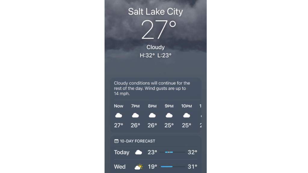
Whatever questions were floating around in your head, the weather app had an easy answer ready. Meanwhile, though, on the other side of that simple interaction is a meteorologist busy predicting the weather trends for the next several weeks in your region. She’s looking at large swathes of data collected from satellites, radar, surface maps, and more, comparing it to historical patterns, and collating and condensing all of it into simple answers to be displayed to users like you and me on our weather apps.
All of that meteorological data they’re working with is valuable – but in a practical sense, that immense value only manifests once the meteorologist has analyzed and interpreted it into an accessible weather report.
If we instead opened our weather apps to find satellite readouts, radar maps, wind speed tables, and decades-spanning historical climatic datasets, 99% of us would be no better prepared to plan that long drive to Grandma’s than we were before.
* * *
At this point, I could turn this into an article about the value of experts. (Indeed, there is certainly a conversation to be had about the current trends in the data on public trust in experts). However, while that’s definitely part of the picture when it comes to topics of data analysis, my point here is really about the data itself.
We are in an age now where the amount of data we have access to is frankly staggering. How did we get to this point? Perhaps it started in 2017 with this Economist article calling data the world’s most valuable resource. Maybe it began further back in the 1960s, when we first started using computers for decision-making support systems. Or maybe our obsession with it dates back even to the 19th century, with the advent of time management exercises. Whatever the chain of events, there is so much data around us that we’re practically drowning in it.

Some might say that the world today runs on data. But I’d say that that’s not exactly the case. Rather, the world runs on the actionable insights gleaned from data.
Without doing the work to truly understand what our data is telling us, it’s all but useless.
The big 3 problems of experience data
I have no doubt that everyone reading this has at least a few data collection tools that they regularly use in their work. In the User Experience / Digital Experience space, we rely on many different kinds of data: web analytics, behavioral data, survey responses, usability testing sessions, interview findings, and more.
It’s also almost certainly not news to you that you have to analyze that data to find the proverbial diamonds in the rough – I know that it’s not a groundbreaking assertion.

I think it’s important, though, to set up this discussion with the above framework. When we collect any kind of data, it represents a commitment of time, money, and energy to actually get something out of that exercise. So naturally, it’s important that as we engage in data-gathering activities, we have a clear understanding of the inherent problems that can potentially undermine our work, and make it overly time-consuming, inaccurate, or just flat-out wrong.
So let’s talk about the big problems with the data we collect in the experience research space. In my view, there are 3.
- Problem of SCALE / QUANTITY:
The first problem has to do with scale. Many times, the amount of data collected from research activities far outstrips the time in the day that we have to analyze it. What compounds this problem is that within that huge quantity of data, only some of it even contains the answers we’re looking for. By definition, major portions of practically any dataset will consist of noise. That noise doesn’t negate the value of the truly meaningful pieces of data – but it does make it more time-consuming to find those pieces.
- Problem of BIAS:
The second problem is related to bias. Bias can enter the picture at many levels, but one that is often overlooked is the very question of which datasets to collect. It’s easy to forget that this very basic initial decision is itself subject to our biases about what’s important, what we expect to find, and what problems we do or don’t already know about. As useful as a hunch can be, it can also lead us to collect data to investigate a pet project when a more worthwhile issue is flying under the radar.
- Problem of SILOS:
The market for research tools is now filled with a great variety of powerful tools that enable different data collection methods. In many organizations today, each internal team has its own subscriptions to the different tools it has chosen to spend budget on. But with different unique datasets spread between so many different tools used by so many different teams, we’re often missing out on the complete picture. Each of us has only one slice of the whole – like the 6 blind men touching the elephant.

Diving in: How 3 big data problems manifest
More data, more problems
The problem of quantity is an obvious one, and one you’ve probably faced yourself. Deciding where to dedicate your time as you perform data analysis can make the difference between finding that diamond in the rough, or brushing right past it. Of course, you could always increase the amount of time spent analyzing your data, to ensure that you’ve combed through every corner of it from every angle.
Unfortunately, that isn’t actually a feasible strategy – we all have other responsibilities to take care of, and spending time on analysis inherently involves a tradeoff for time spent on other things. Instead, the solution must necessarily involve using the same amount of time better, more efficiently.

Things you never knew you never knew
The question of bias in the datasets we collect, as I’ve argued above, is often overlooked – but I believe it’s an extremely important one.
Imagine that you’re preparing a usability test to get feedback on your website’s user journey. You write a series of tasks leading the participants from Page A, to Page B, C, then D. You run the test and hear all sorts of opinions from respondents about what could be improved. You spend time analyzing that data, collating the findings, and then updating the designs of your funnel pages based on what your respondents told you.
But, the A-B-C-D user flow that you tested was based on the ideal-case user journey that your web design intends for users to follow – when in reality, the most common pathway your website visitors follow starts at Page C, and then goes -A-B-A-D-X-Y-Z.
The fact is, it’s often not easy to know what steps actually constitute “our user journey.” It’s often not easy to know where the root of a problem actually lies. If a problem that’s happening deep into the user journey is triggered by an action users can take way back during signup, you may not even know to look there. And then there’s the obvious difficulty of collecting data for a problem you don’t know exists. If you don’t even know it’s there, how can you know the data you should be gathering?
Oceans apart, day after day
This brings us to the problem of siloing – because sometimes, the answers we need are actually available somewhere – just not to us. Maybe the marketing team has access to data about top entry pages and user pathways that would have helped with that user test setup. Maybe a PM from a different team has a tool that flags rage clicks and errors, but the issues they’re prioritizing don’t overlap with yours, and so no one notices issues that are afflicting your product.
How many designers would benefit from some of the traffic and behavioral data on Google Analytics, but don’t have access to it? How many have access to it, but just don’t have the advanced Google Analytics knowledge needed to drill down and find the relevant information? After all, it’s not an easy platform to figure out (if it was, there wouldn’t be such a thing as Google Analytics certifications); and if you don’t know your way around, you might never find the data points you need.
The outcome of all this is that many teams today are making important decisions that affect the organization’s bottom line, based on the incomplete view they’ve gleaned from just their own research projects, tools, and datasets.
All 3 of these big problems lead back to our overarching problem set out at the beginning: How do we turn data into insight? The overabundance of data fuels inefficiency in finding insights. Bias in the collection process skews the reliability of our insights. And siloed data leaves us to fill in the blanks in our insights with assumptions.

Better integration leads to better insights
In the above sections, my goal has been to clearly lay out the overlapping challenges we face when relying on data in our work. In this next section, my hope is twofold: to (1) identify in concise terms a trend that is already beginning to take form in our space; and (2) reflect on the best ways forward.
The trend I’m speaking of is the drive for experience data integration.
The rise (and fall – or transformation?) of research repositories
One of the clearest reflections of this trend, in my view, is the rise of research repositories as an important tool for UX, product, and marketing teams. Even more specifically, though, this trend has been followed almost immediately by another one you may have noticed: that of established research companies building or acquiring research repositories to supplement their data collection tools.
We at Trymata, for example, acquired the repository tool Considerly; our competitors at UserZoom acquired EnjoyHQ. Qualdesk was bought up by Miro. QuestionPro, rather than making an acquisition, has built their own research repository in the form of InsightsHub. We can only assume this trend will continue; already the number of independent repository companies has dwindled as one after another follows this very logical outcome.
Research repositories are a powerful instrument for helping to solve our data problem. By allowing researchers and other data users to aggregate datasets of all kinds and provenances in one place and analyze it in enormous cross-sections, these platforms strengthen the quality of the insights to be gained. Surveys, interviews, user tests, behavioral data, and more can be pulled together and compared, filling in the various gaps that each method by itself leaves.
Despite these notable benefits, repositories by themselves are not the perfect, heaven-sent solution to our data problems. With a repository, your data is still only united at the end of the collection process. To truly improve our relationship with data, the integration must begin much earlier.

Integrating research from the beginning
To truly solve our big 3 data problems, we need to look further back in the research process. Functionally, this means using different research methods and data types in a constantly reinforcing cycle, so that they’re never really separate processes at all – just different threads in the same research tapestry.
We’re already starting to see success with the integrated digital experience research approach we’ve recently undertaken here at Trymata. Late last year, we decided to make a bet on this very idea – the idea that different research methods are better together. So, in addition to our user testing tools, which was until then our sole offering, we unveiled an integrated product analytics suite. Traditionally, many of the data types available from the new suite would be used primarily by marketers, product managers, or even technical teams: for example, web analytics and traffic data like you can find in Google Analytics, and behavioral tagging like rage clicks and error clicks.
We believed, though, that the designers and UX researchers that comprised the majority of our users could benefit greatly from this data, and that, in fact, they should be using it to inform the way they do user research and make design decisions. Not only that, but we believed equally that the marketer and PM type users that would traditionally engage with the product analytics data would benefit just as much from integrating their quantitative datasets and behavioral methods with the in-depth user interviews and feedback sessions available to run through our integrated user testing suite.
While still in its early stage, this combination of research methods and data types in one place has allowed us – and our customers – to start experimenting with an integrated research process where all of these datasets inform and enhance each other.

The next 3 sections will address in specific terms how this approach can help to solve each of the 3 big problems with data.
1. Solving the problem of bias
By starting with web analytics data, we learn about what’s happening in key user flows at a macro level, and objectively evaluate what those flows actually look like, and how they look over time. We can measure performance and set benchmarks for our existing goals using a variety of real usage-based KPIs, and observe improvements over time as we fix known issues.
Importantly, we can also learn about patterns we didn’t know about. These may be common pathways we didn’t know users were taking, or clusters of frustration indicators like rage clicks or dead clicks. It may be exit rates or bounce rates that are higher than we’d like. It could be differences in behavioral patterns between user segments, or even device or language trends among groups of users. Any of these could be a hint for us to dive deeper into the relevant behavioral data, or to run a usability test to learn more.
Starting from the analytics frees us from allocating research efforts based only on our roadmap priorities, pet projects/hunches, and known UX issues. We can open our eyes to research opportunities, both known and unknown, and weigh all of them to strategize a more unbiased set of research goals and testing plans.
What’s different about this approach?
None of these pieces of data are new or revolutionary in and of themselves; you may be checking some of them already in different tools. The key differences here are (1) the intention with which we’re looking at this data, and (2) the application of the knowledge as it relates to other product research and decision-making processes.
As far as point (1), the idea here is that web analytics should not just be used to track KPIs and measure performance, but to actually constantly assess your research and design priorities.
If you’re mainly checking your traffic numbers, exit rates, time on page, rage clicks, and other such metrics just when it’s time to report on your KPIs, and not as part of the actual research and discovery process, you’ll almost certainly see different things in the data. Approaching the data with curiosity and open-mindedness, and with the intention of noticing new things, will affect what you get out of that exercise.
As far as point (2), you can then apply what you notice to your decisions, both about the research projects you choose to run and the design projects you choose to work on.
If your team currently runs usability tests and other in-depth qualitative studies only when releasing a new feature or evaluating a feature that’s already been slated for design updates on your roadmap, you’re far from alone. Many teams distribute their research efforts in this way. But the fact is, there are many avenues of inquiry that are worthwhile beyond these specific moments.
If your macro data reveals different pathways that users are following, hidden inefficiencies in your navigational layout, undesirable usage patterns among certain user segments, or dips in the numbers for flows that were thought to be safe – any of these can be followed up on with more thorough and targeted research. Just getting those opportunities on your organizational radar and into the list of possible projects is already a win.
Lastly, there’s a key difference related to (3) access. As mentioned previously, in many organizations these insights are not distributed to all of the teams that would benefit from them, or considered together in the same decision-making flow. By bringing these data types together in a single research platform, we reframe the relationship between them and, hopefully, the way people conceptualize that.

2. Solving the problem of quantity
Once a problem is identified within the traffic data (or picked from the list of known issues), we can take that same data and start viewing it through layers of filters and segments that eliminate as much of the noise as possible, leaving us with just the most relevant users/session data.
Once we’ve reached a scale of data that’s manageable – and on-topic – it becomes much more feasible to start working with behavioral data: for example, examining individual users’ event logs and session replay videos. This kind of analysis is undoubtedly “nitty-gritty,” but it’s also what enables us to analyze and understand issues from a human perspective.
This is the point where we start reaching a deeper level of insight into our users, and what we can do to improve their experience (and our performance); but it only happens after we’re able to effectively eliminate or ignore huge amounts of the data that’s been collected, in favor of the few handfuls most likely to answer our research question.
What’s different about this approach?
Chiefly, the difference here is about the transition from the macro-level, quantitative data to the micro-level, qualitative data in the investigative process.
When those two pieces of the puzzle are separated, housed in different platforms with different terminologies, collection / measurement methods, and base datasets, it’s harder to make the jump. If you’ve ever tried to line up Google Analytics numbers with the corresponding numbers from a referring campaign or other marketing analytics platform, for example, you’ve probably had to deal with significant discrepancies between the data from the two sides.
With a platform that combines the big-picture analytics of Google Analytics with extensive behavioral data that can be examined at the level of an individual user, there’s essentially a lossless transition. If you want to know why the data shows a drop in throughput, you can open up the exact list of user sessions relevant to that question and watch user sessions, or scan navigational logs and event logs. While many integrations with the usability testing side are yet to come, you can imagine even finding the web analytics for specific test participants and combining those views.
3. Solving the problem of siloing
At this point, of course, the other thing we can do is to run small-scale, targeted usability tests on the flow we’re investigating.
We’ve identified the issue(s) we want to explore and explain, and we’ve learned about which users are relevant to the issue and how they’re acting. Depending on what’s come out of the behavioral data, though, we may or may not yet understand why they’re behaving the way they are.
This is where we jump to the usability testing side of the platform, to set up a scenario and tasks that will replicate the twists and turns of the user journey we’ve observed already, and get really solid qualitative feedback about what’s going on in people’s heads throughout that experience.
That’s not where the idea of de-siloing ends, though. Once the user tests have been run, the data analyzed, the necessary design changes proposed and executed, we can go right back to our web analytics data and start watching what happens.
If we optimized our designs to decrease abandonment, do we actually observe a decrease post-release? If we were trying to optimize an inefficient navigational pattern, do we actually observe users following the intended pathway at higher rates?
By integrating these qualitative and quantitative sides of the equation together, we can create a constant iterative loop between observation and investigation that’s accessible to everyone involved.
What’s different about this approach?
The big idea here is that iteration is not limited to just the design side of the product sphere. Research too can be constantly optimized, honed, and refocused in tandem with design and engineering. By ensuring that research decisions are an active part of the iterative cycle, we can better ensure that we are optimizing the choice of product questions that are asked, investigated, and solved.
Again, this is not a revolutionary new discovery. Rather, the point is to encourage a mental framework in which research is not an appendage of roadmaps that are chosen beforehand, but an active driver of the roadmap in itself. By discussing a way of thinking about this process in concrete, well-defined terms, and supporting it with an integrated platform that embodies that way of thinking, I hope to positively influence the way this flow is conceptualized in organizations that still have room to grow in their research processes (which is all of them – ourselves included!)
Conclusion
In summary, a workflow like described here helps to address and eliminate the 3 major problems of data and insights in our industry in multiple, layered ways.
- By starting with all of the web data, you can reduce the bias of where you’re looking, and what you’re running user tests on.
- Segmenting your product analytics data and collecting small-batch usability testing feedback allows you to focus on a manageable quantity of data to solve a specific problem.
- Doing it all together in a platform designed for product and marketing people to use without a high level of expertise makes it easy to get a holistic understanding without leaving out a key piece of the puzzle.
While our vision of a seamless digital experience research workflow is still in its early stages, we are continuing to develop our platform to support an integrated workflow that’s easy to execute and enables you to reach a higher level of success turning your data into insights.