


Matrix bar
The matrix Bar is a data visualization widget in the BI dashboard designed for matrix-style questions or any question containing multiple rows with common categorical columns. It enables users to visualize data using averages, counts, or average percentages across different rows, providing clear insights into comparative patterns.
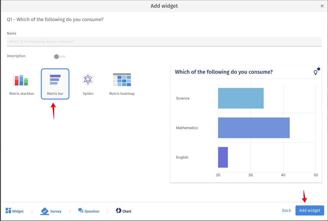
To add a Matrix Bar, follow these steps:
- Click on Add Widget.
- Select the desired data source.
- Choose a matrix-style question.
- Select the Matrix Bar widget and confirm by clicking Add Widget.
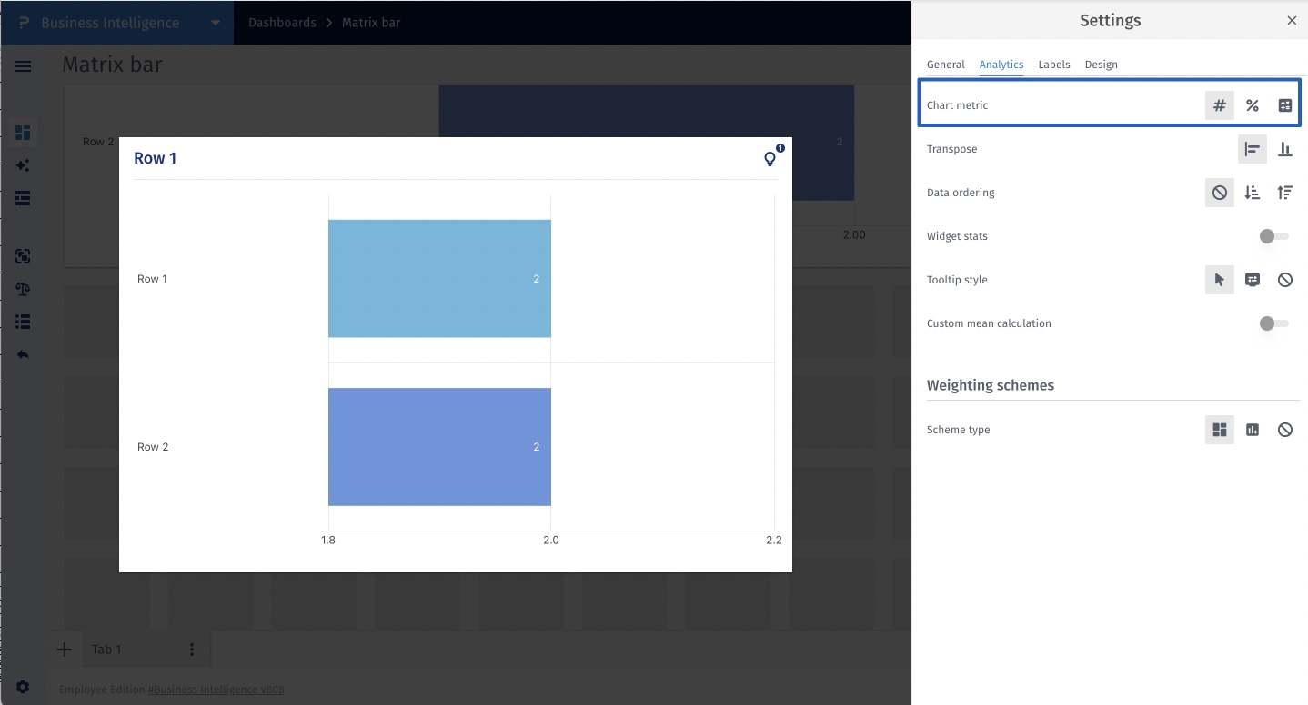
A chart metric refers to the data used to generate a chart. The following chart metrics are available for use:
- Count: Based on the number of respondents for that row.
- Percentage: Based on the mean percentage for that row.
- Mean: Based on the mean for that row.
This feature is available with the following licenses :
Team Edition Research Edition Communities Customer Experience Employee Experience University - Research Edition