Matrix questions are among the most powerful tools in a researcher’s toolkit. They capture nuanced, comparative data across multiple dimensions in a single question, making them essential for satisfaction studies, product feedback, and CX research.
Yet they’re also one of the leading causes of survey abandonment.
The reason? Traditional matrix grids are built for spreadsheets, not for people.
The solution? Carousel Layout for Matrix Questions.
QuestionPro’s new Carousel Layout replaces the static, overwhelming grid with a focused, one-row-at-a-time experience. This ensures respondents can answer with confidence, regardless of what device they’re on.
The Grid Was Never Built for People
When a respondent opens a matrix question on their phone, here’s what they experience.
A table that’s wider than their screen. Column headers that disappear when they scroll down. Rows of text so compressed they require deliberate focus to parse. And the quiet, growing realization that there are fifteen more rows to go.
Most don’t abandon immediately. They do something worse: they start selecting answers without reading. Straight-lining. Pattern-clicking. Answering in a way that looks complete but reflects nothing real.
The research is consistent on this. Unoptimized matrix questions can contribute to more than a 40% drop in data quality compared to focused, progressive layouts. That’s not a UX inconvenience; it is a research validity problem.
And it’s not just mobile. Dense grids create cognitive overload on desktop too, especially for non-native speakers, respondents with cognitive differences, or anyone taking a survey across multiple interruptions. The grid doesn’t care. It just sits there, all thirty rows visible at once, daring the respondent to care as much as you do.
What Changes with Carousel Layout
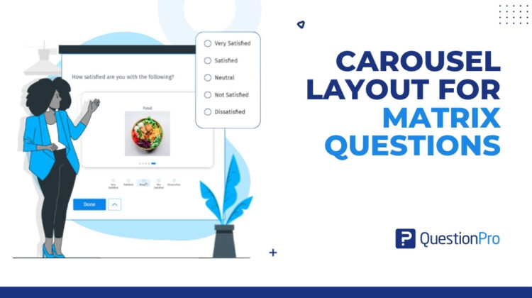
Carousel Layout is a new setting in QuestionPro’s Matrix Question that replaces the static grid with something fundamentally different: a one-row-at-a-time card experience.
Instead of presenting all matrix rows simultaneously, each statement gets its own card. The respondent sees one item, answers it, and moves to the next. A progress bar, such as “Question 3 of 5,” keeps them oriented throughout. Selecting an answer automatically advances to the next card, creating a rhythm that feels less like filling out a form and more like a conversation.
The grid isn’t just reskinned. The interaction model is different. The cognitive demand is different. The result, for both respondents and researchers, is different.
Before and After: What Respondents Actually Experience
Before: Standard Matrix Grid
A respondent on mobile opens a satisfaction survey. They see a 10-row, 5-column table. The column headers cut off at the screen edge. They scroll right, lose their place on the row, scroll back. After two rows, they pick a column and tap straight down to the bottom. Done in fifteen seconds. Every answer: “Neither satisfied nor dissatisfied.”
You now have ten data points that mean nothing.
After: Carousel Layout
The same respondent sees one statement: “The quality of coffee in the office.” Below it, five options are presented in clean cards. They tap “Somewhat satisfied,” and the next card slides in automatically. “The comfort of chairs.” They think for a second, select “Extremely dissatisfied,” and the next card appears.
Sixty seconds later, they answered all ten rows genuinely. You have ten data points you can actually use.
The difference isn’t cosmetic. It’s whether your matrix question measures what you think it measures.
When Should You Use Carousel Layout?
Carousel Layout isn’t a replacement for every matrix question. It’s the right tool for specific situations where the traditional grid consistently underperforms.
- Mobile-heavy audiences. If a meaningful portion of your respondents are on smartphones, the standard grid is working against you from the moment the page loads. Carousel Layout’s vertical single-column mode is purpose-built for small screens, featuring no horizontal scrolling, no truncated headers, and no accidental taps.
- Long matrices. The longer the matrix, the higher the straight-lining risk. Any matrix with more than five or six rows is a candidate. Carousel Layout isolates each row, making length feel manageable instead of daunting.
- High-stakes data collection. When the research matters, such as brand equity studies, product feedback loops, or NPS follow-up surveys, the cost of junk data is high. Carousel Layout is worth using whenever data quality is more important than survey brevity.
- Accessibility requirements. Standard grids routinely fail basic accessibility standards for users with cognitive or motor impairments. The focused, progressive card format is more navigable for respondents using assistive technology, and more readable for those with attention differences.
- Varied answer lengths. When your response options include descriptive text rather than short scale labels, horizontal cards get crowded fast. Carousel Layout’s Full Width card style gives longer options room to breathe.
Two Layouts, One Setting
Carousel Layout gives researchers control over how response options are displayed, not just the card format itself.
- The Horizontal layout shows response options in a row beneath each carousel card, with a choice between Compact style (tight, efficient for short scale labels) and Full Width style (expanded, for descriptive options) based on set row width. This works particularly well for Likert-style scales on desktop.
- The Vertical layout stacks response options beneath the card in a column. A column selector lets researchers control density: one column creates a clean mobile-friendly list, while two or more columns shift into a grid format that handles larger answer sets efficiently.
Both modes support Radio and Checkbox answer types in the current release.
Switching between them is a single dropdown in the Matrix Question settings panel. The preview updates in real time.
What’s Coming Next
Carousel Layout is the foundation. But the direction it points toward is more interesting than any single feature.
The next frontier for matrix questions isn’t just better formatting; it’s smarter formatting. Planned future capabilities include the ability for researchers to visually emphasize specific “critical” rows within a matrix, drawing respondent attention to the data points that matter most. Further out, AI-assisted auto-grouping could analyze matrix rows and suggest logical sub-carousel groupings based on semantic themes, automatically breaking a 20-item table into digestible, themed sections without any manual effort.
The goal is a matrix question that doesn’t just present information to respondents. It adapts to them.
Your Data Is Only as Good as the Experience That Collected It
Researchers spend significant time on question wording, scale design, and statistical analysis. The assumption is that the format itself is neutral and that it doesn’t affect what respondents tell you.
It’s not neutral. It never was.
The matrix grid was a practical compromise for an earlier era of survey design. Carousel Layout isn’t a feature update to that compromise; it is a rethinking of the assumption that showing respondents everything at once is the best way to understand what they actually think.
One row at a time. One honest answer at a time.
That’s where better research data starts.