


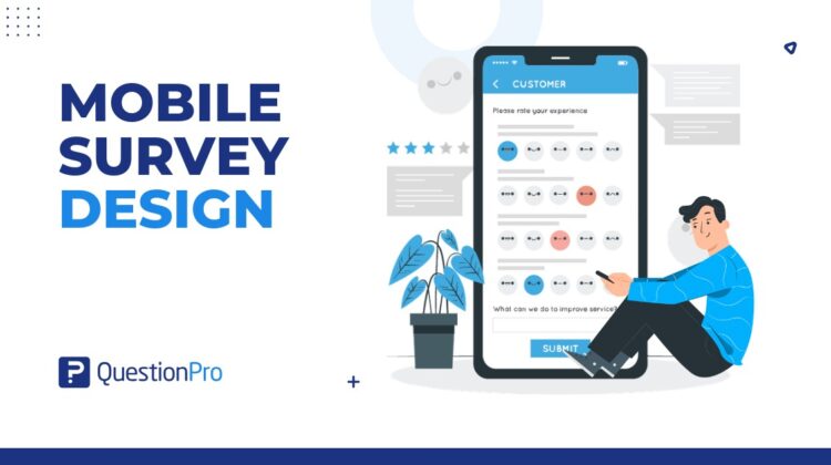
Mobile survey design is the process of creating surveys that are easy to read, answer, and complete on smartphones and tablets. It focuses on short questions, simple layouts, mobile-friendly answer options, fast loading, and a smooth respondent experience.
This matters because mobile is no longer a secondary channel. Pew Research Center reports that about nine-in-ten US adults own a smartphone, making smartphone ownership in the United States a strong reason to design surveys for mobile-first. A survey that looks fine on a laptop can feel slow, cramped, or frustrating on a small screen.
Good mobile survey design helps people respond faster and more accurately. Poor design can increase drop-offs, rushed answers, and low-quality feedback.
What is mobile survey design?
Mobile survey design means building surveys specifically for mobile screens, touch-based interaction, and on-the-go response behavior.
A mobile-friendly survey should be simple enough to complete with one hand, clear enough to understand quickly, and light enough to load without delay. It should avoid long grids, tiny buttons, heavy images, and long open-ended questions that are hard to type on a phone.
The goal is not just to make a survey “fit” on mobile. The goal is to make the full survey experience feel natural for mobile respondents.
Strong survey design still matters on mobile, but the layout, question length, and answer formats need extra attention on smaller screens.
Why does mobile survey design matter?
Mobile survey design matters because respondents often complete surveys while multitasking, commuting, shopping, waiting in line, or using short breaks.
That means your survey has less patience to work with. If the first screen feels long or confusing, many respondents will leave. If answer options are hard to tap, they may choose quickly without thinking. If the survey asks for too much typing, they may skip the question or abandon the survey.
Strong mobile survey design helps improve:
- Survey completion rate.
- Respondent experience.
- Data quality.
- Feedback speed.
- Participation from mobile-first audiences.
- In-the-moment feedback collection.
- Customer and employee survey response.
For US businesses, this is useful for retail feedback, event surveys, patient experience surveys, employee pulse surveys, product feedback, and post-service customer surveys.
How are mobile surveys different from desktop surveys?
Mobile surveys are different from desktop surveys because respondents use smaller screens, touch inputs, mobile keyboards, and shorter attention windows.
Desktop surveys can support wider layouts, longer answer lists, and more complex grids. Mobile surveys need tighter design. A question that looks short on desktop may take up the full screen on a phone.
Key differences include:
- Mobile screens show less text at once.
- Respondents tap instead of clicking.
- Long answer lists require more scrolling.
- Typing is slower on mobile keyboards.
- Slow loading feels more noticeable.
- Respondents are more likely to be interrupted.
- Complex matrix questions are harder to answer.
- Buttons need enough space for touch.
A good rule: design for mobile-optimized surveys first by checking the smallest realistic screen. Then test the same survey on desktop, not the other way around.
What are the main benefits of mobile survey design?
The main benefit of mobile survey design is that it makes surveys easier to complete on the devices people already use.
A well-designed mobile survey can help teams collect feedback faster without adding unnecessary friction.
Key benefits include:
- Convenience: Respondents can answer from almost anywhere.
- Efficiency: Short, focused surveys take less effort to complete.
- Higher completion potential: Clear mobile layouts can reduce drop-off.
- Faster feedback: Mobile surveys can capture responses close to the moment of experience.
- Better accessibility across devices: A responsive survey works for more respondents.
- Stronger customer connection: Asking for feedback in a simple way shows respect for the respondent’s time.
- Cleaner response behavior: Simple question formats can reduce rushed or confused answers.
The benefit is not just speed. It is better fit between the survey and the respondent’s real context.
What question types work best for mobile surveys?
The best mobile survey questions are easy to scan, easy to tap, and quick to answer.
Strong mobile-friendly question types include:
- Single-select multiple choice.
- Yes or no questions.
- Star ratings.
- Number rating scales.
- Smiley scales.
- Short dropdowns.
- Short text fields when needed.
- Image choice questions with limited options.
Use these question types carefully:
- Matrix questions.
- Long ranking questions.
- Large grids.
- Long open-ended responses.
- Image-heavy questions.
- Questions with too many answer choices.
- Questions that require detailed typing.
For example, a five-point rating scale usually works better on mobile than a large matrix with ten rows and five columns. A short multiple-choice question often works better than asking respondents to type a paragraph.
If you need open-ended feedback, ask one focused question and explain why it matters.
What are the best practices for mobile survey design?
Mobile survey best practices focus on reducing effort, improving clarity, and helping respondents move through the survey without frustration.
Keep questions short and focused
Each question should ask one thing.
Long mobile survey questions are harder to read on a phone. Split complex questions into smaller parts when needed. Avoid double-barreled questions, where one question asks about two ideas at once.
Bad example:
“How satisfied are you with our app design and customer support?”
Better example:
“How satisfied are you with the app design?”
Then ask a separate question about customer support.
Use mobile-friendly answer options
Answer options should be short, clear, and easy to tap.
Avoid long labels when a short label works. Use vertical answer lists when possible because they are easier to scan on a phone.
For rating questions, keep the scale simple. A 5-point scale is often easier on mobile than an 11-point scale, depending on the topic.
Limit open-ended questions
Open-ended questions can be useful, but too many of them create typing fatigue.
Typing on a phone takes effort. If every other question asks for a written response, completion rates can suffer.
Use open-ended questions when you need context, not as a default. A good mobile survey may include one or two open-text questions, placed after easy questions.
Use survey logic to reduce friction
Survey logic shows respondents only the questions that apply to them.
For example, if someone says they have not used a mobile app feature, they should not see follow-up questions about that feature. Skip logic and branching help keep the survey shorter and more relevant.
This improves the respondent experience and can reduce survey fatigue.
Avoid clutter and heavy visuals
A mobile survey should load quickly and feel clean.
Avoid unnecessary logos, decorative images, oversized headers, and crowded screens. Visuals can help when they clarify the question, but they should not slow down the survey or distract respondents.
On mobile, simple design usually performs better.
Test the survey on real devices
Always test the survey on real phones before launch.
Check how it works on iOS and Android. Review the first screen, question spacing, answer buttons, progress indicator, dropdown behavior, text entry, and final submit button.
Do not rely only on a desktop preview. Mobile issues often appear only when you test the survey the way respondents will actually use it.
What mobile survey design mistakes should you avoid?
The biggest mobile survey design mistake is building the survey for desktop and only checking later if it works on mobile.
Avoid these common mistakes:
- Using large matrix questions.
- Asking too many open-ended questions.
- Making the survey too long.
- Using small buttons or tight answer spacing.
- Adding unnecessary images.
- Using long answer labels.
- Asking irrelevant questions.
- Forgetting skip logic.
- Hiding the progress indicator.
- Using unclear instructions.
- Not testing on real mobile devices.
- Making respondents scroll too much before answering.
A practical test: if a respondent needs to pinch, zoom, scroll sideways, or think too hard about where to tap, the design needs work.
Poor mobile formatting can also increase survey dropout, especially when respondents face long grids, small buttons, or too much typing.
Mobile survey design checklist
Use this checklist before sending a mobile survey:
- Is the survey short enough for mobile?
- Does the first question feel easy to answer?
- Is each question focused on one idea?
- Are answer options short and clear?
- Are buttons easy to tap?
- Are open-ended questions limited?
- Is skip logic hiding irrelevant questions?
- Does the survey load quickly?
- Are images necessary and optimized?
- Does the progress indicator work?
- Is the submit button easy to find?
- Did you test it on iOS and Android?
- Did you test it on different screen sizes?
- Does the survey work without sideways scrolling?
This checklist is simple, but it catches many problems that hurt mobile survey completion.
How can QuestionPro help with mobile survey design?
QuestionPro can help teams create mobile-friendly surveys that are easier to complete across devices.
With mobile surveys, teams can collect feedback from respondents using smartphones and tablets. This is useful for customer feedback, event surveys, product feedback, employee pulse surveys, and market research.
QuestionPro also supports helpful survey design features such as question types, skip logic, branching, rating scales, and reporting. These features help teams keep surveys relevant, reduce unnecessary questions, and review response patterns after launch.
For field research or offline data collection, the QuestionPro mobile app can help teams collect survey responses on iOS and Android devices, then sync the data when connected.
The tool can support mobile survey design, but the research team still needs to write clear questions, choose the right format, and test the survey before sending it.
Final thoughts on mobile survey design
Mobile survey design works best when the survey respects the respondent’s time, screen size, and context.
The goal is not to squeeze a desktop survey onto a phone. The goal is to create a survey that feels easy to answer on mobile from the first screen to the final submit button.
If the survey is short, clear, relevant, and tested on real devices, respondents are more likely to finish it and provide useful feedback.
Frequently Asked Questions (FAQs)
A mobile survey should usually be short enough to complete in a few minutes. The exact length depends on the topic, but shorter surveys often work better on phones because respondents face more distractions and typing friction.
Matrix questions are not always bad, but they are risky on mobile. Large grids can be hard to read, tap, and complete on small screens. Use single-question formats or shorter scales when possible.
The best first question is simple, relevant, and easy to answer. A rating, yes or no question, or single-select question often works well because it helps respondents start without effort.
Yes, but use them carefully. Open-ended questions can provide useful context, but they require typing on a phone. Ask one focused open-ended question when the answer will help explain ratings or behavior.
Mobile survey design improves response quality by reducing confusion, effort, and fatigue. Clear questions, simple answer options, and relevant logic help respondents answer more carefully instead of rushing or abandoning the survey.
Mobile survey design is important for US audiences because smartphone use is widespread across age groups, industries, and daily activities. Many respondents will open surveys on phones, especially for customer feedback, event feedback, and quick pulse surveys.