
Here’s the uncomfortable truth about most CX programs: they collect plenty of data and still can’t tell you what to fix. Knowing how to measure customer experience is what closes that gap. It means tracking how customers feel about your brand at each touchpoint, then turning those feelings into numbers your team can actually act on.
Most US companies already survey customers in some form. Few connect a single survey score to something that matters on a P&L, like retention or repeat revenue. That’s rarely an effort problem. It’s a measurement problem.
In this guide, we’ll learn the core CX metrics, the formulas behind them, and a step-by-step process for building a measurement program that survives contact with a real business.
What does it mean to measure customer experience?
Measuring customer experience means collecting data on how customers perceive their interactions with your brand, then converting that data into scores you can track over time. Simple to say. Harder to do well, because it blends three kinds of evidence: what customers say in a survey, what they actually do, and how your operations perform behind the scenes.
Here’s where most programs go sideways. A team sees a healthy NPS and assumes everything’s fine, while a support queue is quietly backing up. One metric flatters you. Another one tells the truth. The job of a CX measurement program is to hold both up at once, instead of publishing whichever number looks better in a slide deck.
That’s also where CX measurement differs from customer satisfaction alone. Good customer experience spans the whole relationship, from the ad someone scrolled past to the tenth call they made to support. Satisfaction, by contrast, is a snapshot of one moment inside it.
Why does measuring customer experience matter in the US?
Because CX quality moves loyalty, spend, and revenue, not just a dashboard score. And right now, it’s sliding across most US industries, which changes the math on why measurement matters.
Only 3% of US companies are currently customer-obsessed, meaning they put customer needs at the center of every major decision, and CX quality has declined for three consecutive years (Forrester, 2024).
Read that stat twice. 97% of US companies aren’t built around the customer, even though most of them would say they are. That gap between belief and reality is exactly why measurement beats intention. A brand that tracks the right metrics and actually fixes what it finds isn’t just keeping up. It’s pulling away from competitors who are still guessing.
What are the perception metrics for measuring customer experience?
CX metrics break down into three categories: perception metrics that capture how customers feel, outcome metrics that capture what customers actually did afterward, and operational metrics that capture how your team performed behind the scenes.
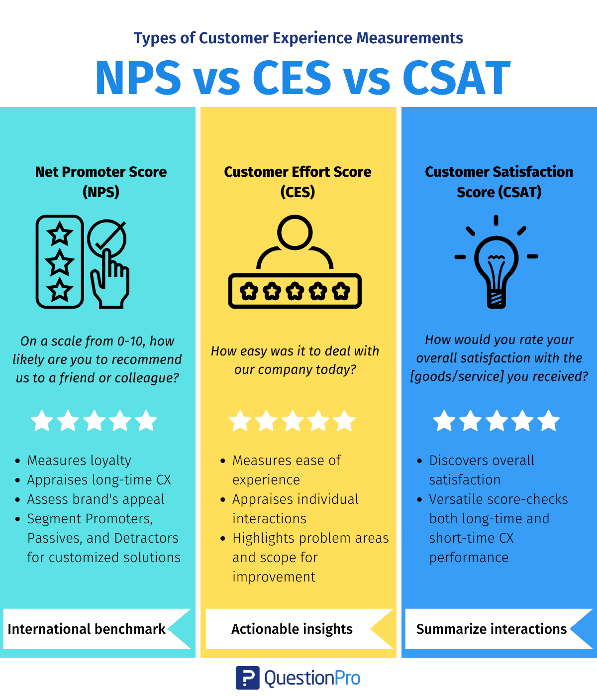
Perception comes first, and three metrics carry most CX programs here: Net Promoter Score, Customer Satisfaction Score, and Customer Effort Score. Each looks at a different slice of the relationship, and any one of them used alone will eventually mislead you.
What is Net Promoter Score (NPS) and how do you calculate it?
Would your customers actually recommend you, or just tolerate you? That’s the one question Net Promoter Score (NPS) asks, on a 0 to 10 scale.
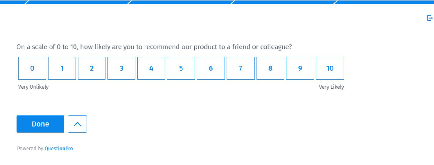
- 9 or 10, promoter. Loyal customers who fuel referrals and repeat purchases.
- 7 or 8, passive. Satisfied enough, but easy prey for a competitor’s better offer.
- 0 to 6, detractor. Unhappy customers who actively discourage others from buying.
NPS = % of promoters minus % of detractors
Say 60% of respondents are promoters and 15% are detractors. Your NPS lands at 45. It’s a relationship metric, not a transaction metric, so quarterly or post-renewal is usually the right cadence, not after every single ticket.
One catch worth knowing upfront: a rising NPS with no explanation attached is close to useless, since the score alone never tells you why customers feel that way. Always pair it with an open-ended follow-up. Curious how it actually compares to the other two? Here’s how NPS vs CSAT vs CES differ in practice.
What is Customer Satisfaction Score (CSAT) and how do you calculate it?
A customer just finished a support call. Were they satisfied with that one interaction, on a 1 to 5 scale? That’s Customer Satisfaction Score (CSAT), and unlike NPS, it only judges a single moment, not the whole relationship.
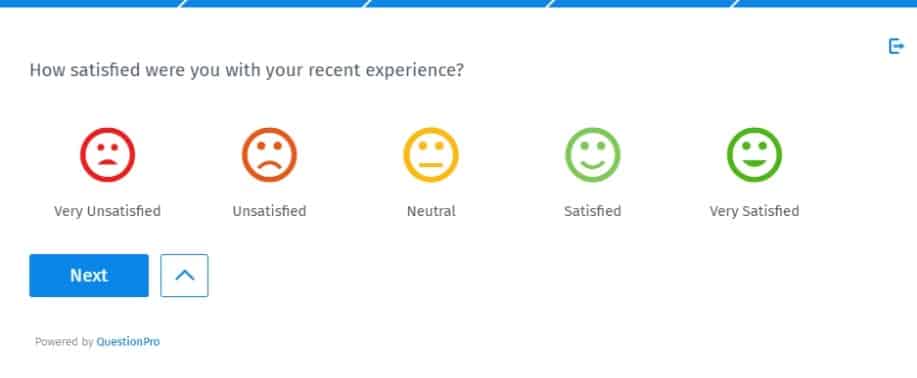
CSAT = (number of satisfied responses ÷ total responses) × 100
Example: 80 out of 100 respondents rate the call a 4 or 5, so CSAT lands at 80%.
For context, the US national customer satisfaction average sits at 76.7 out of 100, and ACSI’s Q1 2026 report frames that as a warning sign, not a stable baseline: customer complaints rose 16% in the same quarter, and the index has now sat flat since 2013 despite over $100 billion a year in CX spending (ACSI, 2026).
Most CX teams treat 75% to 85% as a healthy CSAT range, though that figure is a widely repeated rule of thumb rather than a number tied to one authoritative study, so weigh it as general orientation, not a hard target.
A CSAT survey only works if you follow a few rules:
- Send it immediately after the interaction, while it’s still fresh
- Keep it to one or two questions, never a full-length survey
- Track it by touchpoint, not as one blended company-wide number
What CSAT won’t tell you is whether that same customer is quietly shopping your competitors. For that, you need CES.
What is Customer Effort Score (CES) and how do you calculate it?
How hard did a customer have to work to get something done? Customer Effort Score (CES) answers that directly, whether the task was resolving a billing issue or finishing a checkout.
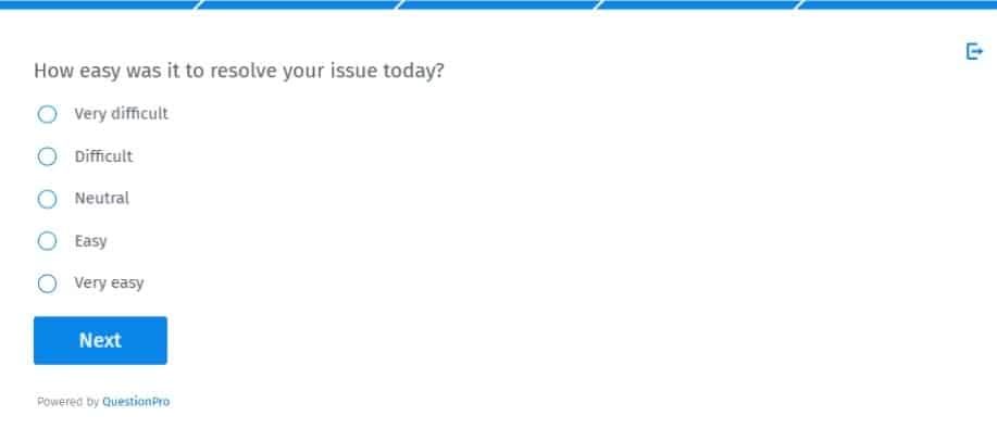
CES = average of all effort ratings collected
Customers rate the interaction on a 1 to 7 scale, and the score usually breaks down like this:
| CES range | What it signals |
|---|---|
| 1 to 3 | High effort. A friction point worth fixing fast. |
| 4 to 5 | Moderate effort. Workable, but not memorable. |
| 6 to 7 | Low effort. The experience you’re aiming for. |
Low effort predicts repeat business better than satisfaction does. A CES research study of more than 75,000 customer interactions found that effort was a stronger predictor of loyalty than either satisfaction scores or NPS (Dixon, Freeman & Toman, Harvard Business Review, 2010), which is why support-heavy businesses lean on CES so hard. One caveat: CES only reflects the moment measured, so a low score at checkout says nothing about how that same customer feels about your product overall. The full case for why is in this breakdown of Customer Effort Score.
Not sure which of the three to reach for? A quick gut check:
- Ask NPS when you want to know if the relationship as a whole is healthy
- Ask CSAT right after a transaction, to catch a problem before it repeats
- Ask CES when you suspect one specific step in the process is the friction point
What are the outcome metrics for measuring customer experience?
The second category is outcome metrics. NPS, CSAT, and CES all measure perception. Churn rate and customer lifetime value (CLV) measure what actually happened afterward, which makes them the reality check on everything perception metrics tell you.
- Churn rate: Percentage of customers who leave in a given period. Formula: (customers lost ÷ customers at start of period) × 100
- Customer lifetime value (CLV): Total revenue expected from a customer across the full relationship. Formula: average purchase value × purchase frequency × customer lifespan
Here’s the tell that something’s wrong with your measurement setup, not your customers: NPS and CSAT are both climbing, but churn hasn’t budged. When perception and outcome disagree, trust the outcome, then go looking for what the survey missed.
What operational metrics show how CX performs day to day?
Perception metrics like NPS and CSAT tell you how customers feel, and outcome metrics like churn tell you what happened as a result. Operational metrics tell you why, by measuring how your team actually performed behind the scenes. These three show up in nearly every mature CX program.
| Metric | What it measures | Formula |
|---|---|---|
| First response time (FRT) | How fast a team replies to a new customer request | Total time to first response ÷ number of tickets |
| Average resolution time (ART) | How long it takes to fully resolve an issue | Total resolution time ÷ number of resolved tickets |
| First contact resolution (FCR) | The share of issues solved on the first attempt | Requests resolved at first contact ÷ total requests |
A high CSAT score paired with a slow ART is a warning sign. Customers might forgive one wait, but repeat delays quietly pull loyalty metrics down over the following quarter.
What do CX survey questions actually look like in practice?
Knowing the formula is one thing. Writing the actual question is another, and that’s usually where programs quietly go wrong by asking three questions instead of one.
- NPS question: “On a scale of 0 to 10, how likely are you to recommend [company] to a friend or colleague?” followed by an open-ended “What’s the main reason for your score?”
- CSAT question: “How satisfied were you with [specific interaction]?” on a 1 to 5 scale, sent within minutes of the interaction ending.
- CES question: “How easy was it to resolve your issue today?” on a 1 to 7 scale, or the agreement version, “[Company] made it easy for me to handle my request.”
Stick to one core rating question plus a single optional open-text field. Stacking five rating scales onto a CSAT survey defeats the point. It’s built to capture one moment, not to run a full interview.
Wording matters as much as structure. A leading question quietly inflates the score and makes the data useless for spotting real problems:
- Leading (avoid): “How satisfied were you with our award-winning support team?”
Clean: “How satisfied were you with the support you received?” - Leading (avoid): “How easy was it to use our simple, intuitive checkout?”
Clean: “How easy was it to complete your checkout?”
The fix is the same in both cases: strip out any adjective that answers the question for the customer before they’ve had a chance to.
What is the step-by-step process to measure customer experience?
Building a CX measurement program is a sequence, not a single survey launch. This is the order that holds up in practice.
- Define the business question first.
Decide what you’re trying to learn, such as whether onboarding is causing early churn, before picking a metric. - Map the journey and pick your touchpoints.
Identify the moments worth measuring, like sign-up, first purchase, or renewal. A customer journey map turns this step into something concrete instead of guesswork. - Match metrics to touchpoints.
Use CSAT or CES for transactional moments and NPS for relationship-level checkpoints. - Collect feedback through more than one channel.
Combine surveys with reviews, support transcripts, and social mentions so you’re not only hearing from people who choose to respond. - Segment the results.
A single average score hides problems specific to a region, a product line, or a customer tier. - Close the loop.
Route low scores to an owner who follows up with that customer directly. - Track trends and benchmark against competitors.
One bad week isn’t a trend, but a metric sliding for three straight months is. Compare your numbers against direct competitors too, not just your own history. An NPS of 45 can lead one industry and lag another.
How many CX metrics should you track at each stage of maturity?
The right number of metrics depends on how mature your CX program is, not on how many metrics exist. Tracking everything at once usually means acting on nothing.
- Just starting out: Track CSAT and NPS to establish a baseline. Two metrics you actually use beat ten you don’t.
- Growing program: Add CES and one operational metric, like ART, to catch friction before it shows up in churn.
- Mature program: Layer in churn rate, CLV, and sentiment analysis, which uses natural language processing to score the emotional tone of open-text feedback, to connect experience data to revenue.
What tools and methods do you need to measure customer experience?
You need at least one way to ask customers directly and one way to observe their behavior. Relying on a single source of data leaves blind spots you won’t see until they show up as churn.
| Method | What it captures |
|---|---|
| Surveys | Direct feedback right after a transaction or on a relationship cadence |
| Journey analytics | How feedback connects to actual customer behavior across channels |
| Sentiment and text analysis | Tone and recurring themes in open-ended responses and support tickets |
| Contact center data | Operational metrics like FRT and ART pulled straight from your support platform |
A platform built for this, like customer experience software, centralizes these methods so NPS, CSAT, and CES scores live next to journey maps and operational data instead of scattered across five different tools. Layering in a voice of the customer strategy also helps you catch unsolicited feedback you’d otherwise miss entirely.
How does QuestionPro Customer Experience make these metrics actionable?
QuestionPro Customer Experience combines NPS, CSAT, and CES survey templates with real-time dashboards, so a score change shows up the same day instead of at the next quarterly review. A few specifics worth knowing if you’re weighing this against a spreadsheet-based process:
- AskWhy question captures the reason behind the score.
After a customer rates you 0 to 10, a built-in follow-up asks what drove that number, so the “why” arrives in the same response instead of a second survey days later. - Automated alerts close the loop.
Detractors and low CSAT or CES scores route straight to an owner, which is the follow-up step most CX programs quietly skip. - Dashboards sit next to journey data, not apart from it.
A score doesn’t live in a silo separate from the touchpoint that produced it.
One real example: The National Independent Soccer Association (NISA), a US professional soccer league, used AskWhy, a QuestionPro question type that pairs a rating with an open-ended reason, alongside in-stadium QR code polling to collect fan feedback during live matches and broadcasts instead of relying on a single post-season survey. The full NISA case study walks through how the setup worked touchpoint by touchpoint.
For teams that need to connect scores to specific touchpoints, the platform’s Journey Management Tool maps customer stages and layers feedback data directly onto each stage, instead of keeping journey maps and survey results in separate files that nobody cross-references.
What mistakes quietly break CX measurement programs?
Most CX programs don’t fail because of bad metrics. They fail because of how those metrics get collected and used.
- Surveying too often: Frequent surveys cause fatigue and skew results toward whoever bothers to respond.
- Tracking one metric alone: NPS without CSAT or CES tells you customers are unhappy but not why.
- Skipping segmentation: An average score can hide a serious problem in one region or customer group.
- Never closing the loop: Feedback without follow-up trains customers to stop responding altogether.
- Treating scores as a report, not a trigger: If a falling CES never causes a process change, the metric isn’t doing its job.
Measuring customer experience only works if you act on what you find
Knowing how to measure customer experience isn’t about picking the single “right” metric. It’s about picking a small set of metrics that map to real decisions, then actually making those decisions when the numbers move.
The companies pulling ahead right now aren’t the ones with the fanciest dashboard. They’re the ones who saw a CES score creep up at checkout and fixed the checkout flow before it became a churn number three months later. Start with two metrics you’ll actually use, and build from there.
Frequently Asked Questions (FAQs)
Anything above 0 means more promoters than detractors, per Bain & Company’s Net Promoter System, which created the metric. Scores above 50 are commonly treated as excellent. Average NPS varies widely by industry, so compare your score against direct competitors and your own history rather than a single national benchmark.
Most CX teams treat 75% to 85% as healthy, though that’s a repeated rule of thumb, not one specific study. The US average sits at 76.7 out of 100 per ACSI’s Q1 2026 report, which frames it as a warning sign, not a target.
On the common 7-point scale, an average of 5 or higher is generally considered good, and scores above 6 signal a genuinely low-effort experience. Scores below 4 usually point to a specific process worth investigating right away.
Partially. Behavioral signals like churn, repeat purchase rate, and support ticket volume show the effect of a good or bad experience. Surveys and open-text feedback remain the most direct way to learn why customers feel the way they do.
Transactional metrics like CSAT and CES should run continuously, right after the relevant interaction happens. Relationship metrics like NPS work best on a quarterly cadence or tied to a milestone, such as a renewal or annual contract review.
Customer service metrics, like first response time, measure support team performance. Customer experience metrics, like NPS, measure the customer’s overall perception across every touchpoint, not just support interactions.
No. A small business can start with CSAT alone and a simple feedback form. Enterprises juggling multiple products and regions typically need NPS, CES, churn tracking, and segmentation to see patterns a single average score would hide.