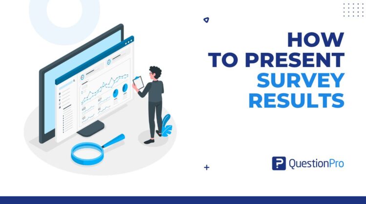
Knowing how to present survey results decides whether your research changes anything or just gets filed. It means turning raw responses into a short story with evidence, a recommendation, and a next step that a decision-maker can approve in the room.
A well-run survey can still fail at the last step, when a crowded slide meets a skeptical audience. Stakeholders skim, ask one question, and move to the next agenda item.
In this blog, we’ll break down a six-step framework, the right chart for each question type, and the mistakes that quietly bury good findings.
What is a survey results presentation?
A survey results presentation is a structured way of sharing survey findings so an audience can understand them and act on them. It comes after survey data analysis and decides whether the research gets used or filed.
A strong one includes:
- A single objective tied to a real business decision
- Three to five findings, each supported by one clear visual
- A recommendation with an owner and a deadline
- A defined audience and one specific ask
Leave any of these out and the presentation turns into a data dump. It stays accurate, but it rarely gets used. The same logic applies whenever you present research findings, whether they come from surveys, interviews, or usability tests.
How to present survey results in six steps
To present survey results persuasively, follow six steps in order: decision, story, chart titles, recommendation, payoff, and action. The order matters, because each step earns the attention the next one needs.
1. Open with the decision on the table
Spend the first 30 seconds on the question the survey set out to answer. Name the decision, the deadline, and what is at stake. Skip the methodology for now.
A good opening sounds like this:
“A competitor just launched a similar product and is missing one customer segment. Can we win 1,000 first-time buyers from that segment next quarter?”
This is your burning question: the single decision the survey exists to inform. Every slide that follows should serve it.
2. Tell the story behind the data
People decide with emotion as much as logic, so give your evidence something to hang on. Data storytelling is the practice of explaining data through narrative, evidence, and visuals. Use it to carry your findings instead of letting the charts carry the story.
A simple story spine works well:
- Setup: How the issue surfaced and why you ran the survey.
- Tension: What the responses revealed that surprised or worried you.
- Resolution: What the evidence says is possible, and for whom.
Let the story choose the charts. Never let the charts choose the story.
3. Put the answer in the chart title
A chart title should state the conclusion, not label the axes. Your audience then confirms what you told them instead of decoding a graphic on their own.
Instead of “Logo preference by segment,” write “Most first-time buyers prefer logo B.” Add the sample size in small print underneath, since n is the number of respondents. The takeaway is the part people remember.
4. State your recommendation as a solution
By now, your audience understands the issue and has seen the evidence. What they want next is what to do about it. Present a solution, not just a finding.
Make it concrete. A mock-up, a pilot plan, or a one-page rollout outline gives people something to react to, and it spares them from inventing the answer themselves. A strong recommendation names three things:
- What changes
- Who owns it
- When it starts
5. Show the payoff
Tell the audience why the recommendation is good for them, in their terms. The payoff answers the question every listener is silently asking: what do I get out of this?
Frame it as who benefits, what improves, and by when:
“If we approve this pilot, new hires should feel supported sooner, and managers should spend less time answering the same setup questions.”
6. Make the next step easy to take
End with one action you want approved today, and arrive with everything needed to take it.
- Need budget approval? Bring the paperwork ready to sign.
- Need a follow-up meeting? Open the calendar and book it in the room.
- Need an owner? Propose a name and confirm it on the spot.
You will rarely have the room’s attention like this again, so use it. Prepare a version that runs about ten minutes and save the detail for an appendix.
Survey report, dashboard, or presentation: which do you need?
Use a presentation to win a decision, a dashboard to monitor results over time, and a report to document everything for reference. Teams often blur the three, which is a common reason findings stall.
Here is how they differ:
- Survey report: A static, complete record of every question and response, built for reference or compliance.
- Survey dashboard: A live view of results that updates as responses arrive, built for teams that check in often.
- Survey presentation: A short, audience-specific story built for one decision moment.
Most survey software can produce all three from the same data. A dashboard can feed the other two: pull one view into a report for distribution and another into a slide for the meeting.
Survey data visualization: Which chart fits which question?
Pick the chart by the type of survey data, not by which one looks most polished. The wrong chart makes your audience work harder than the finding deserves. Good survey data visualization starts with the question type.
| Question type | Best chart | Avoid |
|---|---|---|
| Single or multiple choice | Horizontal bar chart | Pie chart with more than five slices |
| Rating scales and Likert questions | Stacked or diverging bar chart | A table of raw numbers with no visual summary |
| Results over time | Line chart | Bar chart with many time points |
| Results split by group | Grouped bar chart or heat map | One combined average that hides group differences |
| Numeric answers such as age or tenure | Histogram | A list of every individual value |
A Likert scale is a rating question with ordered choices, such as strongly disagree to strongly agree. Cross-tabulation splits results by a group, such as region or tenure, so a single average does not hide differences.
Showing open-ended answers
Open-ended answers are text, so they resist charts. A word cloud is a fast way to surface frequent words for a general audience, but treat it as a starting point.
For anything decision-critical, group responses into five to eight themes and chart them as a simple bar chart. Then add two or three verbatim quotes to bring the numbers to life.
How to present survey results to stakeholders with different needs
The same survey findings need different framing for different stakeholders. Executives want the answer and the ask, managers want the reasons behind it, and working teams want to know what happens next.
- Executives: Lead with the recommendation, no more than three findings, and the decision you need. Keep the detail in an appendix.
- Department managers: Add segment breakdowns and the reasons behind the numbers, since they own the changes.
- Working teams: Share what will change because of the survey and who is responsible, so the feedback feels heard.
You do not need to rebuild the analysis for each group. Custom survey dashboards let you duplicate one report and tailor the questions shown to each audience.
A worked example: From a flat average to a funded pilot
This example applies the six steps to an employee engagement survey. The scenario is illustrative.
An HR team ran its annual engagement survey. The overall score barely moved from the year before, which made it easy to file away as routine. Instead of opening with the flat average, the team used cross-tabulation to split results by tenure. First-year employees reported the lowest engagement of any group.
The presentation opened with the decision: How to keep new hires engaged through their first year. One chart carried the story, and its title said so: “New hires report the lowest engagement of any tenure group.“
The recommendation was specific: A 90-day structured check-in program, piloted in one department. Leaders heard the payoff as fewer early exits and faster ramp-up. Pilot approval was the ask, made in the same meeting.
The team also did something before the survey launched. Leadership committed to telling employees what would change. The Society for Human Resource Management advises securing that commitment up front, because failing to act on results erodes trust and hurts participation next time. It also advises against reporting team-level results when fewer than 10 people responded, to protect anonymity.
The lesson applies well beyond HR. A flat headline number often hides the finding that matters, and segmentation is usually where it appears.
How to tell whether your presentation worked
A presentation worked if it changed what happened next. That is measurable, so track it instead of guessing from the mood in the room.
- A decision or action logged in the meeting.
Look for at least one owner and one date. - Time to first action.
Measure how long it takes for the insight to become a real change. - Follow-up questions about implications.
Questions that start with “what if we” show engagement with meaning, not confusion about numbers. - Requests for the underlying data.
A few signal trust. A flood signals that something was unclear. - Repeat use of the same format.
If the audience asks for the same layout next cycle, it works.
If the room went quiet, simplify the structure before you redesign the charts.
Mistakes that sink a survey results presentation
Most weak presentations fail for a handful of repeatable reasons, not because the data is poor. Each one has a quick fix.
| Mistake | Why it hurts | Fix |
|---|---|---|
| Showing raw output | Buries the two or three findings that matter | Pick three findings and move the rest to an appendix |
| Cluttered charts | Gridlines, 3D effects, and dense labels slow people down. Nielsen Norman Group calls these extras chartjunk and advises clearing them out | Strip decoration and keep only labels that carry meaning |
| Hiding the sample size | The audience cannot judge how much weight a finding deserves | Show the respondent count and the margin of error, the range where the true result likely falls |
| Leading with methodology | Loses the room before the story starts | Open with the decision and put methodology in a one-line footnote |
| No recommendation | Leaves the audience guessing what to do | End with a recommended action, an owner, and a date |
| One deck for every audience | Executives and working teams need different levels of detail | Build a short version and a detailed appendix |
Turning survey dashboards into slides in QuestionPro
QuestionPro helps when the slow part is getting from analysis to deck. QuestionPro BI builds dashboards from your survey data, and role-based dashboards let each stakeholder see the views that matter to them.
Its PowerPoint export turns selected dashboard widgets into a .pptx first draft. You spend your time on the message instead of copying charts.
- Open the dashboard and click the Download icon in the top-right corner.
- Select PowerPoint Export and tick the widgets you want.
- Use the Slide dropdown beside each widget to set the order.
- Click Next to edit the intro and outro slides, then click Export.
- At 100% in the Progress panel, click the file name to download the .pptx file.
Treat the file as a first draft. It is a snapshot, not a live link, and not every widget exports as an editable chart. Add your story, your chart titles, and your recommendation on top. Availability depends on your plan, so confirm with your account admin.
The presentation is where the survey earns its keep
Survey design, sampling, and response rate work all exist to produce a finding worth acting on. How you present that finding decides whether it reaches someone who can do something with it.
Open with the decision, tell the story, let chart titles do the talking, and end with a clear ask. Repeat that structure each cycle, and your research stops being a report people receive and becomes a decision people make.
Frequently Asked Questions (FAQs)
Aim for six to ten slides for a 10 to 15 minute readout. Include one slide for the decision, one per key finding, one for the recommendation, and one for the next step. Move everything else into an appendix.
Show the respondent count and margin of error on the slide. Use raw counts instead of percentages when responses are few, and call findings directional rather than conclusive. Add quotes or follow-up interviews for context.
State the finding plainly, explain what is driving it, and move quickly to a recommended fix. Leaders respond better to a clear problem with a plan than to a soft summary that hides the number.
Send a one-page executive summary ahead if the audience is senior, but keep the full story for the live session. A pre-read helps people arrive informed, while presenting live lets you control the order and secure the decision.
Send a short recap within a day that lists the decision, owner, and deadline. Then tell respondents what will change because of their feedback. Visible follow-through builds the trust that keeps response rates healthy next time.