• Skip to main content
  • Skip to primary sidebar
  • Skip to footer
QuestionPro

QuestionPro

questionpro logo
  • Products
    survey software iconSurvey softwareOur flagship survey solution. Sophisticated tools to get the answers you need.research edition iconResearch SuiteTuned for researchers. Get more insights. Response based pricing.CX iconCXExperiences change the world. Deliver the best with our CX management software.WF iconWorkforceEmpower your work leaders, make informed decisions and drive employee engagement.
  • Solutions
    IndustriesGamingAutomotiveSports and eventsEducationGovernment
    Travel & HospitalityFinancial ServicesHealthcareCannabisTechnology
    Use CaseNPS+CommunitiesAudienceContactless surveysMobile
    LivePollsMember ExperienceGDPRPositive People Science360 Feedback Surveys
  • Resources
    BlogeBooksSurvey TemplatesCase StudiesTrainingHelp center
  • Features
  • Pricing
Language
  • English
  • Español (Spanish)
  • Português (Portuguese (Brazil))
  • Nederlands (Dutch)
  • العربية (Arabic)
  • Français (French)
  • Italiano (Italian)
  • 日本語 (Japanese)
  • Türkçe (Turkish)
  • Svenska (Swedish)
Call Us
+1 800 531 0228 +1 (647) 956-1242 +52 999 402 4079 +49 301 663 5782 +44 20 3650 3166 +81-3-6869-1954 +61 2 8074 5080 +971 529 852 540
Log In Log In
SIGN UP FREE

Home Market Research Research Tools and Apps

Data Visualization: What it is + Strategies

data visualization

One of the most significant advances in the last few decades has been how companies collect, store, and analyze their data. With a massive increase in data, new methods are required to organize and analyze these numbers. That demand is the foundation of data visualization. This article will define data visualization, discuss some common applications, and end with the tangible benefits of implementing it within your organization.

What is Data Visualization?

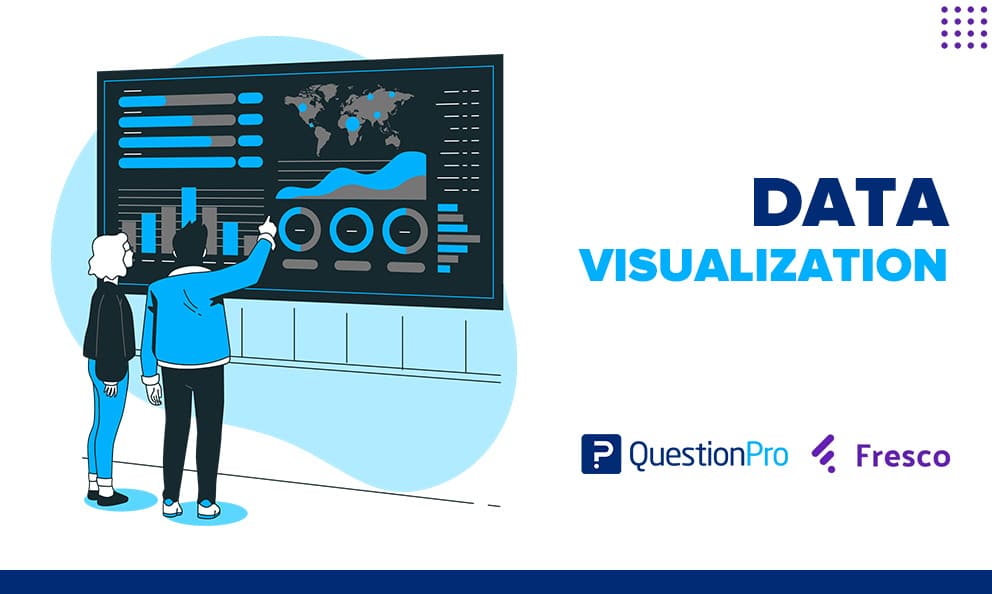
Data visualization is taking a large amount of raw data and diagramming it into a graph, chart, image, or analytical structure. This helps with taking a large pool of data and making it easy to understand what the numbers mean and how they relate to tangible aspects of your business.

Additionally, one of the most critical parts of data visualization is the ability to draw trends from a diagram based on data you’ve collected from your users. Seeing a data set in a visual diagram makes it easier to find trends, patterns, outliers, and other important indicators to optimize your processes. A great option is the use of online whiteboards.

Data visualization strategies

Data visualization comes in many forms and can be applied to an infinitely large number of data sets. There are some common themes, however, so here we’ll outline some common use cases for data visualization and some of the formats these diagrams take.

Customer Experience (CX)

One of the best ways you can visualize data is through aggregating customer feedback. CX is extremely important to creating a good product, and the primary method of understanding the customer experience is through their feedback. Data visualization helps display what people think (based on general sentiments) and allows you to display data collected through surveys to show general product trends.

This means you can create accurate product changes based on direct feedback from hundreds of customers. However, making real changes is only possible after you visualize large amounts of feedback to determine the best course of action.

Marketing Departments

Understanding customer intent is one of the main pillars of any marketing strategy. With increased traffic and money coming from online sources, it’s more important than ever that marketing teams keep their finger on the pulse of their online data. Data visualization allows marketing teams to analyze every specific detail of data collected for the ideal optimization strategy.

Finance

Finance is a field that has used data visualization for a very long time and to good effect. The most prominent example of this is in the stock market. The line graphs we see representing price action over a period of time are just an aggregate of data collected and displayed regarding the number of buy and sell options each day and how they affect a stock’s price.

Thanks to a large number of applications, finance is a field that benefits highly from data visualization. Now that we have an initial idea of what fields might benefit most from data visualization, let’s cover some of the most popular diagrams utilized in this process.

Bar Graph

The bar graph is one of the most common forms of data visualization, and it is used to compare a (traditionally) fixed x value and a variable y value. This graph can also be stacked with other bars to show the difference between different variables when compared to one another.

Line Charts

Line charts are best at showing trends and commonly compare one variable against time. This chart can also be stacked with the bar graph and is good at showing changes over time or comparative patterns.

Pie Charts

The pie chart is good at showing the difference between items when there is a specific choice people make. For example, you could create a pie chart based on the number of people that, when given a choice, pick cereal or fruit for breakfast. This is a perfect diagram to use when integrating customer feedback, especially in surveys with multiple specific options to choose from.

Scatter Plot

The scatter plot is one of the more popular diagrams to use when determining outliers and individual data points rather than collective figures. This allows you to plot a bunch of points on two axes to see how certain variables line up when compared.

Data visualization benefits

It makes sense that businesses can use it in many different fields. It’s one of the best ways to better understand a large set of numbers that would otherwise take days to comprehend. Here are some of the biggest benefits of conducting data visualization and why it’s so important.

1. Creates Actionable Insights

Enables you to develop a nuanced understanding of the next steps you need to take to meet your business goals. Whether you’re looking at customer feedback, product usage, or marketing data analytics projects. Every diagram will tell a story that informs you about the efficiency of your business. Additionally, these findings can happen much quicker than before because of how efficiently your data is presented.

2. Allows People to Digest Information Quickly

If you gave someone a sheet of numbers in excel, it would take them hours to figure out what they mean and what must be done. If you provide them with a diagram visualizing all of those numbers, however, the answer would be much more apparent. It allows people to digest information exceptionally quickly, moving to the correct conclusion in a very short amount of time.

The brain absorbs information much quicker when displayed graphically instead of textually. Because of this, it creates a cohesive structure that works with your brain’s chemistry to digest and analyze information in a more timely manner.

3. Makes Communication Easier

Another benefit of using data visualization is that it makes communicating data sets much easier and allows multiple people to analyze the same information. Instead of requiring a data scientist to break down a series of information, you can easily share graphics and diagrams with people that might have important insights.

This allows anyone to understand the information and provide a more informed opinion quickly and also improves people’s interest when in an audience or presentation that includes some data.

4. Highlights Clear Patterns

As stated previously, it would be tough to pour through data sets and understand what’s going on without data visualization. It makes it easier to comprehend data sets and allows you to draw clear patterns, trendlines, and outliers much easier.

When things are presented graphically, it’s much easier to analyze macro-level trends that are hard to spot individually and break down the causes for those patterns. This is where visualization helps massively with analytics and understanding the specific implications of data sets.

5. Catalyzes Innovation

Using data visualization to uncover patterns is one of the best ways to innovate. Data-based innovation ensures credibility with future changes and often reflects trends that couldn’t be seen otherwise. It allows people to go deep into the data to spot things that might be looked over in another scenario.

This ability to see increased detail and create innovative progress is one of the biggest benefits of data visualization.

Conclusion on data visualization

People are visual learners, which also applies to how they comprehend data. Data visualization is an incredibly important tool to help understand and communicate complicated data sets, and it will be vital for years to come.

The QuestionPro data visualization tool allows viewing data gathered from offline mobile surveys instantly. Researchers use it to seamlessly sync data from their QuestionPro offline survey app and use interactive charts to analyze and present the data. It provides the perfect data dashboard to access, present, and report on your offline surveys anytime, anywhere.

Now collecting customer feedback, conducting market research, capturing leads offline, and presenting the data in a visually appealing way is as easy as designing a survey using QuestionPro.

LEARN MORE

SHARE THIS ARTICLE:

About the author
Fabyio Villegas
View all posts by Fabyio Villegas

Primary Sidebar

Gain insights with 80+ features for free

Create, Send and Analyze Your Online Survey in under 5 mins!

Create a Free Account

RELATED ARTICLES

HubSpot - QuestionPro Integration

Customer Attention: What it is, Tips & Best Practices

Dec 30,2022

HubSpot - QuestionPro Integration

The Customer Experience “Experience” Part 2

Sep 15,2020

HubSpot - QuestionPro Integration

Four Ways You Drive Away Customers | Tuesday CX Thoughts

Mar 22,2022

BROWSE BY CATEGORY

  • Academic
  • Academic Research
  • Academic Research
  • Artificial Intelligence
  • Assessments
  • Audience
  • Brand Awareness
  • Brand Awareness
  • Branding
  • Business
  • Business
  • Case Studies
  • Communities
  • Consumer Insights
  • Consumer Insights
  • Customer effort score
  • Customer Engagement
  • Customer Experience
  • Customer Experience IN
  • Customer Loyalty
  • Customer Loyalty
  • Customer Research
  • Customer Satisfaction
  • Customer Satisfaction
  • CX
  • Decision Making
  • Employee Benefits
  • Employee Engagement
  • Employee Engagement
  • Employee Engagement
  • Employee Retention
  • Employee Retention
  • Employee Retention
  • Employee Retention
  • Enterprise
  • Events
  • Forms
  • Friday Five
  • General Data Protection Regulation
  • Guest Post
  • Insights Hub
  • Intercept
  • klantervaring
  • Life@QuestionPro
  • LivePolls
  • Market Research
  • Market Research
  • Marketing
  • Marketing
  • Marktonderzoek
  • medewerkersonderzoek
  • Mercadotecnia
  • Mobile
  • Mobile
  • Mobile App
  • Mobile diaries
  • Mobile Surveys
  • New Features
  • non-profit
  • NPS
  • Online Communities
  • Polls
  • Question Types
  • Questionnaire
  • QuestionPro
  • QuestionPro Products
  • QuestionPro Products
  • Release Notes
  • Research
  • Research Tools and Apps
  • Revenue at Risk
  • Startups
  • Survey Templates
  • Surveys
  • Surveys
  • Tech News
  • Tech News
  • Tips
  • Training
  • Training Tips
  • Trending
  • Uncategorized
  • Video Learning Series
  • VOC
  • Webinar
  • Webinars
  • What’s Coming Up
  • Workforce
  • Workforce
  • Workforce
  • Workforce
  • Workforce Intelligence
  • Workforce Intelligence
  • Workforce Intelligence

Footer

MORE LIKE THIS

We build out a customer journey map because we have recognized that happy customers spend more with businesses they prefer. Let's talk!

The Upsell and Cross-Sell — Tuesday CX Thoughts

Mar 28, 2023

Inferential statistics use analytical procedures to draw conclusions about survey data from sample data. Let's learn about it.

Inferential Statistics: Definition, Types + Examples

Mar 27, 2023

Cognitive Bias

Cognitive Bias: What It Is, Types & Prevention Strategies

Mar 24, 2023

A positive work environment improves employee morale, retention, and productivity. It helps making a workplace better for everyone.

Work Environment: What it is, Types & Elements to Create it

Mar 23, 2023

Other categories

  • Academic
  • Academic Research
  • Academic Research
  • Artificial Intelligence
  • Assessments
  • Audience
  • Brand Awareness
  • Brand Awareness
  • Branding
  • Business
  • Business
  • Case Studies
  • Communities
  • Consumer Insights
  • Consumer Insights
  • Customer effort score
  • Customer Engagement
  • Customer Experience
  • Customer Experience IN
  • Customer Loyalty
  • Customer Loyalty
  • Customer Research
  • Customer Satisfaction
  • Customer Satisfaction
  • CX
  • Decision Making
  • Employee Benefits
  • Employee Engagement
  • Employee Engagement
  • Employee Engagement
  • Employee Retention
  • Employee Retention
  • Employee Retention
  • Employee Retention
  • Enterprise
  • Events
  • Forms
  • Friday Five
  • General Data Protection Regulation
  • Guest Post
  • Insights Hub
  • Intercept
  • klantervaring
  • Life@QuestionPro
  • LivePolls
  • Market Research
  • Market Research
  • Marketing
  • Marketing
  • Marktonderzoek
  • medewerkersonderzoek
  • Mercadotecnia
  • Mobile
  • Mobile
  • Mobile App
  • Mobile diaries
  • Mobile Surveys
  • New Features
  • non-profit
  • NPS
  • Online Communities
  • Polls
  • Question Types
  • Questionnaire
  • QuestionPro
  • QuestionPro Products
  • QuestionPro Products
  • Release Notes
  • Research
  • Research Tools and Apps
  • Revenue at Risk
  • Startups
  • Survey Templates
  • Surveys
  • Surveys
  • Tech News
  • Tech News
  • Tips
  • Training
  • Training Tips
  • Trending
  • Uncategorized
  • Video Learning Series
  • VOC
  • Webinar
  • Webinars
  • What’s Coming Up
  • Workforce
  • Workforce
  • Workforce
  • Workforce
  • Workforce Intelligence
  • Workforce Intelligence
  • Workforce Intelligence

questionpro-logo-nw
Help center Live Chat SIGN UP FREE
  • Sample questions
  • Sample reports
  • Survey logic
  • Branding
  • Integrations
  • Professional services
  • Security
  • Survey Software
  • Customer Experience
  • Workforce
  • Communities
  • Audience
  • Polls Explore the QuestionPro Poll Software - The World's leading Online Poll Maker & Creator. Create online polls, distribute them using email and multiple other options and start analyzing poll results.
  • Research Edition
  • LivePolls
  • InsightsHub
  • Blog
  • Articles
  • eBooks
  • Survey Templates
  • Case Studies
  • Training
  • Webinars
  • Coronavirus Resources
  • All Plans
  • Nonprofit
  • Academic
  • Qualtrics Alternative Explore the list of features that QuestionPro has compared to Qualtrics and learn how you can get more, for less.
  • SurveyMonkey Alternative
  • VisionCritical Alternative
  • Medallia Alternative
  • Likert Scale Complete Likert Scale Questions, Examples and Surveys for 5, 7 and 9 point scales. Learn everything about Likert Scale with corresponding example for each question and survey demonstrations.
  • Conjoint Analysis
  • Net Promoter Score (NPS) Learn everything about Net Promoter Score (NPS) and the Net Promoter Question. Get a clear view on the universal Net Promoter Score Formula, how to undertake Net Promoter Score Calculation followed by a simple Net Promoter Score Example.
  • Offline Surveys
  • Customer Satisfaction Surveys
  • Employee Survey Software Employee survey software & tool to create, send and analyze employee surveys. Get real-time analysis for employee satisfaction, engagement, work culture and map your employee experience from onboarding to exit!
  • Market Research Survey Software Real-time, automated and advanced market research survey software & tool to create surveys, collect data and analyze results for actionable market insights.
  • GDPR & EU Compliance
  • Employee Experience
  • Customer Journey
  • About us
  • Executive Team
  • In the news
  • Testimonials
  • Advisory Board
  • Careers
  • Brand
  • Media Kit
  • Contact Us

QuestionPro in your language

  • English
  • Español (Spanish)
  • Português (Portuguese (Brazil))
  • Nederlands (Dutch)
  • العربية (Arabic)
  • Français (French)
  • Italiano (Italian)
  • 日本語 (Japanese)
  • Türkçe (Turkish)
  • Svenska (Swedish)

Awards & certificates

  • survey-leader-asia-leader-2023
  • survey-leader-asiapacific-leader-2023
  • survey-leader-enterprise-leader-2023
  • survey-leader-europe-leader-2023
  • survey-leader-latinamerica-leader-2023
  • survey-leader-leader-2023
  • survey-leader-middleeast-leader-2023
  • survey-leader-mid-market-leader-2023
  • survey-leader-small-business-leader-2023
  • survey-leader-unitedkingdom-leader-2023
  • survey-momentumleader-leader-2023
  • bbb-acredited
The Experience Journal

Find innovative ideas about Experience Management from the experts

  • © 2022 QuestionPro Survey Software | +1 (800) 531 0228
  • Sitemap
  • Privacy Statement
  • Terms of Use