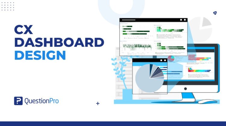
CX dashboard design is the way customer experience teams organize metrics, widgets, colors, and visual cues so they can read customer data faster. A good dashboard does more than look polished. It helps teams spot trends, understand feedback, and decide where action is needed.
The old version of this article focused on adding color themes to a QuestionPro Customer Experience dashboard. That idea is still useful, but color is only one part of a good dashboard. Layout, widget choice, contrast, labels, and metric priority matter just as much.
When a CX dashboard is designed well, people can quickly answer: What changed, where did it happen, and what should we do next?
What is CX dashboard design?
CX dashboard design is the process of arranging customer experience data into a visual dashboard that helps teams monitor key metrics, feedback, and trends.
A CX dashboard usually brings together customer feedback, survey results, NPS, CSAT, CES, sentiment trends, response volume, and touchpoint performance. The design decides how those data points appear on the screen.
Good CX dashboard design should make the most important signals easy to find. It should not make users work hard to understand whether the customer experience is improving, declining, or staying stable.
A dashboard is not just a collection of charts. It is a decision tool.
Why does CX dashboard design matter?
CX dashboard design matters because businesses often use dashboards during fast decisions, executive reviews, and customer experience planning.
A cluttered, unclear, or poorly labeled dashboard can make important patterns easy to miss. Inconsistent colors may also cause teams to misunderstand positive and negative changes. When widgets are not prioritized, minor details can distract from urgent customer issues.
Strong dashboard design helps teams:
- Scan customer experience metrics quickly.
- Identify trends and sudden changes.
- Compare touchpoints, teams, or locations.
- Find where customers are frustrated.
- Prioritize follow-up actions.
- Share CX findings with leaders.
- Reduce time spent interpreting reports.
- Build a clearer customer experience story.
When paired with a customer journey map, a CX dashboard can show where customer friction appears across the full journey.
For US companies managing multiple locations, digital channels, or support teams, dashboard clarity matters because CX decisions often need to happen quickly.
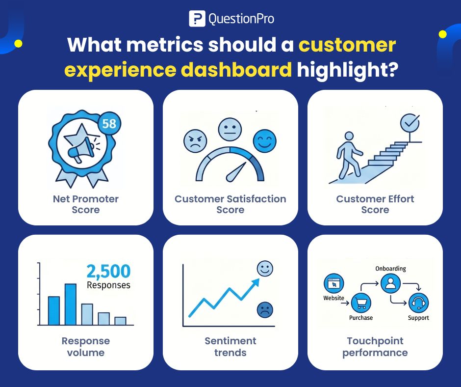
What metrics should a customer experience dashboard highlight?
A customer experience dashboard should highlight the customer experience metrics that explain customer loyalty, satisfaction, effort, feedback volume, and touchpoint performance.
The right metrics depend on the business goal. A support team may care most about effort and issue resolution. A retail team may care about satisfaction by location. A SaaS team may care about onboarding feedback and renewal risk.
Common CX dashboard metrics include:
- Net Promoter Score
Net Promoter Score, or NPS, measures how likely customers are to recommend a company, product, or service. It is useful for tracking loyalty and advocacy over time. It works well as a high-level relationship metric. - Customer Satisfaction Score
Customer Satisfaction Score, or CSAT, measures how satisfied customers are with a specific interaction, product, or experience. It works well after support calls, purchases, deliveries, onboarding steps, or service interactions. - Customer Effort Score
Customer Effort Score, or CES, measures how easy or difficult it was for a customer to complete a task. It is useful for support, checkout, onboarding, claims, issue resolution, and self-service experiences. - Response volume
Response volume shows how many customers provided feedback. This matters because a dashboard trend based on five responses should not be treated the same way as a trend based on five thousand responses. - Sentiment trends
Sentiment trends show whether customer comments are becoming more positive, neutral, or negative over time. Automated sentiment can help flag patterns, but it should not replace human judgment. - Touchpoint performance
Touchpoint performance shows how different customer journey moments are performing. Examples include website visits, purchases, onboarding, support, renewal, store visits, delivery, or post-service follow-up.
How do CX dashboard widgets help teams read data faster?
CX dashboard widgets help teams read data faster by turning raw customer feedback into focused visual blocks.
A widget is a dashboard element that shows one type of information, such as a score, chart, trend, table, filter, or comment feed.
Useful CX dashboard widgets include:
- Score widgets for NPS, CSAT, and CES.
- Trend charts for changes over time.
- Bar charts for comparisons.
- Heatmaps for segment or location performance.
- Comment widgets for open-ended feedback.
- Filter widgets for time period, channel, region, or team.
- Alert widgets for sudden negative changes.
- Response volume widgets for sample context.
The best widgets answer one question at a time. If one widget tries to show too much, it becomes harder to read.
How does color improve CX dashboard design?
Color improves CX dashboard design by helping users identify patterns, status changes, and priority areas faster.
Color can show whether a metric is improving, declining, or stable. It can also separate categories, highlight warnings, and guide attention to the most important parts of the dashboard.
For example:
- Green can signal improvement or healthy performance.
- Red can signal decline, risk, or urgent attention.
- Yellow or orange can signal warning or mixed performance.
- Blue can support neutral information or comparison views.
- Gray can reduce visual noise around secondary data.
Color should support the data, not decorate it. Too much color can make a dashboard harder to read.
What are the best practices for using dashboard color themes?
Dashboard color themes work best when they are consistent, readable, and tied to clear meanings.
A color theme should make the dashboard easier to scan. It should not create a rainbow of unrelated signals.
Best practices include:
- Use the same color meaning across the dashboard.
- Reserve strong colors for important changes.
- Use neutral colors for background or secondary data.
- Keep positive, negative, and warning colors consistent.
- Avoid using too many colors in one view.
- Pair color with labels, numbers, or icons.
- Use contrast that supports readability.
- Check whether the theme works on different screen sizes.
- Design for both analysts and non-technical viewers.
A dashboard color theme should help users understand the customer experience story faster.
How should businesses use color in CX dashboards responsibly?
Businesses should use color in CX dashboards responsibly by making sure important information is not communicated through color alone.
This matters for accessibility and usability. Some users may have color vision differences, low vision, or screens with poor contrast. Others may print reports in grayscale or view dashboards quickly during meetings.
W3C guidance on color contrast is useful for dashboard design because sufficient contrast between text and background improves readability for people with different vision needs.
Good practices include:
- Add labels next to color-coded values.
- Use icons or text with color-based warnings.
- Avoid relying only on red and green.
- Use enough contrast between text and background.
- Test dashboards with users who need to act on the data.
- Keep chart legends clear and close to the chart.
- Make filters and time periods easy to see.
Color is helpful, but clarity is the real goal.
What mistakes should businesses avoid when designing CX dashboards?
Businesses should avoid dashboard design mistakes that make customer experience data harder to understand.
Common mistakes include:
- Showing too many metrics on one screen.
- Using colors without a clear meaning.
- Hiding response volume.
- Mixing unrelated metrics in one widget.
- Making executives and analysts use the same view.
- Using charts that are too complex for the audience.
- Ignoring accessibility and color contrast.
- Not labeling trends clearly.
- Treating every metric as equally important.
- Forgetting to show what action should happen next.
The biggest mistake is building a dashboard that looks impressive but does not help anyone make a better decision.
How can QuestionPro Customer Experience support CX dashboard design?
QuestionPro Customer Experience can support CX dashboard design by helping teams organize customer feedback, track metrics, customize dashboards, and use widgets to monitor changes across touchpoints.
QuestionPro’s CX dashboard lets businesses add and customize widgets such as charts and graphs. Businesses can use dashboards to monitor customer experience metrics, review feedback, and understand changes in customer sentiment or satisfaction.
Color themes can make dashboards easier to scan and help businesses notice positive or negative changes faster. But the real value comes from combining clear design with useful customer feedback data.
QuestionPro Customer Experience can help businesses connect dashboards to action by making feedback easier to view, interpret, and share.
Final thoughts on CX dashboard design
CX dashboard design is not about making reports look colorful. It is about helping teams understand customer experience data faster and act with more confidence.
Color, widgets, layout, and contrast all play a role. When they work together, a dashboard can show where customers are satisfied, where friction is growing, and where teams need to respond.
The best CX dashboards are clear, focused, and easy to scan. They help teams move from data to action.
Frequently Asked Questions (FAQs)
A CX dashboard is easy to read when it shows the most important metrics first, uses clear labels, keeps widgets focused, and avoids visual clutter. Color should highlight meaning, not distract from the customer experience data.
A CX dashboard should include only the metrics needed for the audience and decision. Many teams start with NPS, CSAT, CES, response volume, sentiment trends, and touchpoint performance, then add filters for deeper analysis.
Color coding is useful, but it should not be the only way to communicate meaning. Dashboards should also use labels, icons, numbers, and clear legends so every user can understand the data.
Red is commonly used for negative trends, but it should be used carefully. Pair red with labels, icons, or text so users do not rely on color alone to identify urgent customer experience issues.
CX dashboards should be reviewed based on how fast customer feedback changes. Support and service teams may check dashboards daily, while executive teams may review weekly or monthly CX summaries.
A CX dashboard gives an at-a-glance view of live or updated metrics. A report usually provides deeper analysis, explanation, and recommendations. Dashboards help teams monitor change, while reports help explain why change happened.