What is a customer experience dashboard Or CX dashboard?
A Customer Experience Dashboard, or CX Dashboard, is a tool that shows important information about how customers interact with a business and how satisfied they are. It gives companies real-time insights into their customer service quality, identifying trends, areas for improvement, and overall performance.
By displaying data like customer feedback, Net Promoter Scores (NPS), response times, and other key indicators, a CX Dashboard helps businesses improve their customer experience strategies to meet and exceed customer expectations.
Understanding the customer journey is crucial for businesses that enhance customer retention and satisfaction. By analyzing customer feedback data, companies can gain insights into customer sentiment and identify areas for improvement. With a user-friendly interface, businesses can easily visualize this data, enabling them to make informed decisions that improve the overall customer experience and foster long-term loyalty.
What does a Customer Experience Dashboard do?
A Customer Experience Dashboard is a centralized platform that aggregates and visualizes customer interactions and satisfaction data. It performs several critical functions:
- 1. Data Consolidation: This process integrates data from various sources, such as customer surveys, feedback forms, social media, and support tickets.
- 2. Real-Time Monitoring: Provides up-to-date insights into customer experience metrics, allowing businesses to track real-time performance.
- 3. Trend Analysis: Helps identify trends in customer behavior and satisfaction over time, enabling proactive improvements.
- 4. Performance Metrics: This section displays key performance indicators (KPIs), such as Net Promoter Scores (NPS), Customer Satisfaction Scores (CSAT), and Customer Effort Scores (CES).
- 5. Issue Identification: Pinpoints specific areas where customer service may be lacking, facilitating quick resolution of problems.
- 6. Strategic Insights: Offers actionable insights that inform customer experience strategies, helping businesses tailor their services to meet customer needs better.
- 7. Visualization: Utilizes charts, graphs, and other visual tools to make complex data easily understandable and accessible.
A customer experience dashboard performs these functions, enabling businesses to enhance their customer service, improve customer satisfaction, and ultimately drive customer loyalty and retention.
Steps to Build a CX Dashboard
Building a CX dashboard is a strategic process that involves setting clear objectives, selecting relevant metrics, gathering accurate data, and utilizing effective design and visualization tools. By following these steps, organizations can create a powerful tool that not only provides valuable insights but also drives informed decision-making and enhances the overall customer experience.
01. Define Your Objectives
Before diving into the design and data collection phases, it's crucial to establish the primary objectives of your CX dashboard. Understanding what you aim to achieve with the dashboard will guide the entire development process and ensure that it effectively meets your needs.
- i. Identify Key Goals: Determine the specific customer experience goals you want to achieve, such as improving customer satisfaction, reducing churn, or enhancing service quality.
- ii. Understand Stakeholder Needs: Collaborate with stakeholders, including customer service managers, sales teams, and executives, to gather their input on what metrics and insights are most valuable to them.
- iii. Set Clear Objectives: Define clear, measurable objectives for the dashboard, such as "Increase Net Promoter Score (NPS) by 15% in the next quarter" or "Reduce average response time to customer inquiries by 30%."
02. Identify Key Metrics
Selecting the right metrics is vital for creating a dashboard that provides meaningful insights into your customer experience performance. These metrics should align with your objectives and offer a comprehensive view of customer interactions and satisfaction.
- i. Choose Relevant Metrics: Focus on metrics directly impacting your objectives, such as NPS, Customer Satisfaction Score (CSAT), Customer Effort Score (CES), and churn rate.
- ii. Incorporate Leading and Lagging Indicators: Include both leading indicators (predictive metrics like website engagement) and lagging indicators (historical metrics like sales performance) to gain a holistic view of customer experience.
- iii. Balance Quantitative and Qualitative Data: Combine quantitative metrics with qualitative insights, such as customer feedback and reviews, to understand the "why" behind the numbers.
03. Gather and Integrate Data
Data collection is critical in building a CX dashboard, as it forms the foundation for all subsequent analysis and visualization.
- i. Collect Data from Multiple Sources: Gather data from various touchpoints, including surveys, social media, customer support interactions, and sales data, to ensure a well-rounded perspective.
- ii. Ensure Data Accuracy and Consistency: Validate and clean the data to remove duplicates, correct inaccuracies, and ensure consistency across different sources.
- iii. Integrate Data into a Centralized System: Use data integration tools and platforms to consolidate data from disparate systems into a single, unified repository, making it easier to analyze and visualize.
04. Choose the Right Tools and Platforms
The appropriate tools and platforms for building your CX dashboard are essential to streamline the process and ensure a user-friendly experience.
- i. Evaluate Dashboard Software Options: Consider tools like Tableau, Power BI, QuestionPro, and Google Data Studio, which offer robust features for creating interactive and dynamic dashboards.
- ii. Assess Integration Capabilities: Ensure the chosen platform seamlessly integrates with your existing systems and data sources.
- iii. Consider User Experience: Select tools that provide an intuitive interface and offer customization options to tailor the dashboard to your specific needs.
05. Design the Dashboard Layout
A well-designed dashboard layout enhances usability and ensures that key insights are easily accessible to users.
- i. Create a Logical Flow: Organize the dashboard to guide users through the data logically, starting with high-level insights and allowing for deeper dives into specific areas.
- ii. Use Visual Hierarchy: Employ visual hierarchy principles, such as size, color, and placement, to highlight the most important metrics and insights.
- iii. Design for Clarity and Simplicity: Avoid clutter by keeping the design clean and straightforward, focusing on essential information and eliminating unnecessary elements.
06. Develop Data Visualizations
Effective data visualization is key to conveying complex information clearly and intuitively, enabling users to grasp insights and make informed decisions quickly.
- i. Choose the Right Chart Types: Select appropriate chart types for each metric, such as bar charts for comparisons, line charts for trends, and pie charts for proportions.
- ii. Use Color Strategically: Utilize color to differentiate data points and highlight key insights, but avoid overwhelming users with excessive or distracting colors.
- iii. Ensure Interactivity: Incorporate interactive elements like drill-downs and tooltips to allow users to explore data in depth and uncover hidden insights.
07. Test and Refine the Dashboard
Testing and refining the dashboard is crucial to ensure accuracy, usability, and effectiveness in delivering actionable insights.
- i. Conduct Usability Testing: Involve end-users in testing the dashboard to identify usability issues and gather feedback on its functionality and design.
- ii. Validate Data Accuracy: Cross-check the dashboard's data against source systems to verify its accuracy and reliability.
- iii. Refine Based on Feedback: Use feedback from stakeholders and users to make iterative improvements, refining the dashboard to meet their needs better.
08. Implement and Monitor
Once the dashboard is finalized, it's time to implement it across your organization and establish a monitoring process to ensure its continued relevance and effectiveness.
- i. Roll Out the Dashboard: Deploy the dashboard to relevant teams and provide training to ensure users understand how to navigate and interpret the data.
- ii. Establish a Monitoring Process: Set up a process for regularly reviewing and updating the dashboard to incorporate new data, metrics, and insights.
- iii. Track Performance Against Objectives: Continuously track performance against your defined objectives, using the dashboard to identify areas for improvement and inform strategic decisions.
09. Communicate Insights and Drive Action
A successful CX dashboard not only provides insights but also drives action by facilitating communication and collaboration across teams.
- i. Share Insights with Stakeholders: Regularly share key insights and findings with stakeholders to keep them informed and engaged in the customer experience strategy.
- ii. Encourage Data-Driven Decision-Making: Encourage teams to use the dashboard for strategic planning an
- iii. Identify Opportunities for Improvement: Use the dashboard to identify areas where customer experience can be enhanced and implement targeted initiatives to address these opportunities.
When analyzing CX data, it helps to change how you want to display your results in an easy manner. We reached out to our customers and asked them what we could do to improve customer experience of the dashboard in order to continue to be successful on our CX platform.
Our CX customers' most wanted list:
- > A way to drill down and analyze the dashboard results based on specific questions and profile variables.
- > The ability to customize label and use charts their organization is most accustomed to.
- > Track changes in responses each month and do month on month comparison.
Their wish is our command! Now you can do all that and more with CX’s dashboard 2.0.
- 1. Customizable widget filters: Users can now filter the data on all of the widgets displayed in the online dashboard in one go. Access global custom variables (customer profile information), and segment and filter the results based on specific questions from the CX survey. This means less time setting up filters for every single widget on the dashboard, and more time analyzing all of the results.
- 2. Customizable chart types and labels: Change the chart types (donut, line, bar, columns, etc.) and choose to show/hide widget labels (x-axis, y-axis, chart-labels, gridlines, etc.).
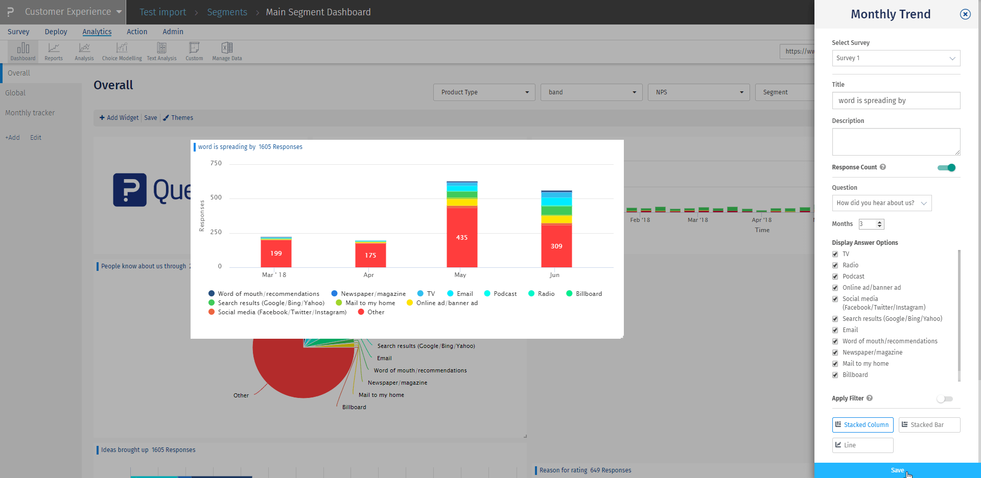
- 3. Monthly tracker widget: Users interested in viewing distribution trends of percentage/responses over specific month range will be able to see the trend of responses received for multi-select/single-select questions. They can select a monthly range to review trending data and select/deselect answer options from the chart.
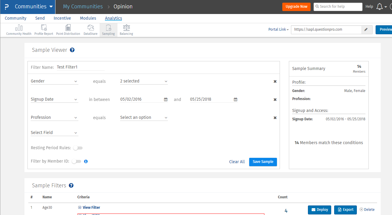
How to set up customizable filters by custom variables and questions?
Learn how to easily create personalized filters using custom variables and questions.
Step 1: Set up custom variable filter
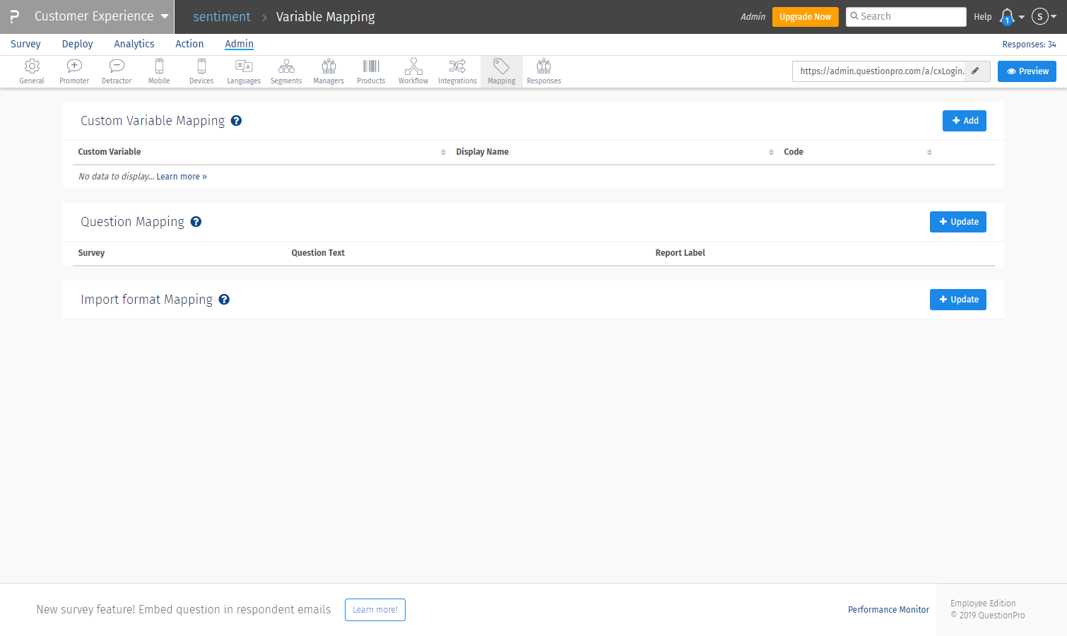
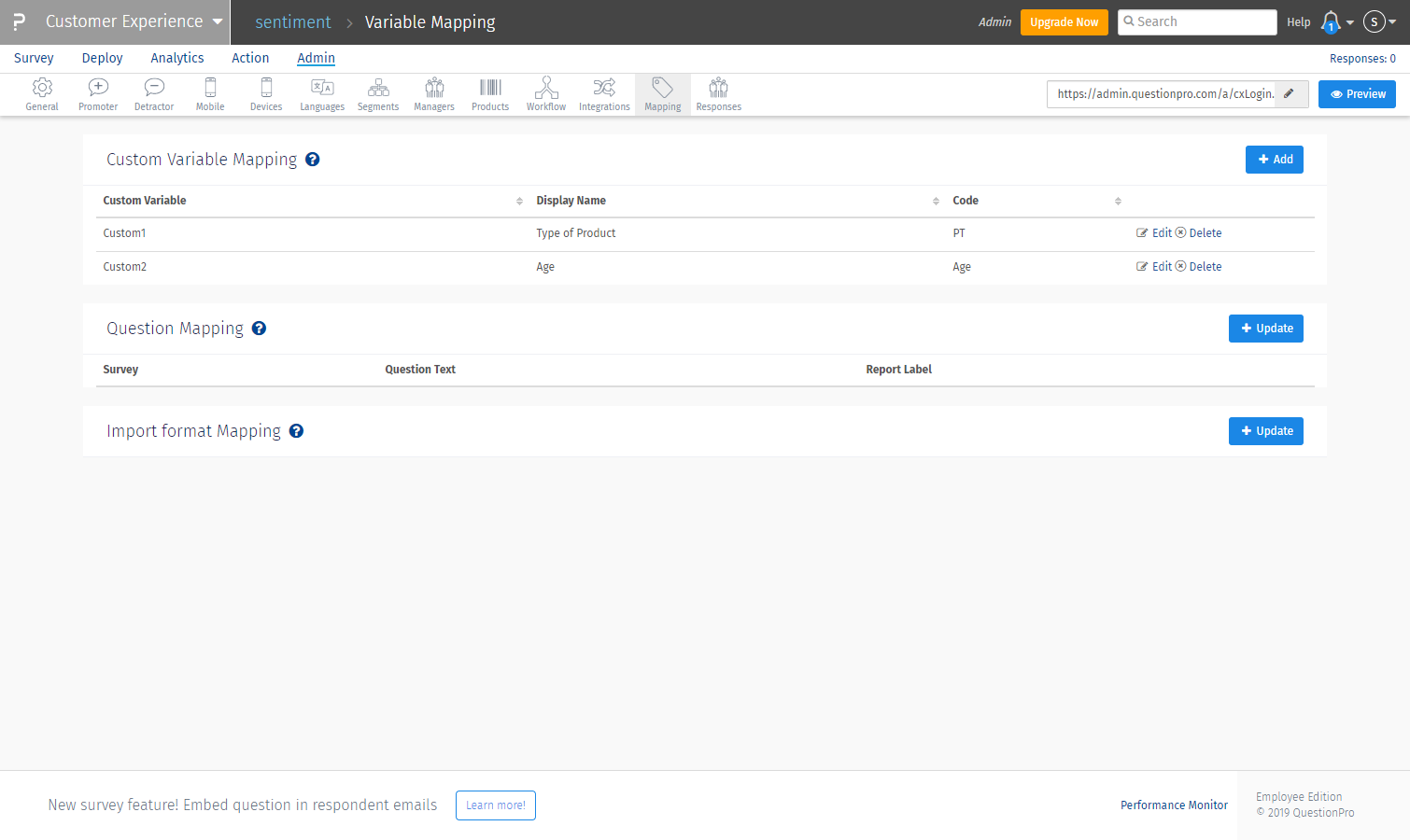
- > Login to the CX project and go to Admin>>Mapping
- > To the far right of custom variable mapping, click the ‘+add’ button
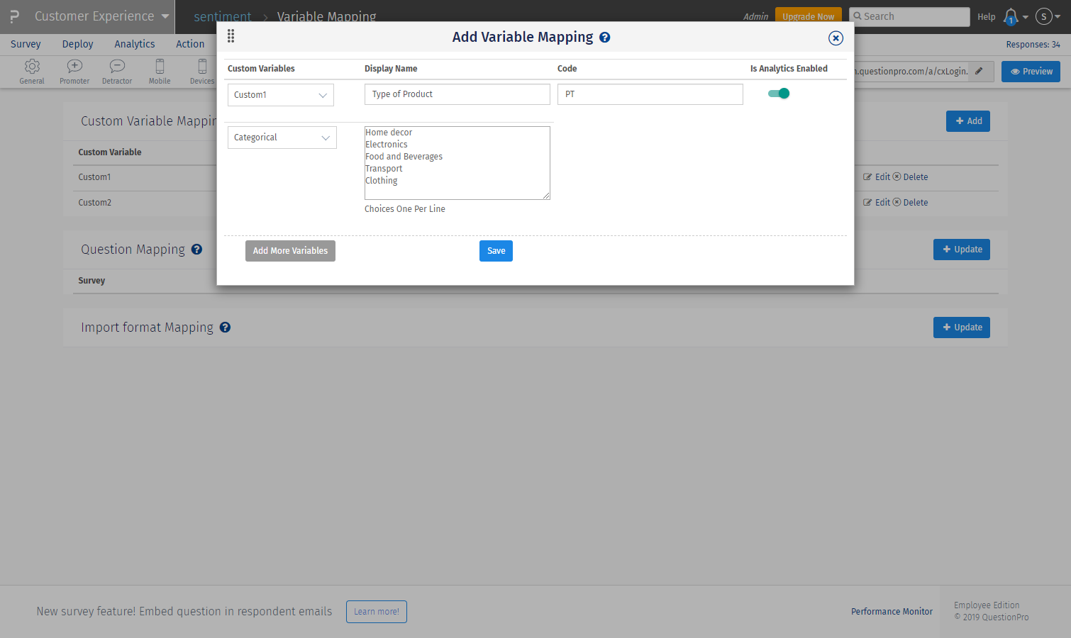
- > Add custom variable number and select the variable type as ‘categorical’ for text values
- > Add a display name and mention the values of the custom variable by selecting one per line
- > Add code name to reference the variable used (optional)
- > Enable the toggle to use as a filter in the dashboard
Step 2: Set up Question filter
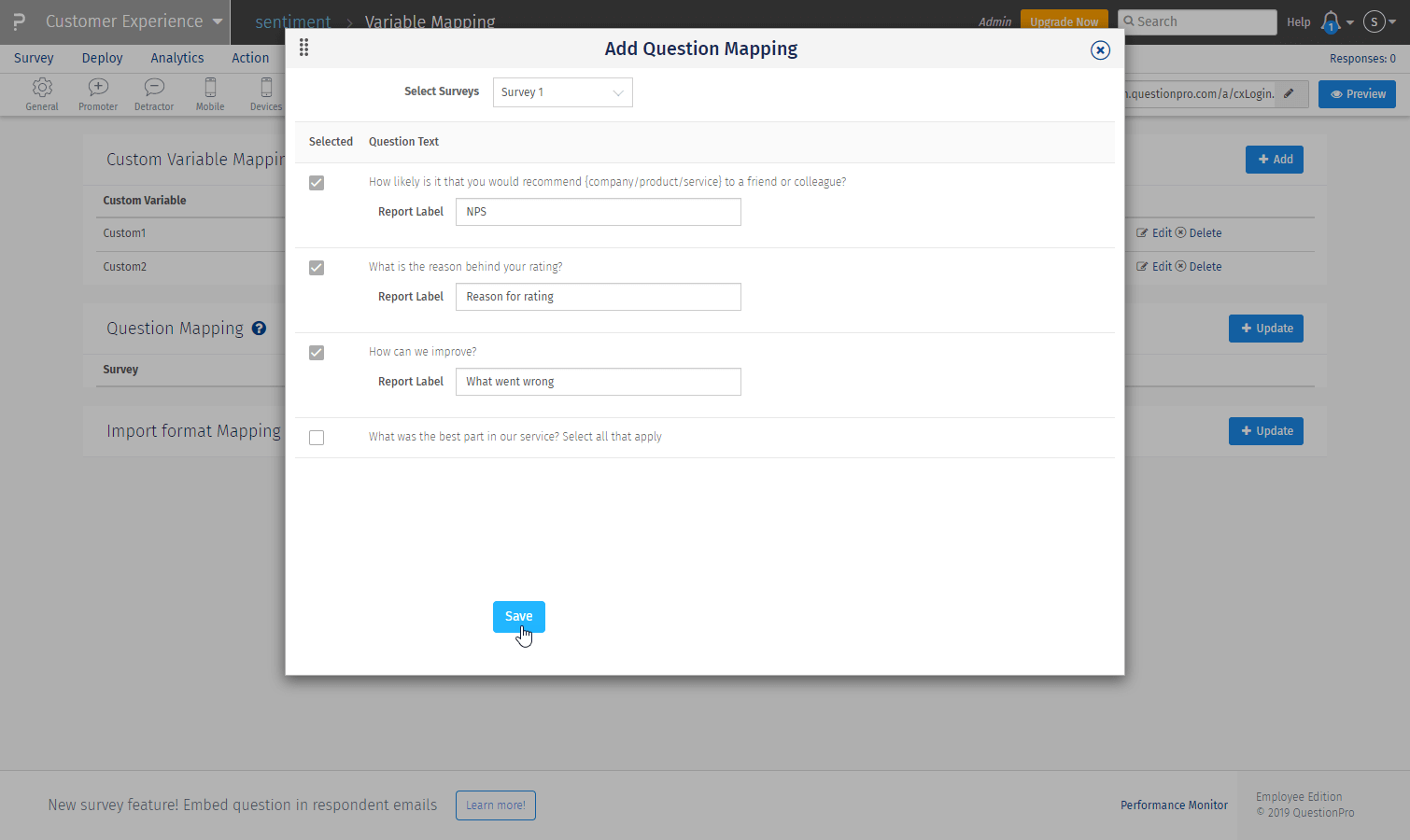
- > Login to the CX project and go to Admin >> Mapping
- > To the right of Question Mapping, click the ‘Update’ button
- > Select the questions to be added as filters
- > Add the text for the filters as the entire question can’t be displayed on a filter
- > Click ‘save’
To filter the entire dashboard with the mapped question and product segment variables, go to:
- > Admin >> Overall dashboard
- > Select the custom variable options, product type, and question you wish to filter the data by and click ‘Apply’ to display in the dashboard.
How to customize chart types and labels on the dashboard?
- > Go to ‘Edit Dashboard’ to edit widgets.
- > Click on the pencil icon to edit any widget within the dashboard.
A settings menu will appear on the overlay with the edit option on the right panel.
Settings that can be edited:
- > Title
- > Description (will show up on hovering ‘i’ icon)
- > Show Response count.
- > Chart type – NPS, Donut chart/Line, bar, etc.
- > Show/hide tooltip
- > Drilldown options: View details or do nothing
- > After setting have been selected, click save to display updated widget
- > Go to Admin >> Monthly tracker>> + add new widget
- > Select ‘Survey” >> chose survey as the monthly tracker is a survey level widget
- > Add widget name
- > Select the monthly tracker thumbnail from charts displayed >> click ‘Next’
- > To create the trend, select the question to be tracked and the # number of months to track
- > Apply a widget level filter (optional) and click ‘Save’ to display.
Analyzing the monthly tracker
- > The X-axis represents responses per answer option by default. You can change it to a percentage from the edit settings
- > Y-axis represents months. Default is the current month and two months before the current month as mentioned while setting up.
- > Each stack in a bar represents an answer option as mentioned below the chart. The number of responses is displayed on the bar for each answer option.
To learn more about these exciting customizable widget options, contact us today and we can walk you through a live tour of CX dashboard 2.0.
 Survey Software
Easy to use and accessible for everyone. Design, send and analyze online surveys.
Survey Software
Easy to use and accessible for everyone. Design, send and analyze online surveys.
 Research Suite
A suite of enterprise-grade research tools for market research professionals.
Research Suite
A suite of enterprise-grade research tools for market research professionals.
 Customer Experience
Experiences change the world. Deliver the best with our CX management software.
Customer Experience
Experiences change the world. Deliver the best with our CX management software.
 Employee Experience
Create the best employee experience and act on real-time data from end to end.
Employee Experience
Create the best employee experience and act on real-time data from end to end.