
A good employee NPS score typically falls between +10 and +50, depending on your industry and company size. Anything above 0 means you have more promoters than detractors, which is a reasonable starting point.
The Employee Net Promoter Score, or eNPS, turns a simple one-question survey into a number leaders can track over time. But a number on its own does not tell you much unless you know what counts as strong, average, or concerning.
In this guide, we’ll cover what a good eNPS actually looks like, how the score is calculated, current industry benchmarks, and what to do once you have your result.
What is a good employee NPS score?
A good employee NPS score generally sits between +10 and +50 on the standard -100 to +100 scale. Scores above +50 are considered excellent, while anything below 0 signals more detractors than promoters and calls for immediate attention.
Context matters more than the number itself. A software company and a manufacturing plant will rarely land in the same range, so comparing your score to your own history often matters more than comparing it to a different sector.
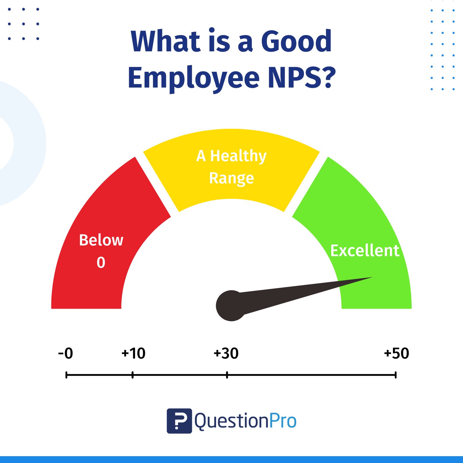
Here is a general way to read your result:
| Score range | Zone | What it typically means |
|---|---|---|
| Below 0 | Negative | Detractors outnumber promoters. Treat this as urgent. |
| 0 to +9 | Neutral | Employees are split. There is room to build loyalty. |
| +10 to +30 | Good | A healthy majority of promoters and a solid foundation. |
| +31 to +49 | Very good | Strong loyalty across most teams and departments. |
| +50 and above | Excellent | Top tier advocacy. Employees actively recommend the company. |
QuestionPro’s own 2025 benchmark data, drawn from over 700,000 responses, puts the overall average eNPS at 32. That places a typical organization solidly in the good range, which is a useful anchor point before you look at your own results.
How is employee NPS calculated?
Employee NPS is calculated by subtracting the percentage of detractors from the percentage of promoters. The formula is simple:
eNPS = % Promoters − % Detractors
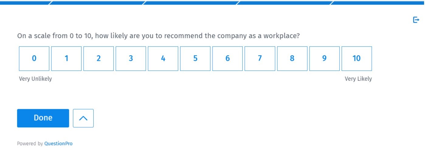
Every employee who answers the core question, “On a scale of 0 to 10, how likely are you to recommend this company as a place to work?” falls into one of three groups:
- Promoters (9 to 10): Loyal employees who actively speak well of the company.
- Passives (7 to 8): Satisfied employees who are unlikely to advocate or complain.
- Detractors (0 to 6): Disengaged employees who may share negative feedback.
Say 60% of respondents are promoters, 25% are passives, and 15% are detractors. Your eNPS would be 60 minus 15, or 45, which lands in the very good range. The score can run anywhere from -100, if every respondent is a detractor, to +100, if every respondent is a promoter.
Use an eNPS Score Calculator to run this math automatically once your survey results come in.
eNPS vs. NPS: What’s the difference?
The Net Promoter Score (NPS) measures customer loyalty, while eNPS measures employee loyalty. Both rely on the same 0 to 10 recommendation question and the same promoter, passive, and detractor grouping.
NPS asks customers how likely they are to recommend a product or service. The Employee Net Promoter Score (eNPS) asks employees the same question about their workplace instead. The methodology traces back to the original Net Promoter Score (NPS) framework, first developed to track customer sentiment.
Teams sometimes assume a strong customer NPS means employee sentiment is fine too. That is not always true. A company can have loyal customers while its internal culture is struggling, which is exactly why eNPS deserves its own tracking rather than being treated as a side effect of customer scores.
eNPS benchmarks by industry in 2025
eNPS benchmarks vary widely by industry, so comparing your score against your specific sector gives a far more accurate read than a single blanket number. Some industries consistently report stronger scores than others due to differences in job security, pace of change, and workplace flexibility.
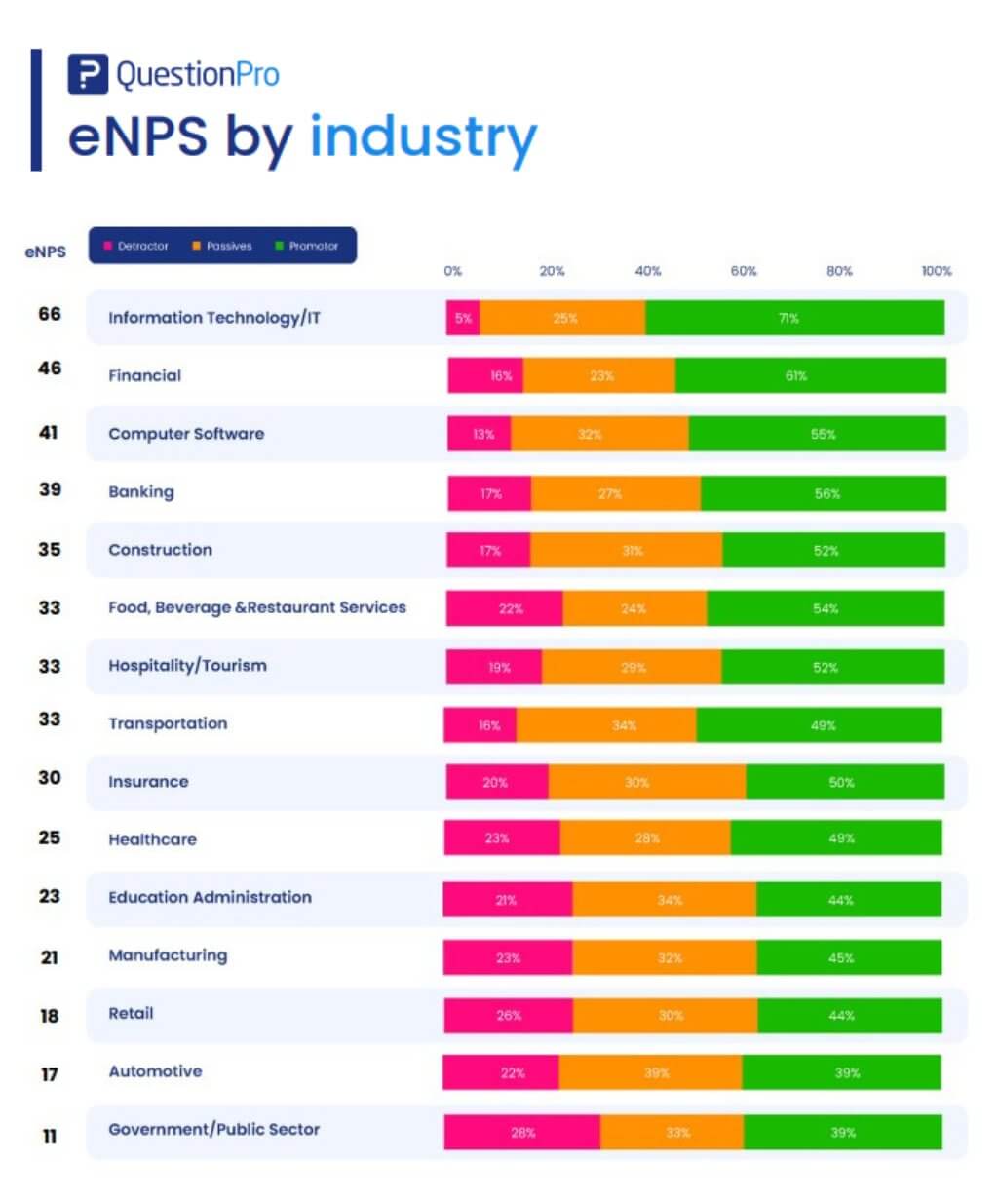
The table below reflects QuestionPro’s latest benchmark data, based on a survey of 5,000 full-time employees across sectors.
| Industry | eNPS 2025 | eNPS 2024 | YoY change |
|---|---|---|---|
| Information Technology / IT | 66 | 71 | -5 |
| Financial | 46 | 38 | +8 |
| Computer Software | 41 | 43 | -2 |
| Banking | 39 | 43 | -4 |
| Construction | 35 | 48 | -13 |
| Food, Beverage & Restaurant Services | 33 | 6 | +27 |
| Transportation | 33 | 19 | +14 |
| Hospitality / Tourism | 33 | 27 | +6 |
| Insurance | 30 | 38 | -8 |
| Healthcare | 25 | 17 | +8 |
| Education Administration | 23 | 42 | -19 |
| Manufacturing | 21 | 13 | +8 |
| Retail | 18 | 17 | +1 |
| Automotive | 17 | 6 | +11 |
| Government / Public Sector | 11 | 24 | -13 |
| Overall average | 32 | 25 | +7 |
For a deeper breakdown, the full eNPS benchmark report covers regional and company-size cuts as well.
What drives a strong or weak eNPS
A strong eNPS usually comes down to how supported employees feel day to day, not any single perk or policy. Weak scores tend to trace back to friction in how work actually gets done.
Across QuestionPro’s benchmark data, these factors consistently show up on each side.
What tends to raise eNPS:
- Supportive teams and strong collaboration
- A clear sense of purpose behind the work
- Genuine investment in inclusivity and belonging
- Open, two-way communication from leadership
What tends to drag eNPS down:
- Clunky processes and unclear workflows
- Weak knowledge sharing between teams
- Decision-making that excludes the people closest to the work
- A customer-first focus that leaves employee needs behind
Gallup’s research backs this pattern. Only 31% of U.S. employees were engaged at work in 2025, which shows how much room most organizations still have to close the gap between a passable score and a genuinely strong one.
A real-world example of eNPS in action
Picture a 200-person software company running its first eNPS pulse survey. The result comes back at +8, technically positive but sitting in the neutral zone.
Instead of treating the number as a pass or fail, the HR team adds a follow-up question asking why employees gave their score. Common themes emerge around unclear promotion paths and slow decision-making between departments.
Over the next two quarters, the company clarifies its promotion criteria and shortens its approval chains. The next survey shows eNPS climbing to +24, moving the company into the good zone. The score change matters less than the fact that specific, addressable problems were surfaced and fixed.
Common mistakes when interpreting eNPS
The most common mistake is treating eNPS as a complete picture of employee sentiment rather than one data point among several. A single question cannot capture every nuance of how people feel about their jobs.
Watch for these missteps when reading your results:
- Comparing across industries without adjusting: A 20 in retail and a 20 in software do not mean the same thing.
- Ignoring passives: They are not detractors, but they are not advocates either, and they often swing the score in either direction.
- Skipping the follow-up question: Without asking why, you get a number with no explanation behind it.
- Not acting on the results: A repeated low score with no visible change erodes trust and can make future surveys feel pointless.
- Overreacting to small movements: A shift of two or three points quarter to quarter is often noise, not a trend.
How to run an eNPS survey step by step
Running an eNPS survey does not require a large initiative. A short, consistent process works better than a one-time deep analysis.
- Ask the core question on a regular cadence.
Quarterly works well for most organizations, alongside shorter pulse checks in between.
- Add one follow-up question.
Something like “What’s the main reason for your score?” turns a number into usable feedback.
- Keep responses anonymous.
Anonymity encourages honest answers, especially from detractors who might otherwise stay quiet.
- Segment your results.
Break scores down by department, location, or tenure to spot patterns a single overall number would hide.
- Pair the score with other signals.
Exit interviews, one-on-ones, and open comment boxes round out what the eNPS number alone cannot show.
How QuestionPro supports your eNPS program
Measuring eNPS is only the first step. Turning that data into action is where most programs either succeed or stall out. QuestionPro Employee Experience supports both sides of that work.
The platform offers ready-made eNPS templates alongside the option to build a fully custom survey with branded follow-up questions that dig into the reasons behind each score. Results flow into live dashboards that break performance down by team, department, or location, and the platform connects with existing HR systems so eNPS data sits alongside turnover and performance trends rather than in a separate spreadsheet. For teams that want to compare their own numbers against outside data, employee survey questions built around eNPS and broader engagement topics make it easier to spot where to focus first.
The score matters less than what you do with it
A good eNPS score is a useful checkpoint, not a final grade. The number tells you where employees stand today, but the follow-up questions, the segmentation, and the changes that come after are what actually shift culture.
Track your eNPS consistently, act on what employees tell you, and treat improvement as the real target rather than a single benchmark number. That approach turns a simple survey question into one of the more reliable signals a company has about its own health.
Frequently Asked Questions (FAQs)
Small businesses often see slightly higher eNPS scores than large enterprises because feedback loops are shorter and leadership is more visible. A score above +20 is a reasonable target, though comparing results against your own prior surveys matters more than chasing a fixed number.
Yes, regional labor markets and industry concentration can shift eNPS by several points. A tech-heavy metro area may skew higher than a region dominated by retail or manufacturing, so segment US results by location when possible for a fairer read.
Yes. eNPS is a single question, so it can miss issues affecting a smaller group, such as one department or shift. Pairing eNPS with qualitative feedback and department-level segmentation helps surface problems a top-line score alone would hide.
A follow-up question like “why did you give that score” turns a number into a reason, which is usually the more actionable half of the data. Teams that skip it often end up guessing at root causes instead of addressing the specific ones employees named.
Your own historical trend is generally the better benchmark, since it accounts for your specific culture, industry, and workforce. Industry benchmarks are useful for context, but a rising or falling trend within your own company tells you more about what is actually working.