
Do you ever wonder how things like your budget, sales, or customer satisfaction impact each other? What if there was a simple way to see these connections at a glance? The best way is a correlation matrix. It’s like a cheat sheet for uncovering hidden relationships in your data. It is used a lot in fields like finance, economics, psychology, and biology because it helps people understand how different things are related to each other.
To make good decisions based on data, you need to know how to read and use a correlation matrix. It shows the variables in rows and columns. The correlation coefficient is written in each cell of a table.
In this blog, we’ll show you how a correlation matrix works and give some examples to help you figure out how to use it to analyze data.
What is a Correlation Matrix?
A correlation matrix is a table displaying correlation coefficients that measure the strength and direction of relationships between variables.
The matrix shows how all the possible pairs of values in a table are related to each other. It is a powerful tool for summarizing a large data set and finding and showing patterns in the data.
It is often shown as a table, with each variable listed in both the rows and the columns and the correlation coefficient between each pair of variables written in each cell.
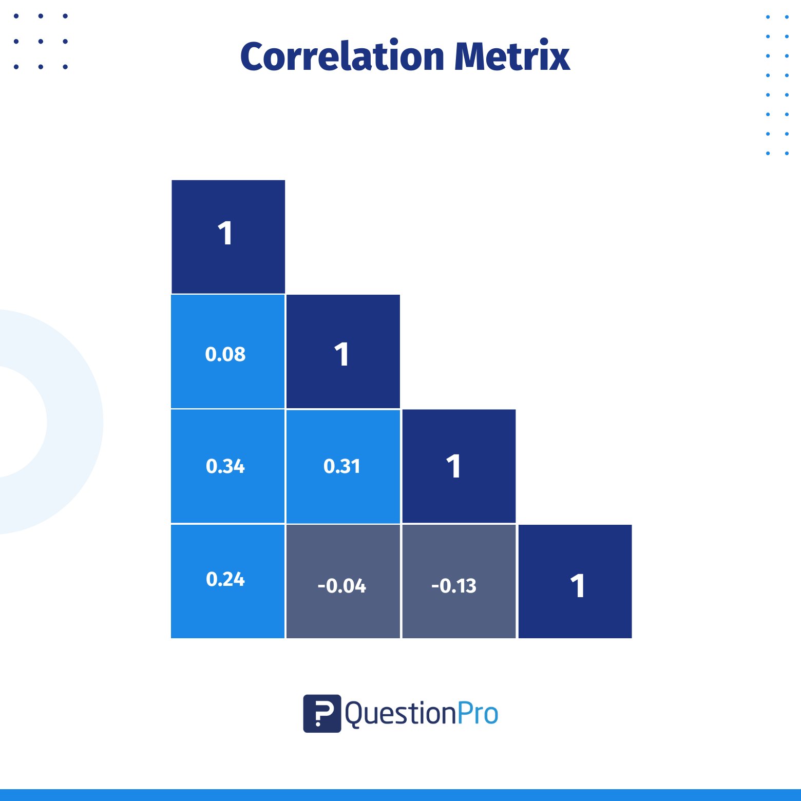
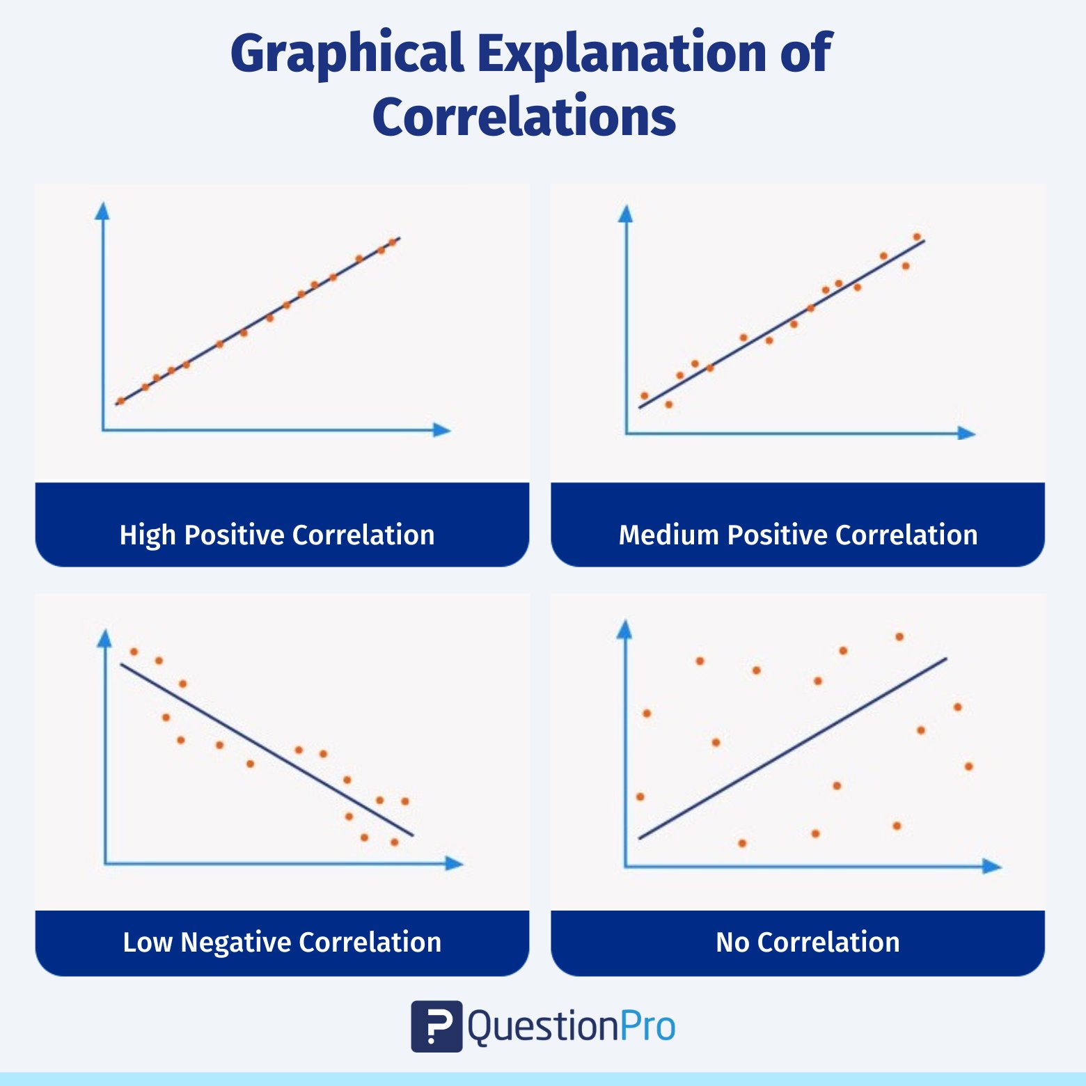
The correlation coefficient ranges from -1 to +1, where -1 means a perfect negative correlation, +1 means a perfect positive correlation, and 0 means there is zero correlation between the variables.
When to Use a Correlation Matrix?
A correlation matrix is a valuable tool for gaining insights into your dataset. For example, if you’re trying to predict the price of a car based on factors like fuel type, transmission, or age, the correlation matrix helps you understand the relationships between these variables.
Here’s how the matrix works:
- A value of 1 indicates a strong positive relationship between two variables.
- A value of 0 suggests no relationship between them.
- A value of -1 signals a strong negative or inverse relationship.
By using a correlation matrix, you can easily analyze and visualize the connections in your data. This makes it an essential step for data scientists before building machine learning models. Understanding which variables are correlated helps you identify the most influential factors for your model.
The matrix provides a range of values between -1 and 1, allowing you to determine the strength and direction of relationships between variables.
How Does The Correlation Matrix Work?
The following formula is used to compute the correlation coefficient between two variables:

r = (nΣXY – ΣXΣY) / sqrt((nΣX^2 – (ΣX)^2)(nΣY^2 – (ΣY)^2))
Where:
- r = correlation coefficient
- n = number of observations
- ΣXY = sum of the product of each pair of corresponding observations of the two variables
- ΣX = sum of the observations of the first variable
- ΣY = sum of the observations of the second variable
- ΣX^2 = sum of the squares of the observations of the first variable
- ΣY^2 = sum of the squares of the observations of the second variable
The resulting correlation coefficient varies from -1 to +1, with -1 being a perfect negative correlation, +1 representing a perfect positive correlation, and 0 representing no correlation between the variables.
- It can be used to determine which variables are significantly connected with one another and which are poorly correlated or not correlated at all. This information can be used to create forecasts and informed judgments based on the facts.
- It makes it easy and quick to see how the different variables are related. Variables that tend to go up or down together have high positive correlation coefficients. Variables that tend to go up or down in opposite directions have high negative correlation coefficients.
- It is important for finding patterns and relationships between variables. It can also be used to make predictions and decisions based on data. Low correlation coefficients show that the two variables don’t have a strong relationship with each other.
Key Points of the Correlation Matrix
The correlation matrix may seem like a somewhat abstract concept with wide variations, especially if we look into the different types of statistical matrices that exist. However, there are certain characteristics that make a correlation matrix functional and effective.
Below, we list the main key points:
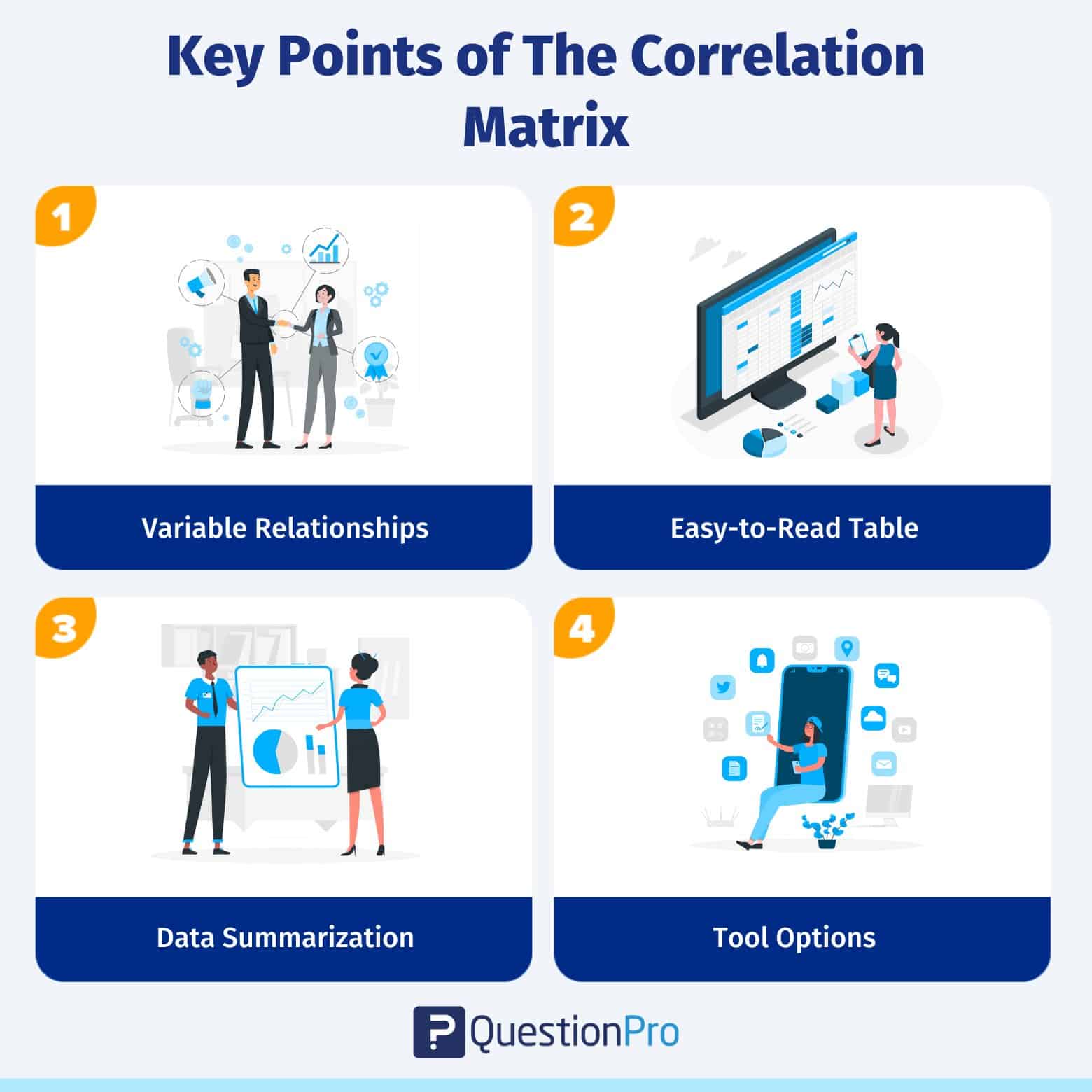
- Variable Relationships: The correlation matrix helps determine how two or more variables relate to or depend on each other.
- Easy-to-Read Table: It is shown in a table format, which makes it easy to read, understand, and find patterns to predict what will happen in the future.
- Data Summarization: The idea helps summarize the data and come to solid conclusions, which helps investors make better decisions about where to put their money.
- Tool Options: You can use Excel or more advanced tools like SPSS and Python-driven Pandas to make the matrix effectively.
In summary, a correlation matrix is a helpful tool for quickly understanding how different variables are related, which can guide you in making data-driven decisions.
Example of the Correlation Matrix
Let’s look at an example to see how a correlation matrix can help people read and understand a dataset with four variables: age, income, education, and job satisfaction:
| Age | Income | Education | Job Satisfaction | |
| Age | 1 | 0.5 | 0.3 | 0.2 |
| Income | 0.5 | 1 | 0.8 | 0.6 |
| Education | 0.3 | 0.8 | 1 | 0.4 |
| Job Satisfaction | 0.2 | 0.8 | 0.4 | 1 |
In this example, we can see that income and education have a strong positive correlation of 0.8. This means that people with higher education levels tend to have higher incomes.
Age and income also have a moderately positive correlation of 0.5, suggesting that income increases as people age. However, the correlation between age and job satisfaction is only 0.2, which shows that age is not a strong predictor of job satisfaction.
The correlation matrix is a useful summary or analysis of how these variables are related to each other.
How to Create a Correlation Matrix in Excel?
Creating a correlation matrix in Excel is simple and can help you analyze relationships between different variables in your dataset.
Here’s how you can do it step by step:
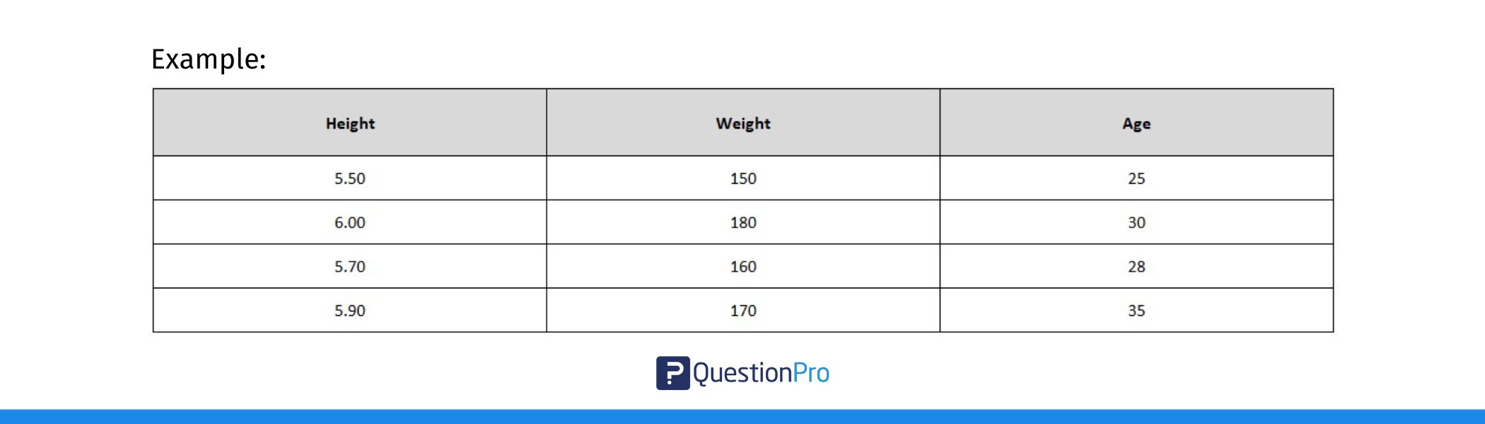
1. Prepare Your Data
First, ensure your data is organized in columns. Each column should represent a different variable, and the rows should contain the values for each observation.
For example, if you’re looking at the relationship between height, weight, and age, each of these variables should be in its own column.
2. Select the Data:
Highlight the data (without including the column headers) for which you want to calculate the correlation.
3. Use the CORREL Function:
If you want to manually calculate the correlation between two variables:
- Click on an empty cell where you want the correlation result to appear.
- Type =CORREL( and then select the range for the first variable (e.g., Height).
- After the comma, select the range for the second variable (e.g., Weight).
For example, if you’re analyzing the relationship between height and weight, after selecting the range for the height data, select the range for the weight data in your spreadsheet. - Press Enter, and Excel will display the correlation coefficient between these two variables.
4. Create the Full Correlation Matrix:
To create a full correlation matrix, repeat the above steps for each pair of variables:
- In the first row, create headers for each variable (e.g., Height, Weight, Age).
- In the first column, list the same variables.
- Fill in the cells by calculating the correlation between each pair of variables using =CORREL().
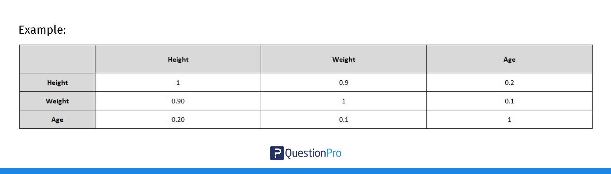
In this table:
- The diagonal values are 1 because any variable is perfectly correlated with itself.
- The off-diagonal values are the correlations between pairs of variables.
5. Use the Data Analysis Tool (Optional):
If you want to automatically generate a correlation matrix for all your data, you can use Excel’s built-in Data Analysis Toolpak:
- Go to the Data tab on the ribbon.
- Click on Data Analysis (if you don’t see this option, you may need to enable the Analysis ToolPak in Excel’s options).
- Choose Correlation from the list and click OK.
- Select the input range (your data), check the Labels in the First Row box (if you have headers), and choose where you want the results to appear.
- Click OK, and Excel will create a full correlation matrix for you!
6. Interpret the Results:
Once the matrix is created, look at the correlation values:
- Values close to +1 mean a strong positive relationship.
- Values close to -1 mean a strong negative relationship.
- Values near 0 suggest little to no relationship.
And that’s it! You’ve now created a correlation matrix in Excel, and you can use it to analyze how different variables in your dataset are related to each other.
Types of Correlation Coefficients
When measuring the relationship between two variables, there are several methods you can use, depending on the type of data you have and the nature of the relationship between the variables.
Here’s a look at some of the most common correlation coefficients:
1. Pearson Correlation Coefficient (r)
The Pearson Correlation Coefficient is the most widely used method for measuring the linear relationship between two continuous variables. It works best when the data is normally distributed and is ideal for parametric data. To identify the Pearson correlation coefficient, calculate the covariance of the two variables and divide it by the product of their standard deviations.
This coefficient gives a value between -1 and +1, where +1 indicates a perfect positive linear relationship, -1 shows a perfect negative linear relationship and 0 means there is no linear relationship between the variables.
Spearman’s Rank Correlation Coefficient ‘ρ’ (rho)
Spearman’s Rank Correlation Coefficient is used when your data is ordinal (ranked data) or when the relationship between the variables is not linear but still monotonic (meaning that as one variable increases, the other tends to increase or decrease, but not necessarily in a straight line).
To identify Spearman’s rank correlation coefficient, first rank the values of each variable from lowest to highest, compute the difference between the ranks for each pair of data points, and use these rank differences in the Spearman formula to calculate the correlation.
Unlike the Pearson coefficient, Spearman’s correlation does not assume the data follows a normal distribution, making it a non-parametric alternative.
3. Kendall’s Tau
Kendall’s Tau is another non-parametric method similar to Spearman’s rank correlation. It’s particularly useful when working with smaller sample sizes or ordinal data. Like Spearman’s, it measures the strength of a monotonic relationship, but it does so with a slightly different approach, often yielding more reliable results when there are tied ranks or small datasets.
The correlation coefficient summarizes the relationship, but remember that correlation does not imply causation—meaning that even if two variables are highly correlated, it doesn’t mean one causes the other to change.
If you want a deeper understanding of how to calculate and interpret the Pearson correlation coefficient, we recommend consulting our detailed guide: Pearson Correlation Coefficient.
Correlation Matrix vs Covariance Matrix
We know that a correlation matrix is a table showing the correlation coefficients between multiple variables. It represents the strength and direction of their relationships on a standardized scale from -1 to +1. On the other hand, a covariance matrix is a table showing the covariances between variables. It measures how changes in one variable are associated with changes in another, but without standardizing the values.
Although both covariance matrix and correlation matrix are used in statistics to help study patterns, they are different. The first one shows how different two or more variables are from each other, while the second one shows how similar they are.
Some of the ways that correlation and covariance matrices are different are:
| Basis | Correlation Matrix | Covariance Matrix |
| Relationship | It helps figure out both the direction (positive/negative) and strength (low/medium/high) of the relationship between two variables. | It only measures which way the relationship between two variables goes. |
| Specified Subset and Range | It is a part of covariance and has a range of values between 0 and 1. (-1 to 1). | It is a bigger idea with no clear limits (it can go up to infinity). |
| Dimension | It can’t be measured. | It can be measured. |
Limitations Of Correlation
While correlation is a powerful tool, it has several limitations that are important to understand to avoid misinterpretation or misuse of the results.
Here are the key limitations of correlation:
- Correlation does not imply causation: A strong correlation does not mean one variable causes the other to change.
- Sensitive to outliers: Extreme values can distort the correlation, making the relationship appear stronger or weaker than it is.
- Only measures linear relationships: Correlation methods like Pearson focus only on linear relationships and may miss non-linear patterns.
- Assumes homoscedasticity: Correlation assumes that the variance of data is consistent across all levels of the variables.
Conclusion
A correlation matrix is a useful tool for figuring out how different variables are related to each other. By looking at the correlation coefficients between two variables, we can learn how they are related and how changes in one variable may affect the other variables.
QuestionPro has a variety of functions and tools that can help you analyze and make a correlation matrix. Its survey platform can help gather data from respondents, and its analysis tools can help make a correlation matrix from the data collected. QuestionPro also has advanced analytics tools to help you find connections between variables and spot multicollinearity.
QuestionPro is a useful tool for researchers and analysts who want to discover how different variables relate to each other and what can be learned from survey data.
Frequently Asked Questions (FAQs)
A correlation matrix shows the relationship between pairs of variables, with values ranging from -1 to +1:
< +1: Perfect positive correlation (both variables increase together).
< -1: Perfect negative correlation (one increases while the other decreases).
< 0: No linear correlation (no relationship).
1. Strong correlation: Values near +1 or -1.
2. Moderate correlation: Values between 0.4 and 0.7 (or -0.4 and -0.7).
3. Weak correlation: Values near 0.
Diagonal values are always 1 (since variables are perfectly correlated with themselves). Off-diagonal values show relationships between different variables. Positive values mean variables move in the same direction, and negative values mean they move in opposite directions.
Remember, correlation does not imply causation, and the matrix only captures linear relationships.
A correlation matrix shows the correlation coefficients between pairs of variables in a dataset. It provides a way to visually represent how each variable is related to the others. The values in the matrix range from -1 to +1, where:
< +1 indicates a perfect positive correlation (both variables move together in the same direction).
< -1 indicates a perfect negative correlation (as one variable increases, the other decreases).
< 0 indicates no linear relationship between the variables.
The matrix displays these values for each pair of variables, allowing you to quickly assess the strength and direction of relationships across the dataset. The diagonal will always show 1 because each variable is perfectly correlated with itself.
To calculate a correlation matrix:
1. Organize Your Data: Arrange your dataset with variables as columns.
2. Calculate Correlation Coefficients: Use the Pearson formula to compute the correlation between each pair of variables.
3. Create the Matrix: Once you calculate the correlation for each pair of variables, arrange them in a square matrix, with diagonal values always being 1.
In R, a correlation matrix displays the correlation coefficients between multiple variables in a dataset. It shows the strength and direction of linear relationships between each pair of variables.