
Have you ever wondered how closely two things are related, such as whether more hours studying mean better grades or more money means more spending? A correlation coefficient analysis can help you figure that out and make informed decisions. It’s a numerical way to measure the strength and direction of the relationship between two things.
A correlation coefficient ranges from -1 to +1, so it’s a powerful statistical tool to see how things interact. Understanding this is key to data analysis in many fields.
In this post, we’ll explore correlation coefficients, their formulas, and real-world examples. Whether you’re a student, researcher, or data enthusiast, you’ll gain the knowledge to apply correlation analysis effectively in your work.
What is the Correlation Coefficient?
A correlation coefficient is a descriptive statistic that measures the relationship between two variables. It is a tangible measure of the association.
This is important for understanding the practical meaning of the data. It tells you how strongly and in what direction two variables are related. Correlation coefficients summarize the strength and direction of a linear relationship, providing a clear picture of variable interaction.
The correlation coefficient value ranges from -1 to 1:
- -1 is a perfect negative correlation.
- 1 is a perfect positive correlation.
- 0 is no correlation at all.
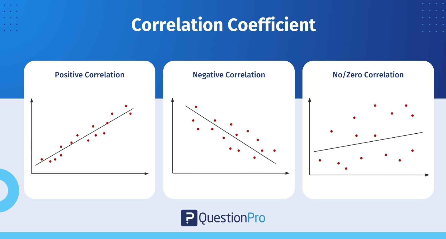
A larger absolute value of the correlation coefficient means a stronger relationship between the variables. For example, a correlation coefficient close to 1 means a strong positive relationship, and a value near -1 means a strong negative relationship.
One of the best things about correlation coefficients is that they are unit-free, so that you can compare across different datasets. From finance to environmental studies, this makes them super useful in many fields, where understanding the linear relationship between variables can be really insightful.
Interpreting Correlation Coefficient Values
Interpreting the values of correlation coefficients is key to understanding the relationships between variables. +1 means a perfect positive relationship where variables move in the same direction. -1 means a perfect negative relationship where one variable increases as the other decreases.
These extreme values are rare but represent the strongest possible relationship between two variables.
A positive correlation means one variable increases as the other tends to increase as well. For example, 0.8 is often interpreted as a strong positive correlation where variables move together in a similar direction. On the other hand, negative means one increases as the other decreases. This is represented by negative values of the correlation coefficient where variables are inversely related.
Values close to zero mean no correlation or linear relationship between the variables. For example, a correlation coefficient of 0.2 to 0.4 means a weak correlation, only a slight association between variables. Outliers can affect correlation coefficients and distort the relationship. So, always consider the data context and potential anomalies when interpreting correlation values.
Practical examples will help illustrate this. 0.5298 means moderate positive correlation, a visible but not strong relationship between variables. Understanding these nuances will help you analyze data better and make better decisions across many fields.
Types of Correlation Coefficients
Correlation coefficients come in various forms, each suited to different types of data and relationships. The most commonly used correlation coefficients include Pearson’s 𝑟, Spearman’s rho (ρ), and Kendall’s tau (τ), each serving specific analytical needs. These coefficients can vary based on the type of relationship, measurement levels, and data distribution.
Pearson’s correlation coefficient is the most popular type and is widely used for measuring linear relationships and linear correlation between two quantitative variables. It is particularly effective when the data meet certain assumptions, such as normal distribution and linearity.
On the other hand, Spearman’s ρ is a non-parametric alternative to Pearson’s 𝑟. It is suitable for ordinal or non-normally distributed data. This makes it a versatile tool for analyzing rank-ordered variables.
Other types of correlation coefficients include:
- Point-biserial correlation: It is used when one variable is dichotomous, and the other is quantitative.
- Cramér’s V: This is applicable for measuring the correlation between two nominal variables.
- Kendall’s tau: It is another non-parametric option. It is often favored for smaller sample sizes due to its robustness.
Understanding these different types allows for more tailored and accurate data analysis.
Pearson’s Correlation Coefficient (𝑟)
Pearson’s correlation coefficient is the foundation of statistics. It describes the linear relationship between two continuous variables. This coefficient measures the strength and direction of the relationship and gives you a complete view of how the variables interact.
Pearson’s 𝑟 ranges from -1 to 1 and measures how linearly related the variables are. The population correlation coefficient gives you the bigger picture of these relationships.
Several assumptions need to be met to use Pearson’s correlation. These are:
- Each data point must be independent of the others.
- Both variables should be measured on an interval or ratio scale.
- The relationship between the two variables should be linear.
- The spread of residuals should be consistent across the range of values.
- Both variables should follow normal distributions.
- Your data has no outliers.
- The data should be drawn from a random or representative sample.
Also, the variables must be normally distributed and free from outliers, as these can skew the results. Both variables must be continuous for Pearson’s correlation to apply.
The value of Pearson’s product-moment correlation coefficient ranges from +1, which indicates a perfect positive correlation. -1 indicates a perfect negative correlation, with 0 signifying no correlation. This relationship is symmetric, so the order of the variables doesn’t matter.
Additionally, the coefficient is unit-free so that you can compare across different scales. So, Pearson’s 𝑟 is a good statistical measure for a linear relationship between two continuous variables.
Calculating the Pearson’s Correlation Coefficient
Calculating the Pearson’s correlation coefficient is a simple but precise process. The correlation coefficient formula finds the relationship between the variables. It returns values between -1 and 1. Use the Pearson correlation coefficient calculator below to see how strong the two variables are.
The formula for Pearson’s correlation coefficient 𝑟 is:

Where:
- 𝑛: Number of data pairs.
- ∑𝑥: Sum of 𝑥 values.
- ∑𝑦: Sum of 𝑦 values.
- ∑(𝑥⋅𝑦): Sum of the product of paired 𝑥 and 𝑦 values.
- ∑𝑥2: Sum of squared 𝑥 values.
- ∑𝑦2: Sum of squared 𝑦 values.
Let’s use an example to calculate the correlation between Age and Income. Organize your data in a table with both variables.
| Person | Age (𝑥) | Income (𝑦) |
| 1 | 20 | 1500 |
| 2 | 25 | 2500 |
| 3 | 30 | 3000 |
| 4 | 40 | 5000 |
| 5 | 50 | 7500 |
Add three additional columns for:
- 𝑥⋅𝑦: The product of corresponding 𝑥 and 𝑦 values.
- 𝑥2: The square of each 𝑥 value.
- 𝑦2: The square of each 𝑦 value.
Calculate and fill in the values for 𝑥⋅𝑦, 𝑥2, and 𝑦2 for each row. Then, sum up each column to get the totals for ∑𝑥, ∑𝑦, ∑(𝑥⋅𝑦), ∑𝑥2, and ∑𝑦2.
| Person | Age (𝑥) | Income (𝑦) | 𝑥⋅𝑦 | 𝑥2 | 𝑦2 |
| 1 | 20 | 1500 | 30000 | 400 | 2250000 |
| 2 | 25 | 2500 | 625000 | 625 | 6250000 |
| 3 | 30 | 3000 | 90000 | 900 | 9000000 |
| 4 | 40 | 5000 | 200000 | 1600 | 25000000 |
| 5 | 50 | 7500 | 375000 | 2500 | 56250000 |
| Total | 165 | 19500 | 757500 | 6025 | 99000000 |
Fill in the values from the table:
- 𝑛 = 5
- ∑𝑥 = 165
- ∑𝑦 = 19500
- ∑(𝑥⋅𝑦) = 757500
- ∑𝑥2 = 6025
- ∑𝑦2 = 99000000
Substitute these values into the formula and calculate 𝑟. If the result is:
- Close to +1: Strong positive linear relationship.
- Close to -1: Strong negative linear relationship.
- Close to 0: Weak or no linear relationship.
The given data’s Pearson correlation coefficient (𝑟) is approximately 0.988. Since 𝑟 is very close to +1, there is a strong positive linear relationship between the two variables (Age and Income). This means that as age increases, income increases linearly.
So, here we see how important it is to understand the data and calculate it correctly. By following these steps, you can get insights from your data and make decisions based on the strength and direction of the linear relationships.
You can also use Excel to calculate correlation coefficients easily. All you need to do is enter your data into two columns and select a cell to put the result in. To get the Pearson correlation coefficient in Excel, use the formula =CORREL(range1, range2) and select the correct data ranges.
Spearman’s Rank Correlation Coefficient
Spearman’s rank correlation is a non-parametric alternative to Pearson’s correlation. It is useful when your data doesn’t meet the assumptions for Pearson’s 𝑟. This coefficient ranks the data points of each variable and measures the differences between those ranks. It tests how well two variables can be modeled by a monotonic function, not a linear one.
To understand Spearman’s correlation coefficient, you need to know what a monotonic function is. A monotonic function is one that never decreases or never increases as the ‘x’ variable increases. A monotonic function can be explained using the image below:
The image explains three types of monotonic functions:
- Monotonically increasing: When ‘x’ increases and ‘y’ never decreases.
- Monotonically decreasing: When ‘x’ increases but ‘y’ never increases
- Not monotonic: When ‘x’ increases and ‘y’ sometimes increases and sometimes decreases.
A monotonic relation is less restrictive than a linear relation, as used in Pearson’s coefficient. Although monotonicity is not a requirement for Spearman’s correlation coefficient, it will not make sense to pursue Spearman’s correlation if you already know the relationship between the variables is non-monotonic.
Using Spearman’s rank correlation helps analysts gain insights into the strength and direction of relationships across various data scenarios, enhancing their ability to interpret findings.
Calculating Spearman’s Rank Correlation Coefficient
The symbols for Spearman’s rho are ρ for the population coefficient and 𝑟𝑠 for the sample correlation coefficient. The formula for Spearman’s rank correlation coefficient is:
Where:
- 𝑑𝑖: The difference between the ranks of each pair of observations (𝑑𝑖=𝑅(𝑥𝑖)−𝑅(𝑦𝑖)
- 𝑛: The number of observations
- ∑𝑑𝑖2: The sum of the squared differences between ranks
To use this formula, you’ll find the differences (di) between the ranks of your variables for each data pair and take that as the main input for the formula.
The Spearman’s Rank Correlation Coefficient ρ can take a value between +1 to -1 where:
- ρ of 1 means all the rankings for each variable match perfectly.
- ρ of -1 means the rankings are in the exact opposite order.
- ρ of 0 means no monotonic relationship, and the variables don’t have a consistent direction.
That’s why Spearman’s rho is great for ordinal data or datasets with outliers, as it can show zero correlation.
Let’s use an example to calculate the Spearman’s Rank Correlation Coefficient. We have the scores of 9 students in History and Geography as follows:
| History | Geography |
| 35 | 30 |
| 23 | 33 |
| 47 | 45 |
| 17 | 23 |
| 10 | 8 |
| 43 | 49 |
| 9 | 12 |
| 6 | 4 |
| 28 | 31 |
Start by ranking the scores for both History and Geography. Assign the rank “1” to the highest score, “2” to the second highest, and so on. If two values are the same, assign them the average of the ranks they would occupy if they were distinct.
| History | Rank | Geography | Rank |
| 35 | 3 | 30 | 5 |
| 23 | 5 | 33 | 3 |
| 47 | 1 | 45 | 2 |
| 17 | 6 | 23 | 6 |
| 10 | 7 | 8 | 8 |
| 43 | 2 | 49 | 1 |
| 9 | 8 | 12 | 7 |
| 6 | 9 | 4 | 9 |
| 28 | 4 | 31 | 4 |
For each pair of scores, calculate the difference in ranks (𝑑) and square the difference (𝑑2):
| History | Rank | Geography | Rank | 𝑑 | 𝑑2 |
| 35 | 3 | 30 | 5 | 2 | 4 |
| 23 | 5 | 33 | 3 | 2 | 4 |
| 47 | 1 | 45 | 2 | 1 | 1 |
| 17 | 6 | 23 | 6 | 0 | 0 |
| 10 | 7 | 8 | 8 | 1 | 1 |
| 43 | 2 | 49 | 1 | 1 | 1 |
| 9 | 8 | 12 | 7 | 1 | 1 |
| 6 | 9 | 4 | 9 | 0 | 0 |
| 28 | 4 | 31 | 4 | 0 | 0 |
Now, add all the squared differences (𝑑2):
- ∑𝑑2 = 4+4+1+0+1+1+1+0+0 = 12
- Also, 𝑛 = 9
Then, the Spearman’s rank correlation coefficient is:
- 𝑟𝑠 = 1 – { 6 ∑𝑑𝑖2 / 𝑛 ( 𝑛2-1 ) }
= 1 – { ( 612 ) / ( 9( 81-1 ) }
= 1 – {72 / 720}
= 1 – 0.1
= 0.9
The Spearman’s rank correlation coefficient is 𝑟𝑠 = 0.9, which means there is a strong positive correlation between History and Geography scores. So, students who do well in History tend to do well in Geography too.
Real-Life Applications of Correlation Coefficients
Correlation coefficients are used in many real-life applications to make decisions across multiple fields. Here are some of them:
- Finance
In finance, correlation coefficients help to evaluate risk and diversify a portfolio by analyzing the relationship between different securities. Quantitative traders also use these coefficients to forecast near-term changes in securities prices to improve their trading strategies.
- Environmental Research
Environmental studies benefit a lot from the correlation analysis. For example, a correlation coefficient matrix can show the significant correlations among trace elements. High correlation coefficients of trace elements in the Gomati River show common geogenic sources, and aluminum has the highest correlation with Fe, Ni, Ti, and Rb. These insights are important to understanding environmental patterns and sources of contamination.
- Genetic studies
Genetic research also uses correlation coefficients to analyze the relationships within genetic variations. For example, Pearson correlation coefficients of 0.783 to 0.895 were observed in studying the genetic differences in weedy rice populations. These analyses help to understand genetic diversity and evolutionary trends.
Limitations of Correlation Analysis
While correlation analysis provides valuable insights, it comes with certain limitations. One of the most important things to remember is that correlation does not imply causation. External factors like confounding variables can misrepresent the correlation between two variables and lead to wrong conclusions. For example, a third variable, such as hot weather, could influence the correlation between ice cream sales and drowning incidents.
The range of observations can also affect correlation coefficients. Narrowing the range of data can change the correlation value and sometimes hide the true relationship between variables. Outliers are another big problem, as they can skew the Pearson correlation coefficient and lead to wrong interpretations. So, always examine the data and consider outliers before drawing conclusions from the correlation analysis.
Also, correlation analysis is only for bivariate data, so it can’t assess relationships beyond two variables. This means more complex relationships involving multiple variables need different analytical approaches, like regression analysis or multivariate analysis. Additionally, measurement errors can affect the reliability of correlation coefficients and can inflate or deflate the observed values.
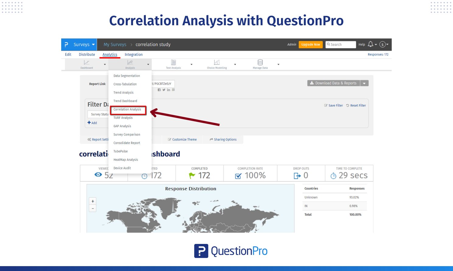
How to Conduct a Correlation Coefficient with QuestionPro
Using QuestionPro’s correlation tool, you can easily see the relationships between survey variables. The matrix and color coding will help you to see positive and negative correlations and make sense of your survey data.
To start analyzing correlations in your survey data:
- Log in to QuestionPro.
- Go to My Surveys from the dashboard.
- Select the survey you want to analyze.
- Go to Analytics and click on Correlation Analysis from the dropdown.
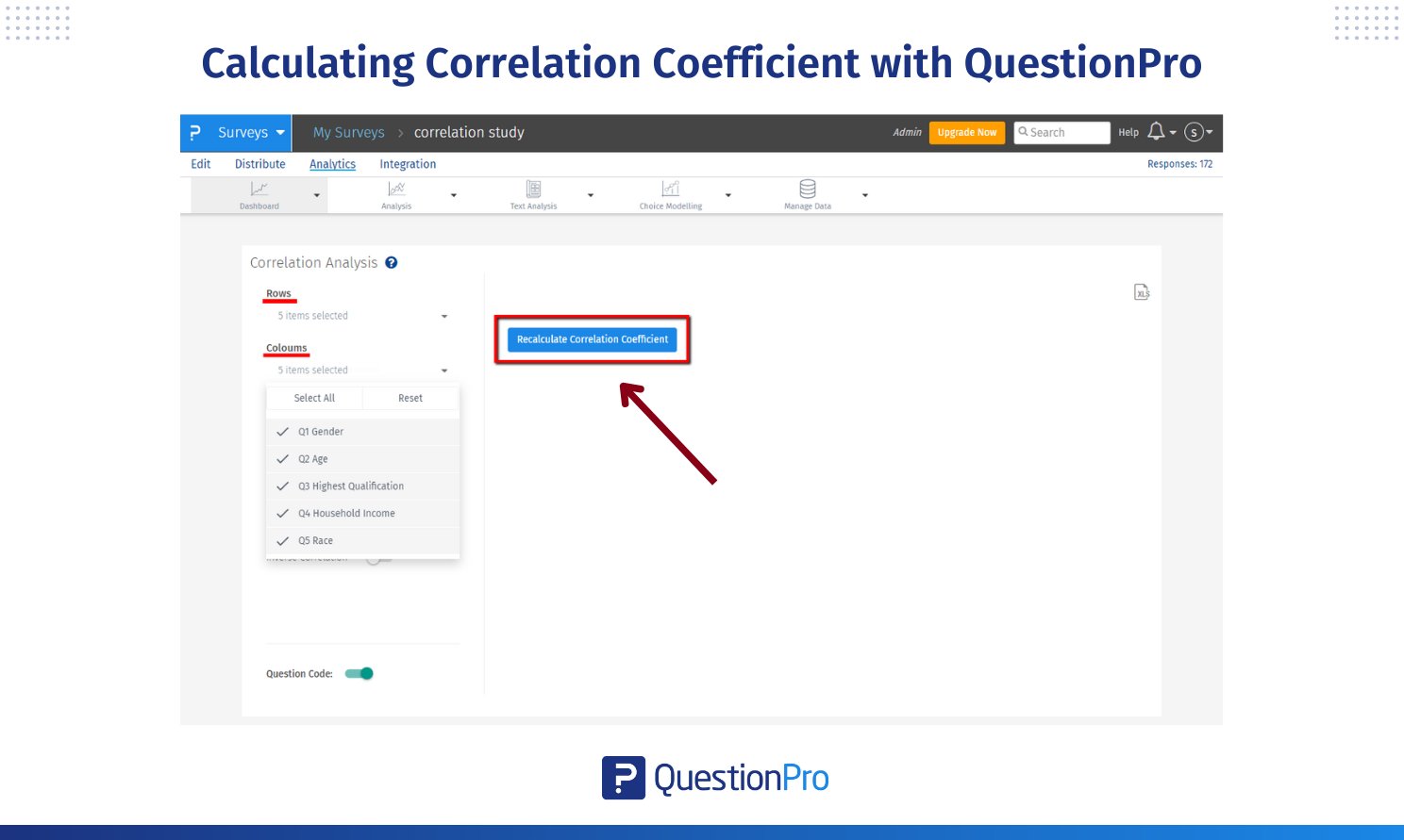
When you open the correlation analysis tool, a 2 × 2 matrix will be displayed.
- This matrix shows the correlation coefficient for the first two questions in your survey.
- The matrix helps you to see the relationship between these variables.
If you want to correlate other questions or the entire survey:
- Select the questions you want to correlate in the Rows and Columns sections.
- To see all questions, select all in the Rows and Columns.
- Click Recalculate Correlation Coefficient to get a new correlation report.
The correlation matrix uses threshold-based color coding to make the strength of relationships easier to interpret.
Direct Correlation (Positive):
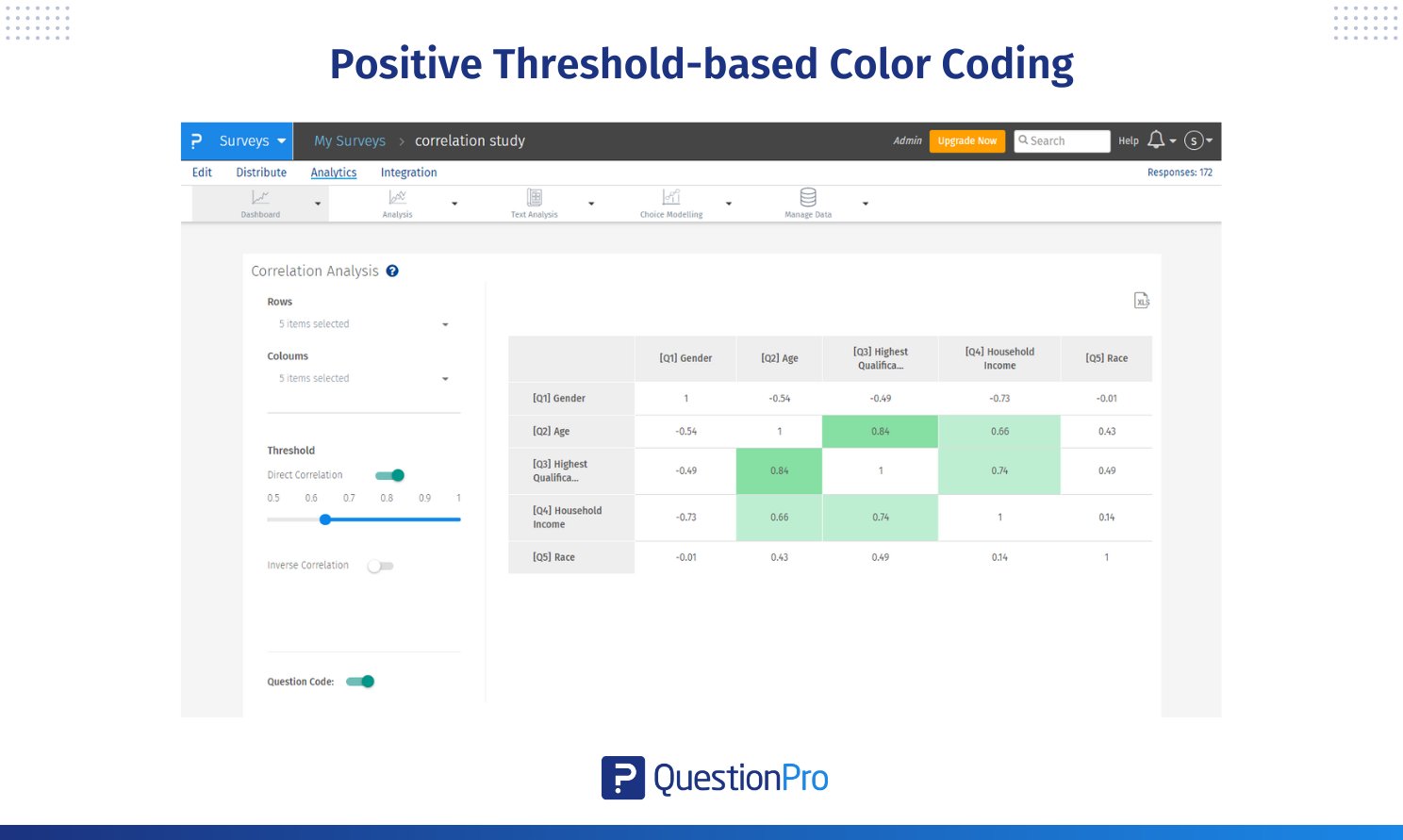
- Light Green: Correlation coefficients between 0.65 and 0.80, indicating a low-strength positive relationship.
- Medium Green: Coefficients between 0.80 and 0.90, indicating a moderate-strength positive relationship.
- Dark Green: Coefficients above 0.90, indicating a high-strength positive relationship.
This implies there is a very strong association between the variables. Any increase in one variable leads to an increase in another.
When the user enables inverse correlation, cells with inverse relation get highlighted. We have similar buckets in inverse correlation.
Inverse Correlation (Negative):
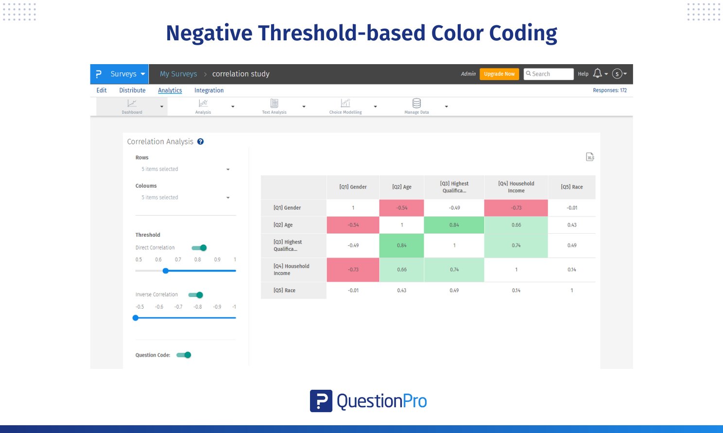
- Light Red: Correlation coefficients between -0.65 and -0.80, indicating a low-strength negative relationship.
- Medium Red: Coefficients between -0.80 and -0.90, indicating a moderate-strength negative relationship.
- Dark Red: Coefficients below -0.90, indicating a high-strength negative relationship.
Conclusion
Correlation coefficients are key to understanding relationships between variables. We’ve covered the basics of correlation analysis – from defining the correlation coefficient to interpreting the values to the different types like Pearson’s and Spearman’s. Calculating these coefficients manually or using tools like Excel is a practical application in different types of research.
While correlation analysis is valuable, it has its limitations. By understanding these concepts, you can unlock your data, make informed decisions, and find meaningful patterns. Correlation coefficients are powerful, and you can use them to level up your data analysis skills.
QuestionPro makes correlation analysis of survey data a breeze. The interface has a correlation matrix with built-in threshold-based color coding, so you can see the strength and direction of relationships between variables. You can select specific questions or all questions. The platform also supports inverse correlations, so you can see both positive and negative relationships.
Whether you are analyzing customer feedback or academic research data, QuestionPro’s correlation analysis tool is a powerful way to find patterns and relationships and make data-driven decisions.
Frequently Asked Questions (FAQs)
Answer: 𝑟 is the correlation coefficient, which shows the strength and direction of the relationship between variables, while 𝑟², or the coefficient of determination, shows how well the model explains the variance in the data.
Answer: 0.8 means a fairly strong positive relationship between two variables, so as one variable increases, the other tends to increase a lot. This is considered a significant relationship in the data.
Answer: The main difference between Pearson’s and Spearman’s correlation is that Pearson measures linear relationships in quantitative data, while Spearman measures monotonic relationships in ranked data and is applicable to ordinal or non-normal data.
Answer: Outliers can severely distort correlation coefficients like Pearson’s and give misleading results for the relationship between variables. You need to identify and address outliers during correlation analysis.
Answer: Correlation can show the relationship, but cannot be used for prediction without significant values and a clear line in the data. So, be careful when using correlation for prediction.