


Comparative Chart Widget in TextAI
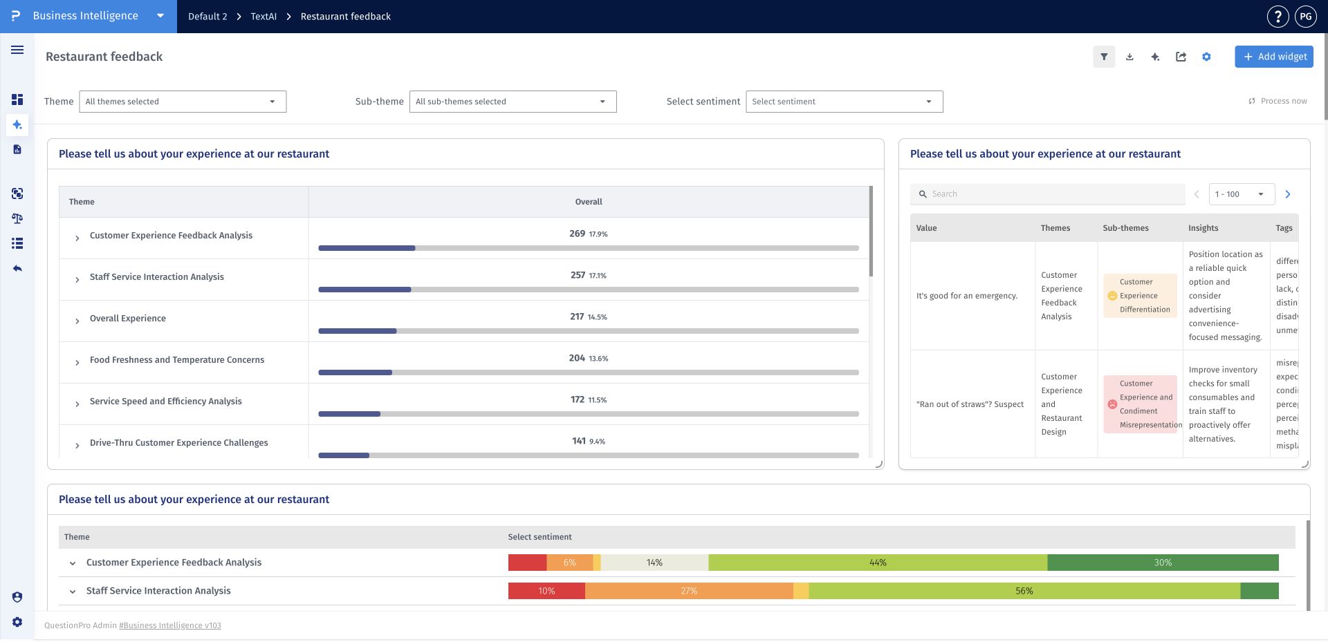
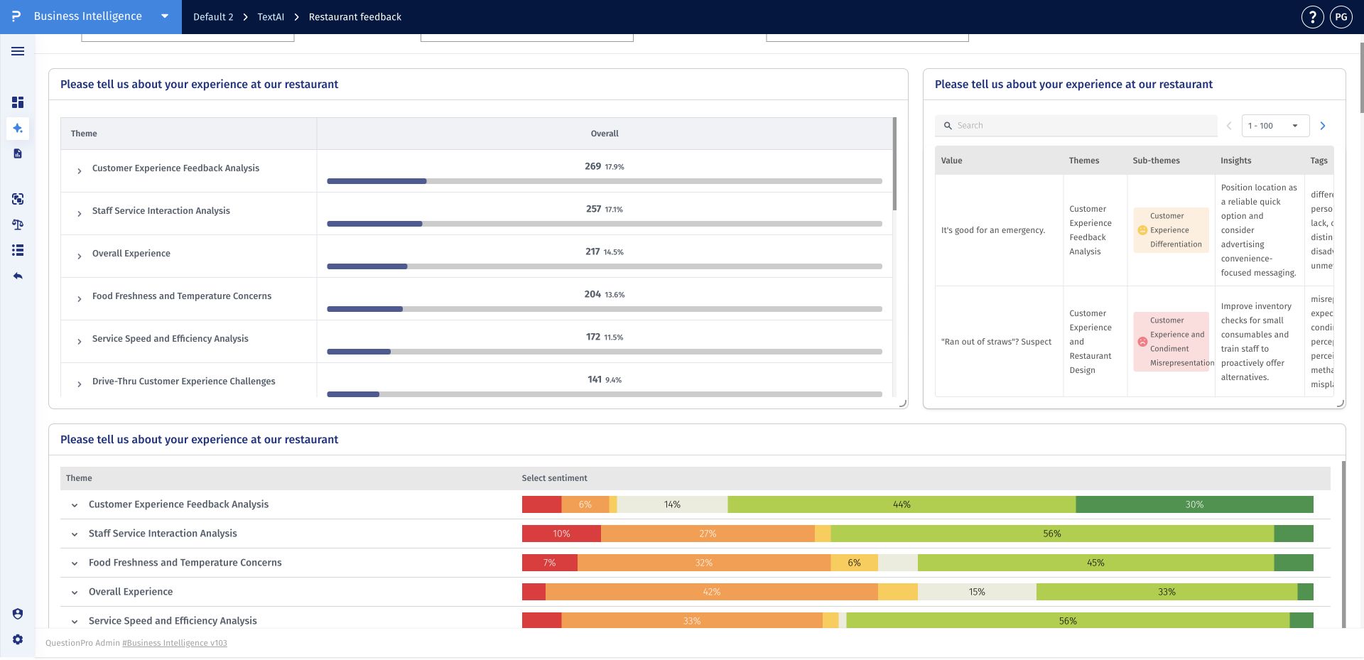
The Comparative chart widget ranks the themes detected in an open-ended question and shows each theme's response count and percentage. Horizontal bars make it easy to compare the relative prominence of themes within the analyzed responses.
Use this widget when you need a compact frequency-based view of the theme structure. The ranked layout helps identify leading themes, less common topics, and categories that may require deeper review.
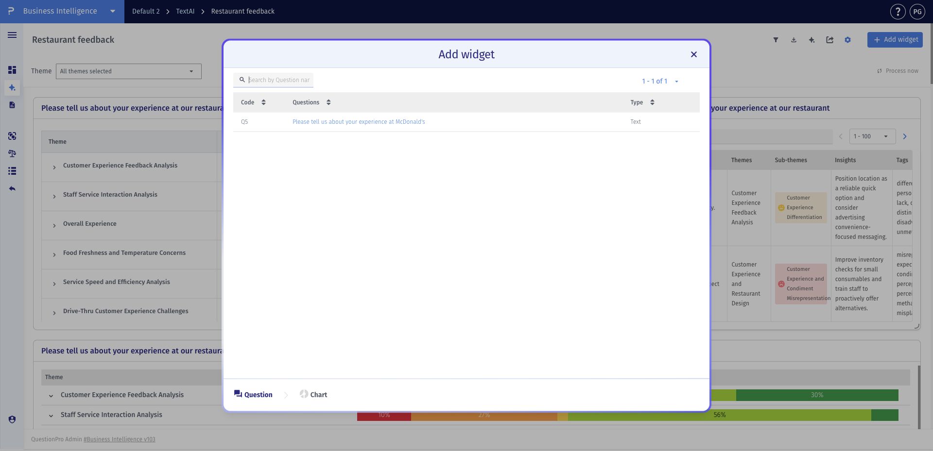
- Step 1: Open a TextAI dashboard and click Add widget.
- Step 2: Select the open-ended question whose themes you want to compare.
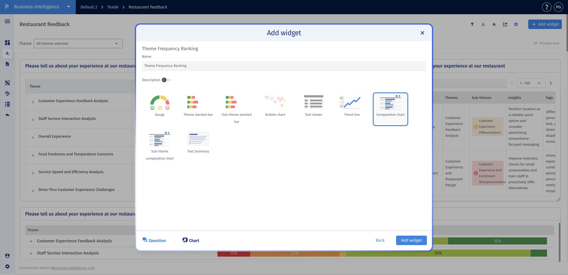
- Step 3: Choose Comparative chart, enter a clear widget name, and click Add widget.
- Step 4: Compare each theme's count, percentage, and horizontal bar to identify the most prominent categories.
This feature is available with the following licenses :
Research Edition Communities Customer Experience Employee Experience University - Research Edition
