- Custom Variable Widget
- Priority Matrix
- Heatmap Widget
- Grid Widget
- Weighted mean widget
- Comment List widget
- Widget Filters
- Ranking List Widget
- Distribution Chart
- NPS Widget
- Trend Widget
- Word Cloud Widget
- Cross tab widget
- KPI Comparison Widget
- Bubble chart
- Custom Metric Trend Chart
- Trend Comparison Widget
CX-Sentiment and Root cause analysis
- Click on Add Widget
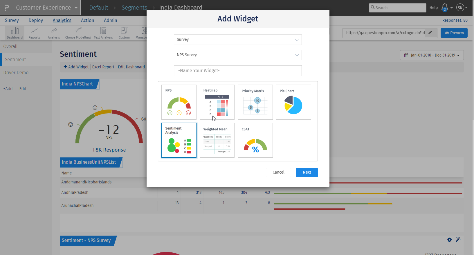
- In the Add widget pop-up, select a widget type - 'Survey'
- Select the Survey for which you want to view the analytics
- After selecting the survey, different types of charts will be visible to you. The list of which is as follows -
- Survey NPS
- Heat Map
- Priority Matrix
- Pie Chart
- Sentiment Analysis
- Click on Sentiment Analysis widget
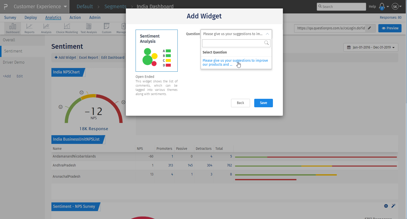
- From the select question drop-down, select an open-ended question
- Click on Save to add the widget on Dashboard
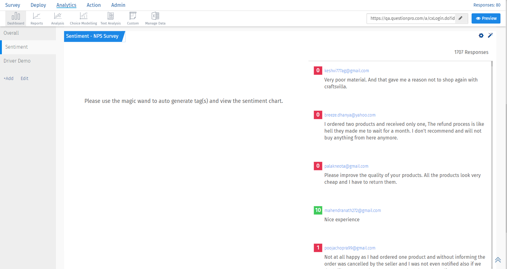
- After you add the widget, click on the magic wand displayed at the top right corner of the widget.
- Wait for some time while the tags are being generated.
- Reload the page after some time, the tags and a bubble chart will populate on the widget. It will show the top 10 tags for that particular question.
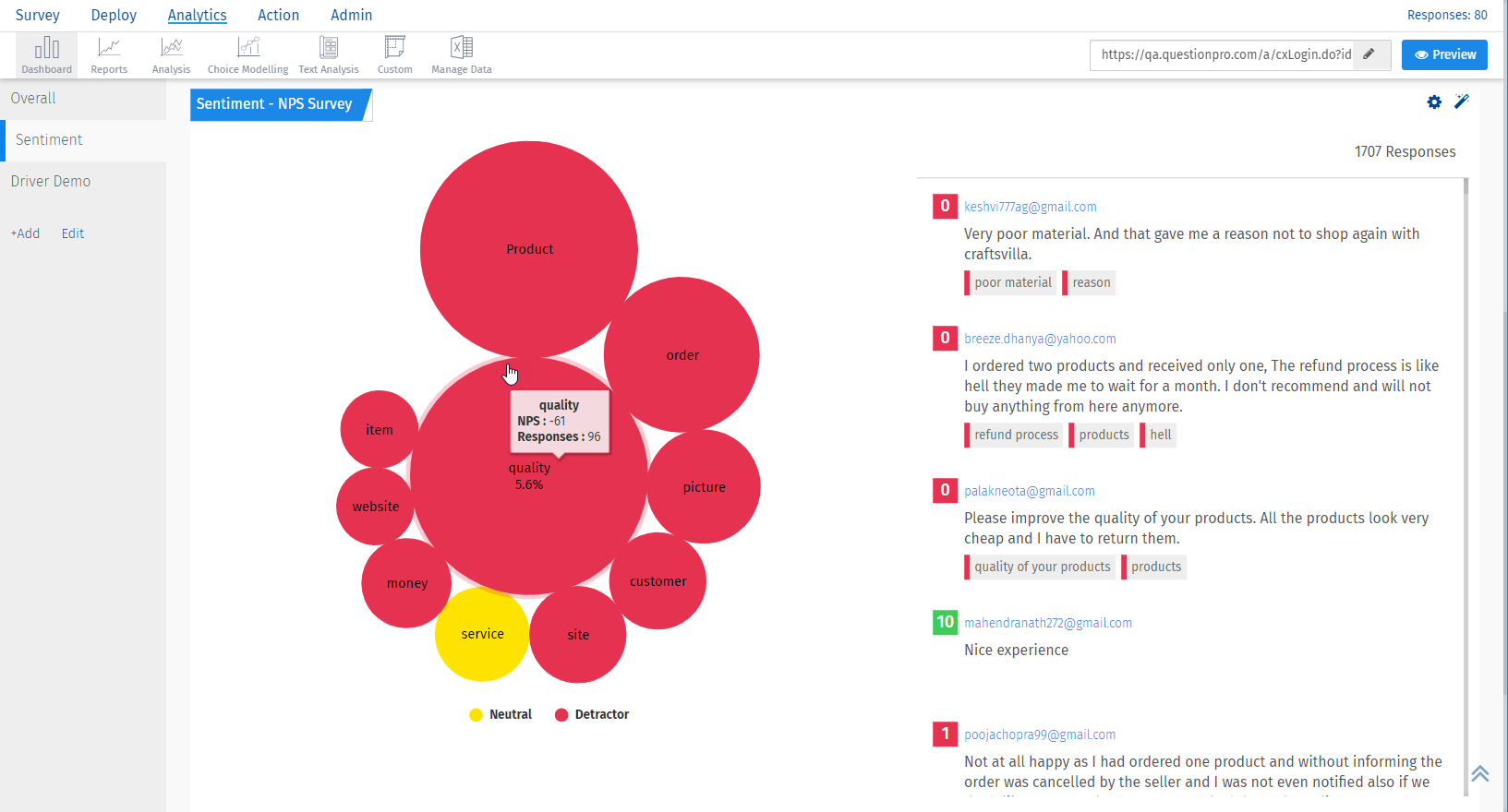
The sentiment analysis is no magical calculation.
The auto tag option brings the tags and the sentiment score associated with those tags from IBM Watson and those tags are displayed along with each comment in the widget.
You can understand all the components of the tags here:
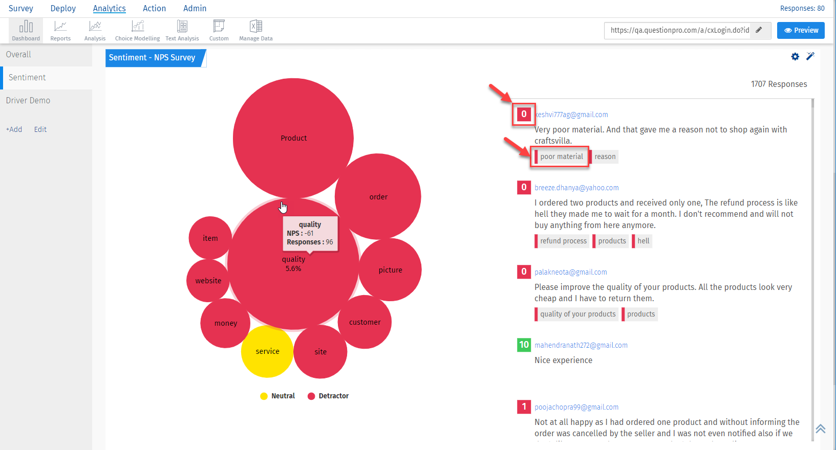
- The tags below each comment are the ones associated with each comment
-
The colour bar on the left of the tag is the sentiment for that tag. Below are the colours and its meanings:
- Green - Positive
- Yellow - Neutral
- Red - Negative
- The number which is shown with each comment is the NPS score.
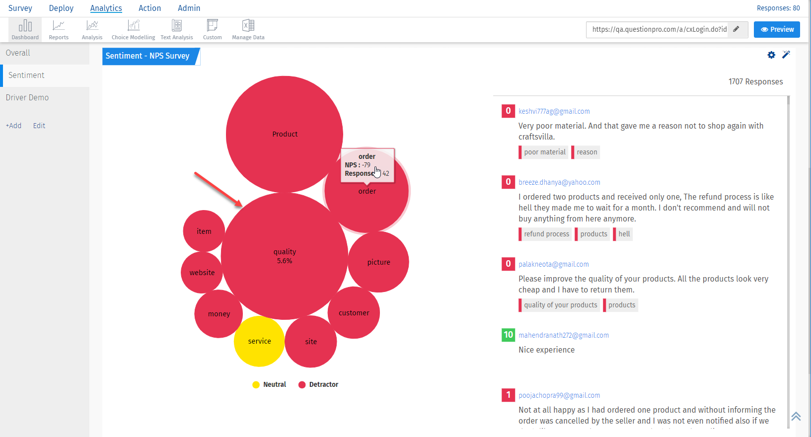
Sentiment analysis provides you the option to drill down on a tag to reach to the root cause of the issue. Find out how!
Click on the tag you want to drill down from the chart. From the big percentage figure, you can check out the proportion of that tag in the entire data set.
 As you drill down, the comments on the right section will be filtered based on the tag you have selected.
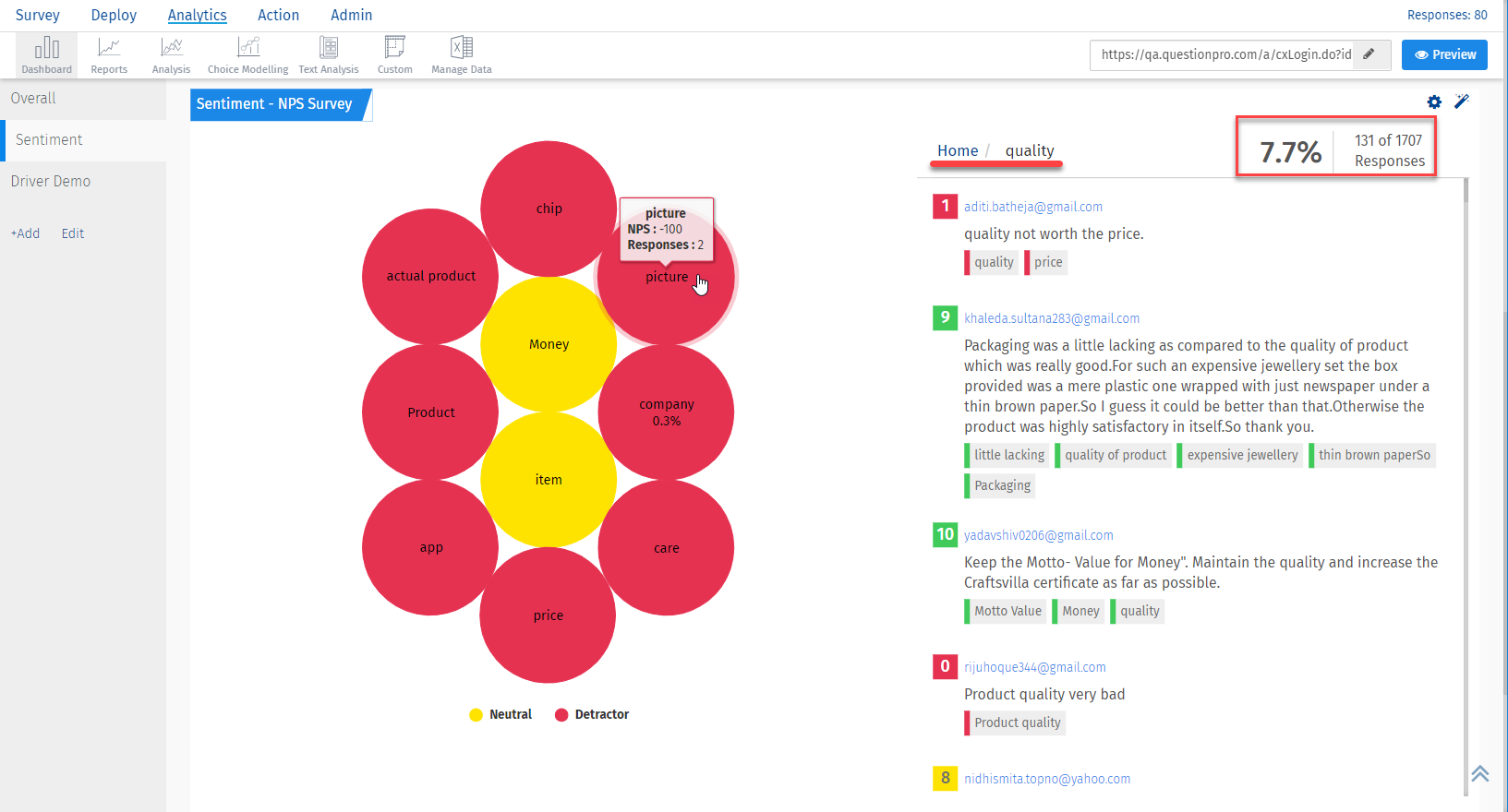 You can drill down further to reach to the minimum number of comments related to the chosen tags.
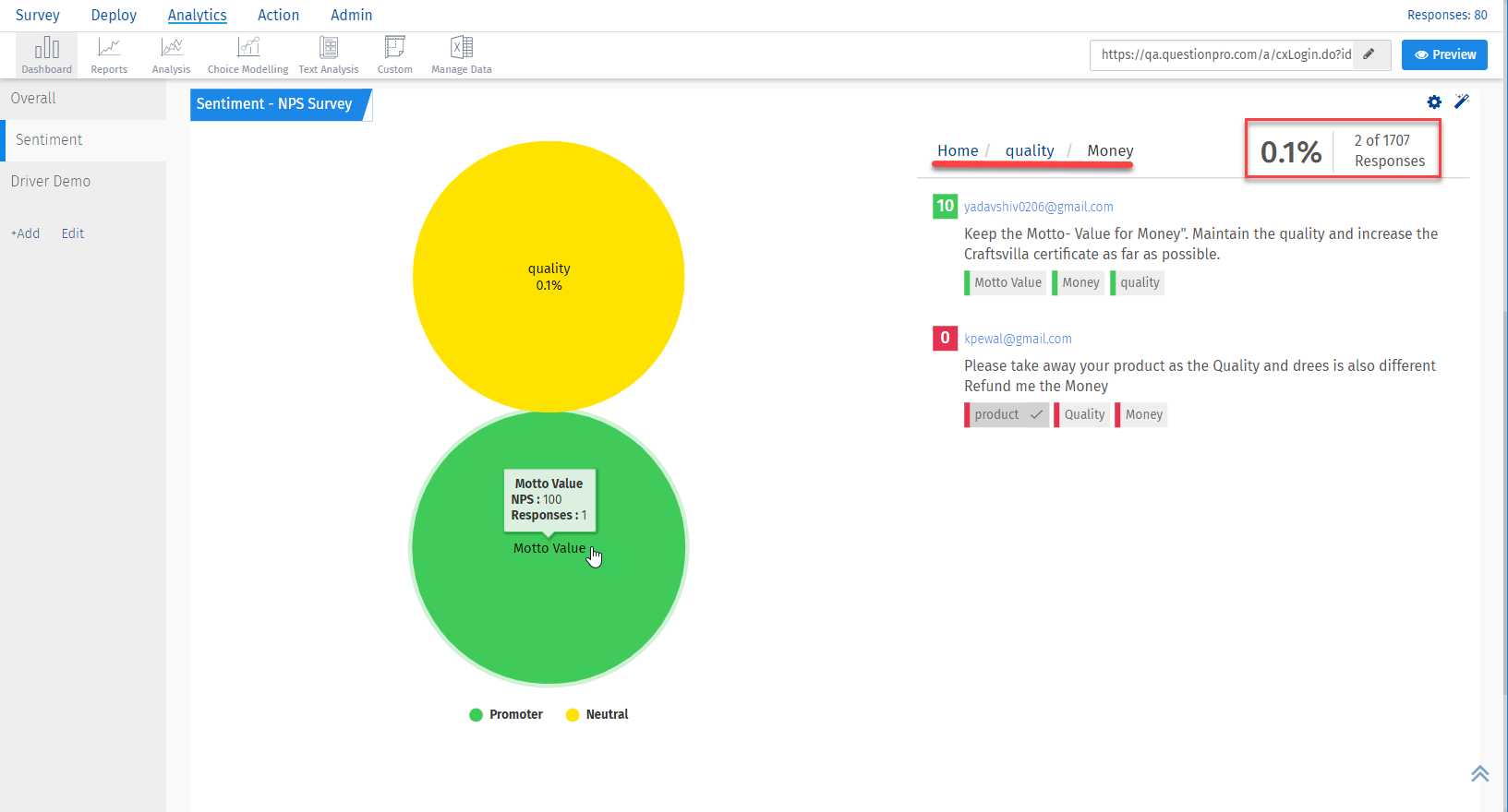 This way the chart and the comments help you reach to the base level/ root cause of the problem.
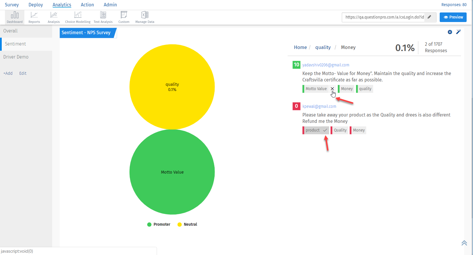
Yes, the tags can be muted/unmuted based on relevance.
Hover over the tag and click on the 'Cross(X)' to stop viewing any tag in the chart. Similarly, you can anytime click on the 'tick mark' present on the muted tag to start viewing it all over again.
This feature helps you keep the relevance of the chart intact.
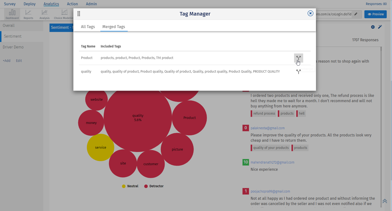
Yes, two or more tags can be merged into one. Find out how!
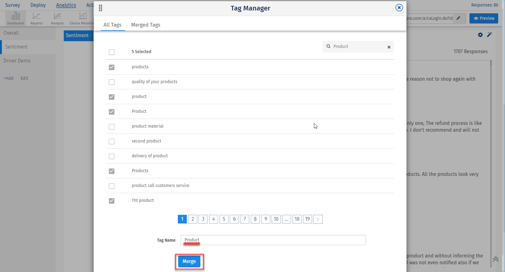
- Go to Tag manager(settings icon next to auto-tag options)
- Search and select the tags you want to merge.
- Provide a relevant name to the merged tag.
- Click on Merge.
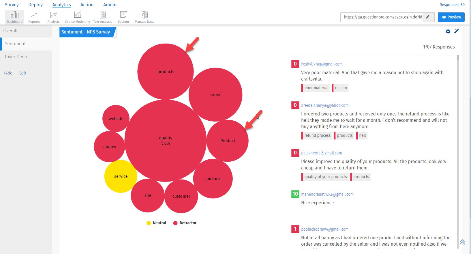
 The chart will show up merged tags.
 Similarly, if you want to unmerge the tags, you can go to Merged tags tab and unmerge from there
