

- Custom Variable Widget
- Priority Matrix
- Heatmap Widget
- Grid Widget
- Weighted mean widget
- Comment List widget
- Widget Filters
- Ranking List Widget
- Distribution Chart
- NPS Widget
- Trend Widget
- Word Cloud Widget
- Cross tab widget
- KPI Comparison Widget
- Bubble chart
- Custom Metric Trend Chart
- Trend Comparison Widget

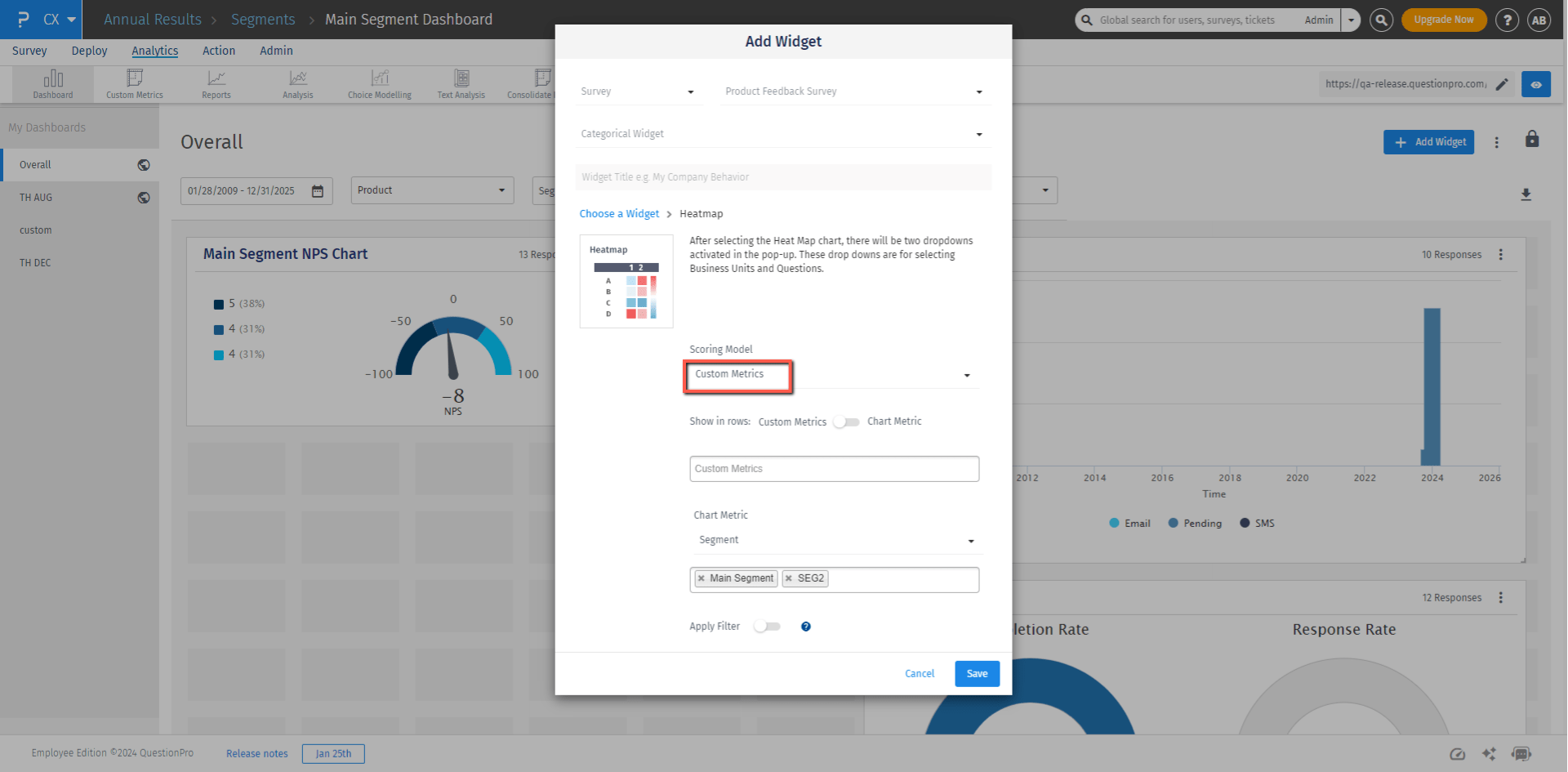
Heatmap Widget
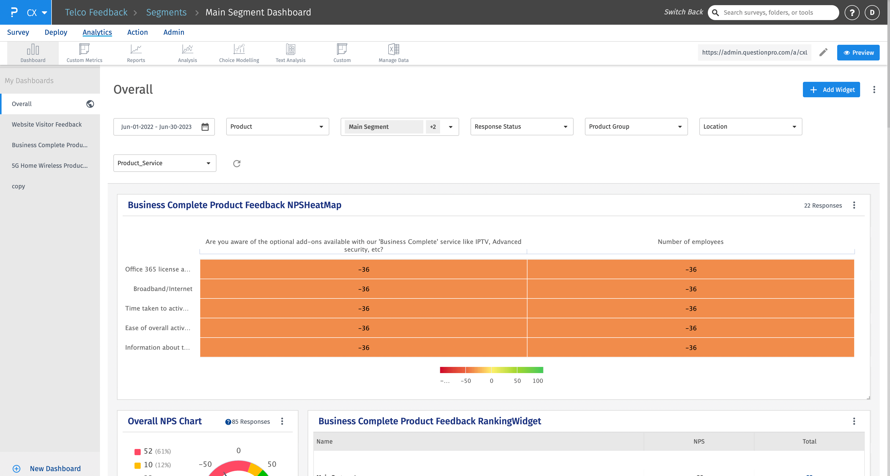
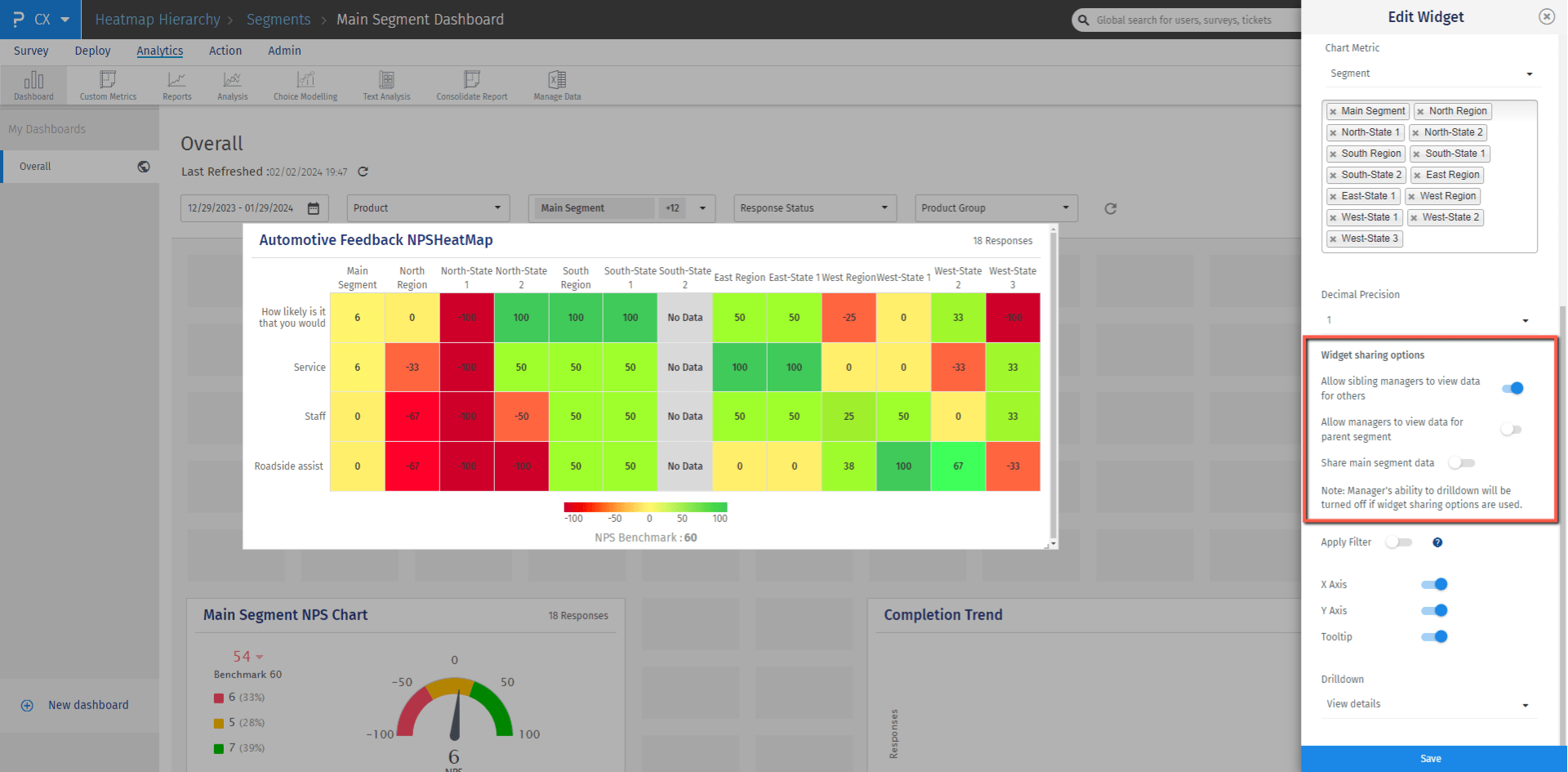
The Heatmap widget can be used to understand which is the weakest touchpoint for a segment and let you compare a touchpoint accross different segments. After Analysing this widget, you will be able to figure out which touchpoint-segment combination has the minimum and maximum NPS score.
The color shades range from dark red to dark green, darkest red represents the highest negative score(-100) and darkest green represents the highest positive score (100).
The score is calculated by comparing the responses of the question with the responses of the benchmarked NPS question.
In addition to NPS, other scoring models such as CSAT, mean, and custom metrics are also supported in the heatmap widget. In case of these scoring models, colors of the heatmap are plotted based on the maximum and minimun values of these scores.
- Login to CX
- Go to Analytics
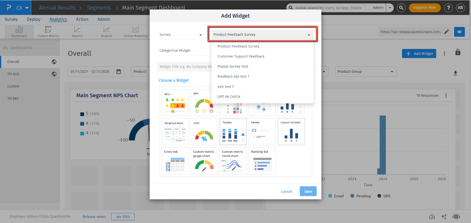
- Click on + Add Widgetbutton
- Select the 'Survey' from the survey type drop down
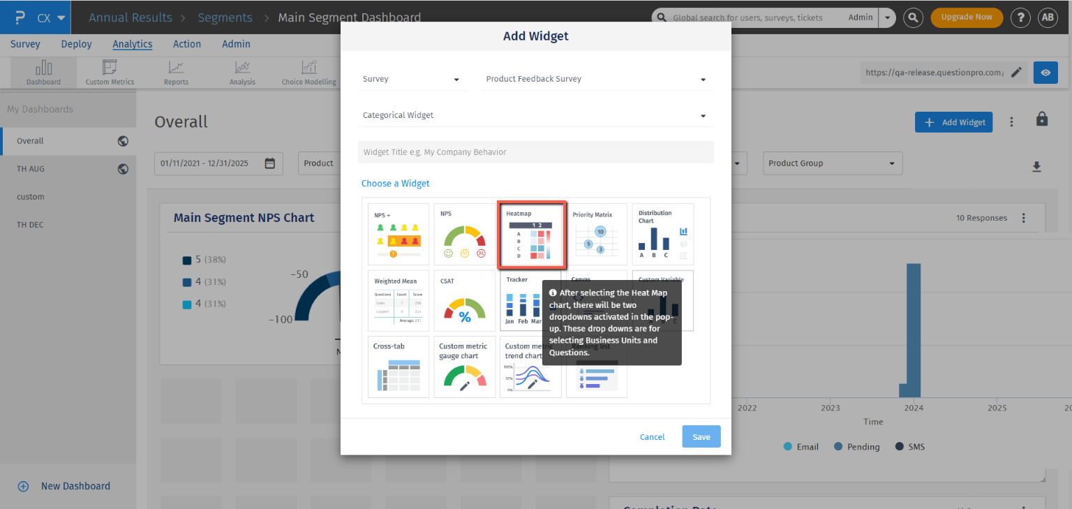
- Select the 'Heatmap' widget
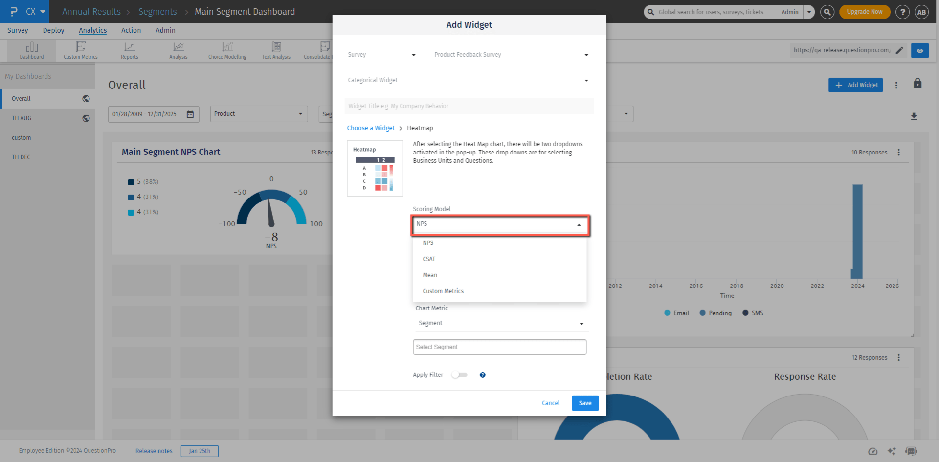
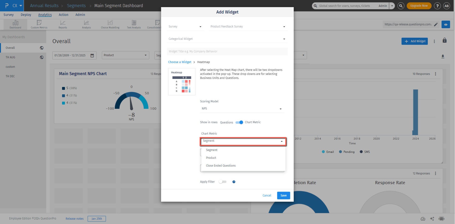
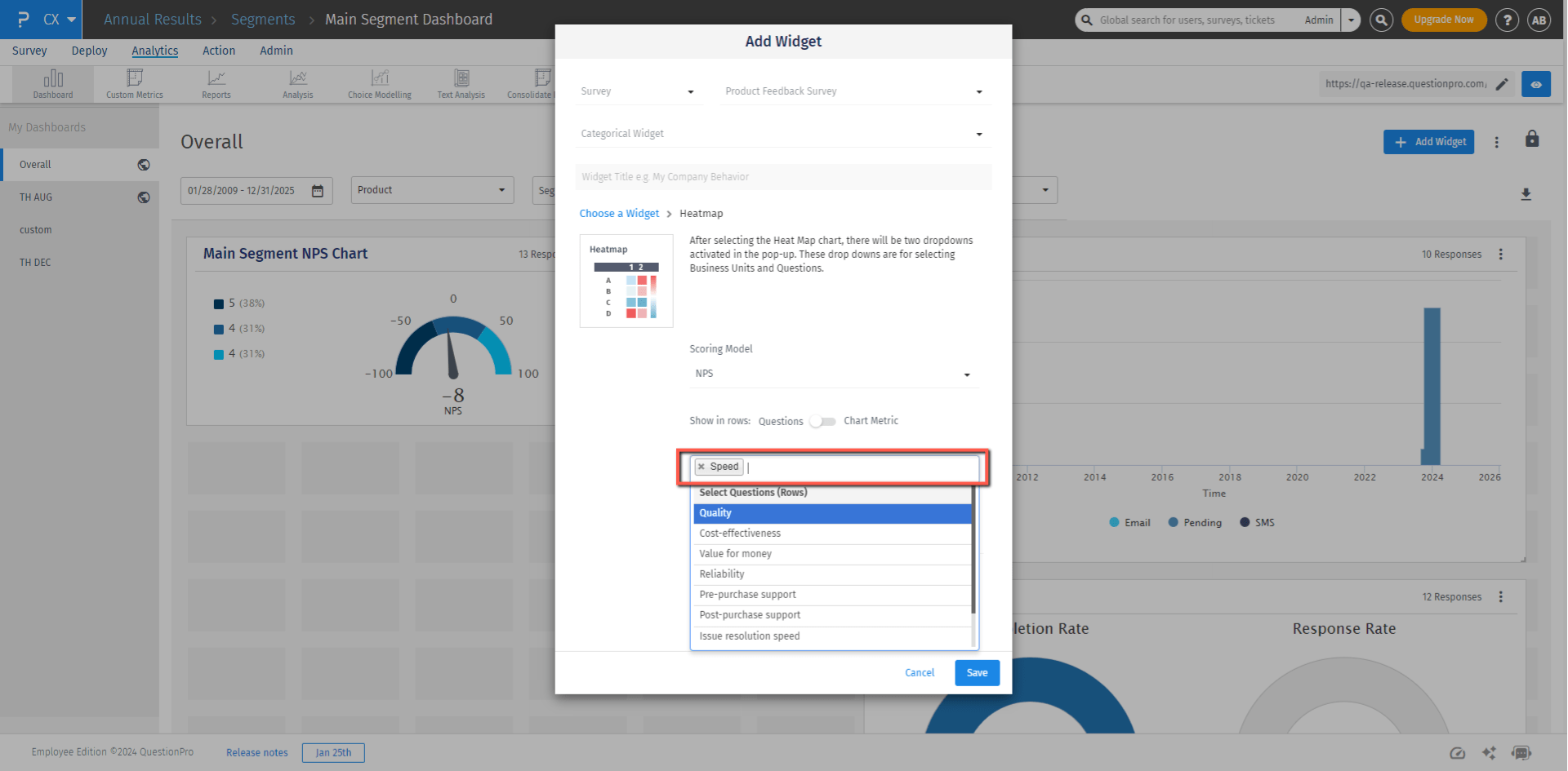
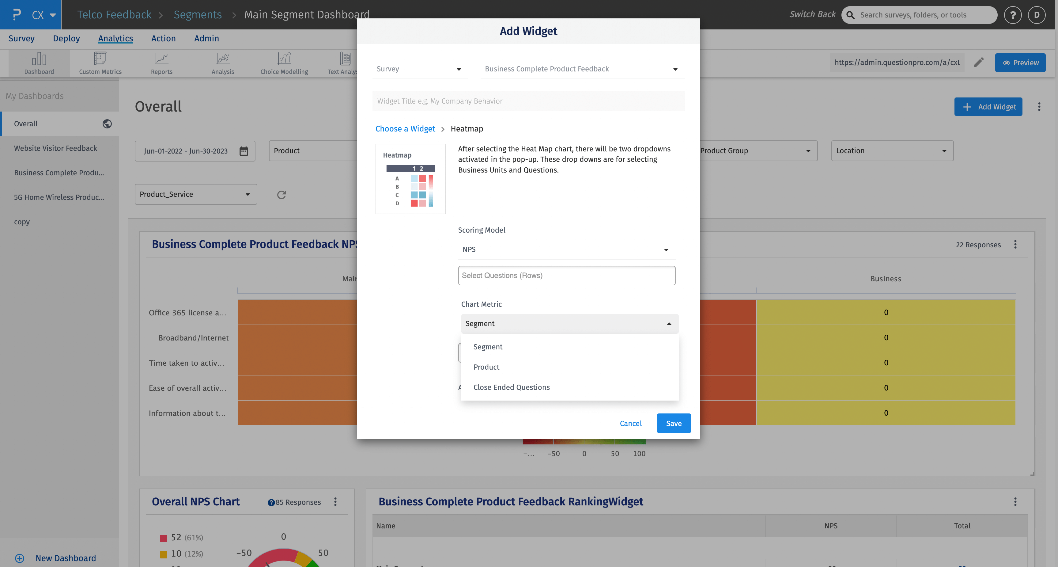
- On the next screen, select the requried scoring model from NPS, CSAT, mean, or cutom metrics.
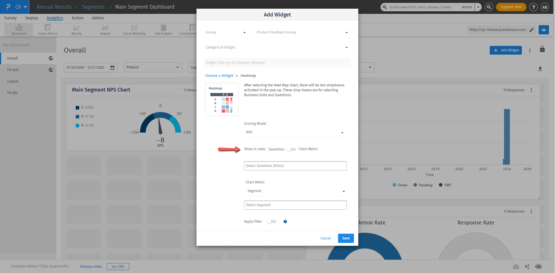
- You can choose what to show in rows and columns as per your requirement using the Show in rows option. By default, questions will be selected in rows.
- If you change the Show in rows to Chart Metric; you can choose either segments, product, or closed ended questions to be shown in the rows. And questions will be shown in columns now.
- Select the segments, products, questions, or custom metrics which you want to compare in the chart
- User can turn on the apply filter toggle button and apply 'Product', 'Product Group' or 'Custom Varable filter'filter
- Click on Save to add the widget on the CX analytics
Heatmap provides options to represent columns by segments, products, or closed-end questions. This feature empowers users to customize their heatmaps by selecting the specific data categories they wish to visualize, enabling more focused and granular analysis of the information presented.
- While adding the widget you can choose the chart metric which consists of options like open ended questions, segment and products which can be represented as columns. For each option there is a multi choice list provided which can be selected as required. The same options are also available while editing the widgets.
- In the image below, the rows represent the questions and the columns represent the chart metric which is open ended questions in this case.
While adding heatmap widget, you can choose mean and custom metrics soring models. When mean scoring model is choosen, mean scores will be used to plot the heatmap cell values.
Custom Metrics: All the custom metrics which are already created and saved in the workspace can be used here to plot the heatmap widget. These custom metrics can be either added to rows or columns. One row or a column for each selected custom metric will be added to the heatmap widget.
The following three are the key widget sharing options present in the Heatmap widget settings: These widget-sharing options are useful while sharing the dashboards with the managers. These options are accessible only to the admin of the account. Multiple toggles can be used simultaneously as per the requirement.
- Allow sibling managers to view data for others – When turned on, managers will be able to see heatmap columns/rows of their sibling managers (managers from the same segment only) along with their data columns/rows.
- Allow managers to view data for parent segment – When turned on, managers will be able to see heatmap columns/rows of their parent segment along with their data columns/rows.
- Share main segment data – When turned on, managers will be able to see the main segment column/row in addition to their columns/rows.
Below question types can be analysed using Heatmap widget:
- Text slider
- Tube pulse
- Single Matrix (Multi-point Scales)
- Customer Satisfaction (CSAT)