

- Custom Variable Widget
- Priority Matrix
- Heatmap Widget
- Grid Widget
- Weighted mean widget
- Comment List widget
- Widget Filters
- Ranking List Widget
- Distribution Chart
- NPS Widget
- Trend Widget
- Word Cloud Widget
- Cross tab widget
- KPI Comparison Widget
- Bubble chart
- Custom Metric Trend Chart
- Trend Comparison Widget

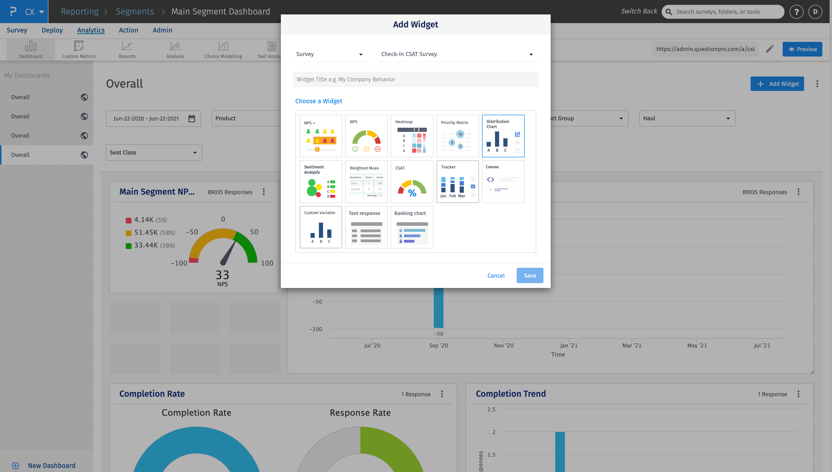
Distribution Chart Widget
What is a Distribution chart widget?
A distribution chart widget in a customer experience management platform is a graphical representation that displays the distribution of customer feedback or ratings across different categories or metrics. It helps businesses analyze and visualize customer sentiment or satisfaction levels to gain insights into their overall customer experience.
The distribution chart widget typically presents data in the form of a histogram or a bar chart, where the x-axis represents the categories or metrics being measured, and the y-axis represents the frequency or percentage of customer responses falling within each category. The bars or bins on the chart indicate the distribution of customer feedback or ratings across the different categories.
How to add distribution chart widget at the survey level?
Follow the steps below to add a distribution chart widget at survey level.
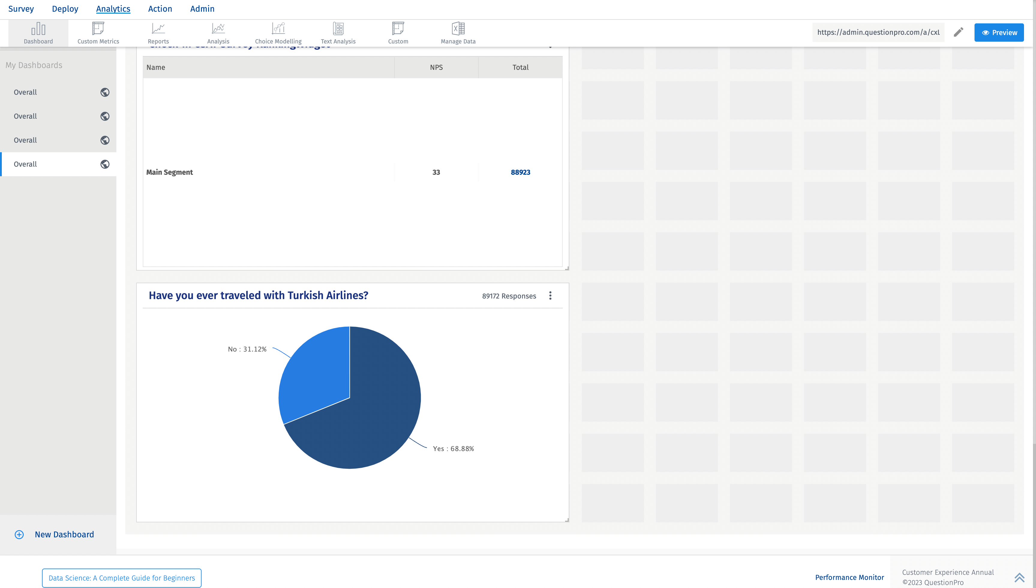
- Click on Add widget button. Select the Distribution Chart. You can select the criteria that includes segments, products, product groups or custom variables. You can also add question filters.
- Distribution chart widget will be added in the dashboard.
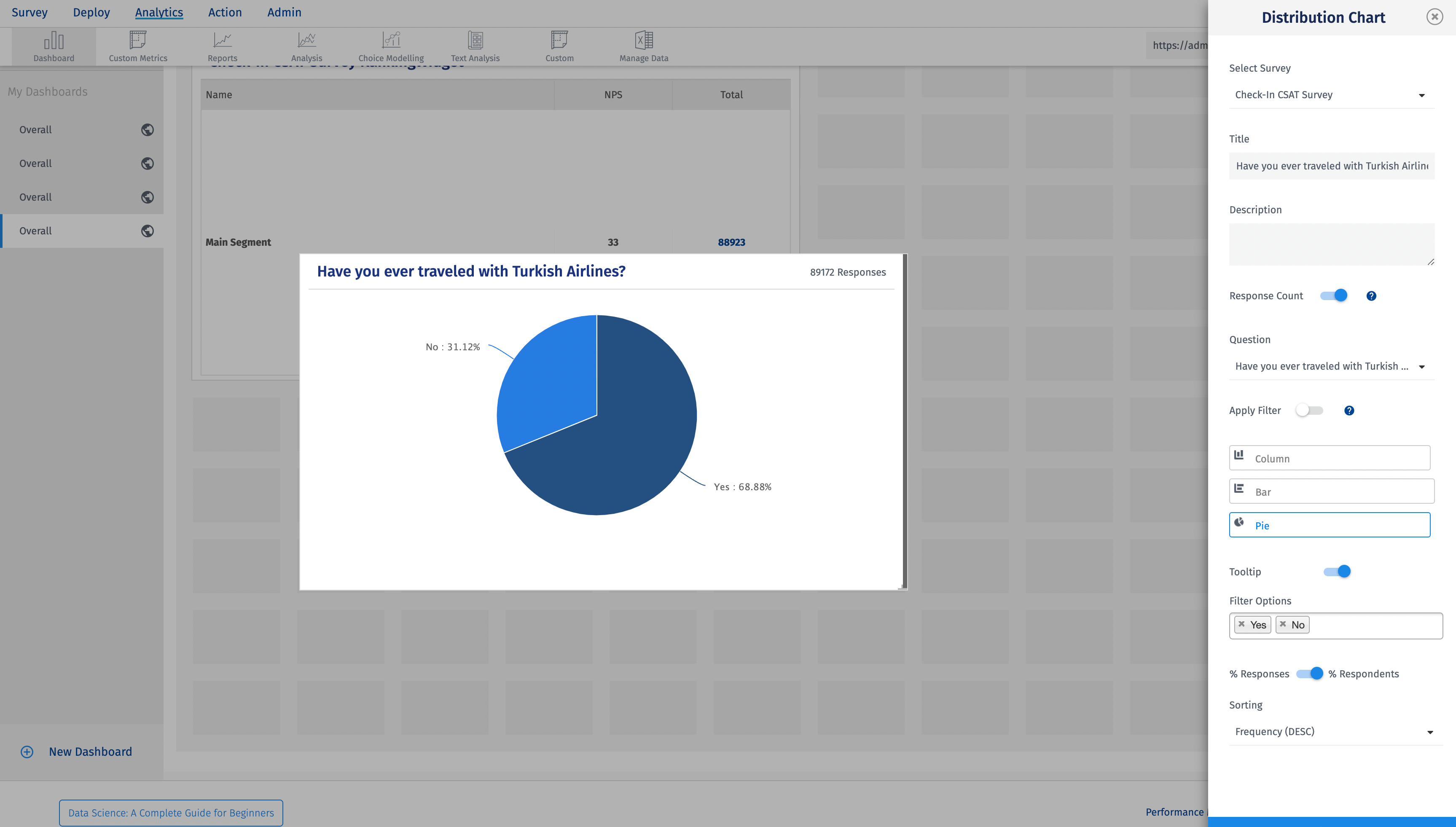
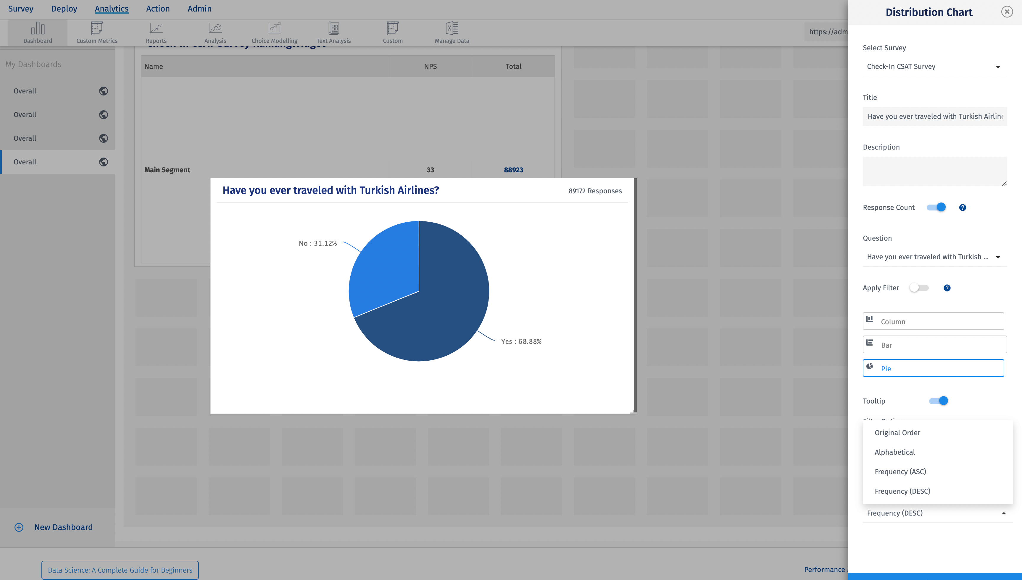
What options are available to customize the Distribution Chart?
You have multiple filter options for this chart.
- Filter answer options - You can add/remove answer options as per the requirement.
- Reponses vs Respondents - You can view the distribution based on the %responses or %respondents.
- Sorting - You can sort the distribution in ascending and descending order based on the frequency, you can keep the original order or sort alphabetically.
You may also be interested in...