

- Custom Variable Widget
- Priority Matrix
- Heatmap Widget
- Grid Widget
- Weighted mean widget
- Comment List widget
- Widget Filters
- Ranking List Widget
- Distribution Chart
- NPS Widget
- Trend Widget
- Word Cloud Widget
- Cross tab widget
- KPI Comparison Widget
- Bubble chart
- Custom Metric Trend Chart
- Trend Comparison Widget

Feedback Intercept - Widget Settings
The Widget Settings page allows you to customize the appearance, position, dimensions, and behavior of the Feedback Intercept widget. These settings help you match the widget with your website branding while providing visitors with an easy way to launch and complete your feedback survey.
To access the Widget Settings page:
- Select the Workspace in which you want to create the intercept.
- Select the Project where the intercept will reside.
- Click Create Intercept.
- Select the Feedback intercept type.
- Choose the survey you want to associate with the intercept.
- After the intercept is created, navigate to the Widget Settings tab to customize the appearance and behavior of the feedback widget.
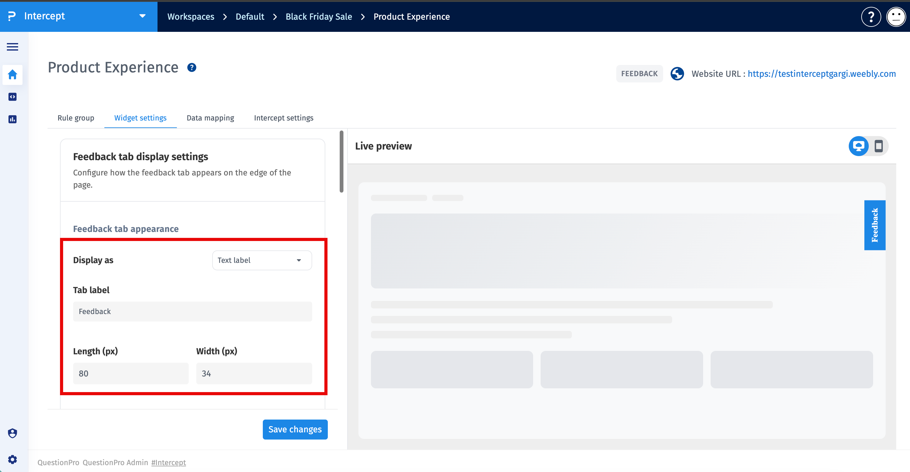
The Feedback Tab Display Settings section allows you to customize how the feedback launcher appears on your website.
Feedback Tab AppearanceConfigure the display style of the feedback launcher.
-
Display As
Select how the feedback launcher appears on your website.
- Text - Displays the launcher as a text-based feedback tab.
- Logo - Displays your uploaded logo as the feedback launcher.
- Logo and Image - Displays both a logo and an image as the feedback launcher.
- Plus Icon - Displays a floating "+" icon that visitors can click to launch the feedback survey.
-
Tab Label
Specify the text displayed on the feedback tab. This text can be customized to suit your website.
-
Length (px)
Specifies the length of the feedback tab in pixels.
-
Width (px)
Specifies the width of the feedback tab in pixels.

-
Transparent Background
Enable this option to display only the tab label without a background color.
-
Tab Color
Select the background color of the feedback tab.
-
Label Color
Select the text color displayed on the feedback tab.
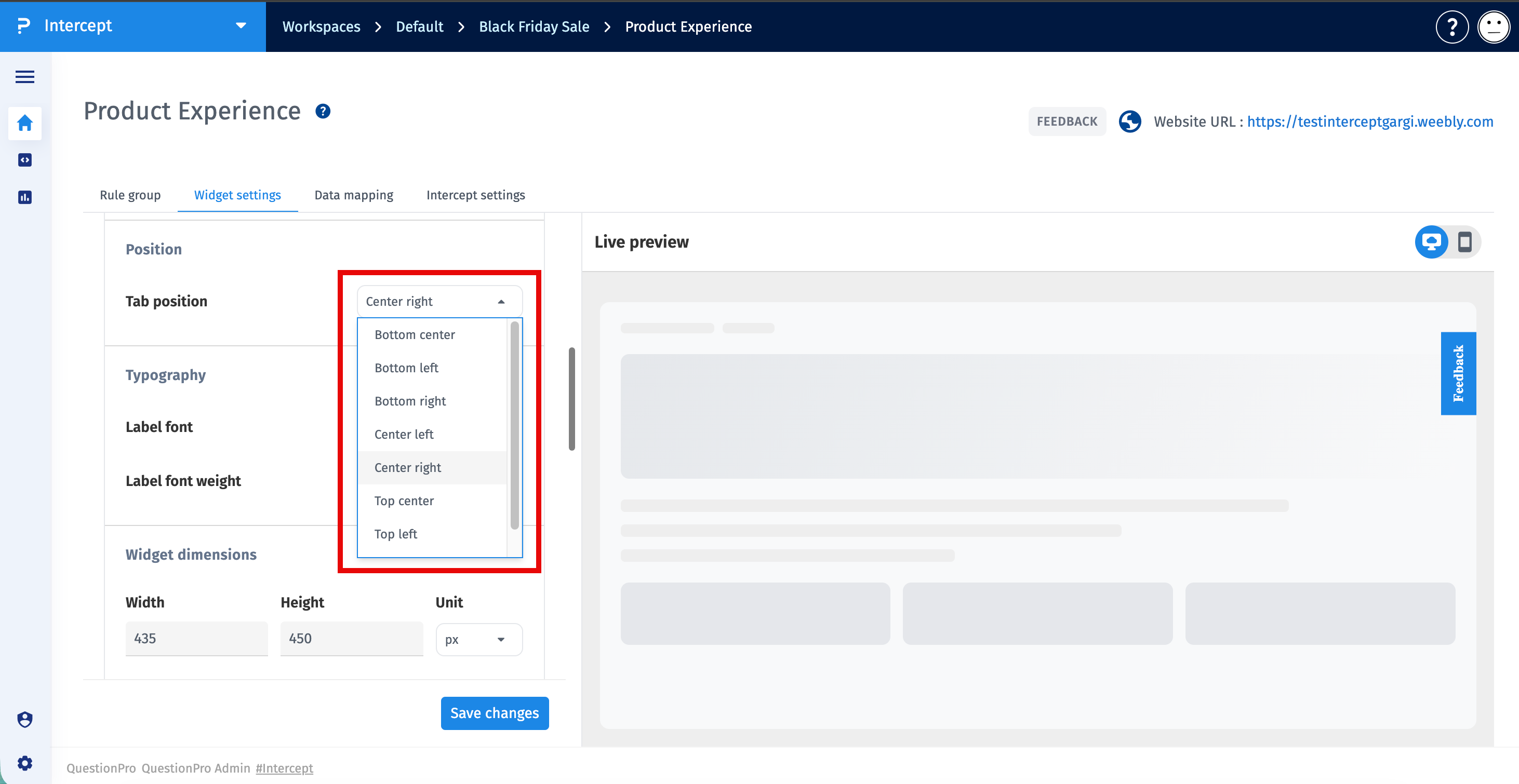
Use the Position section to choose where the feedback launcher appears on your website.
- Bottom Center
- Bottom Left
- Bottom Right
- Center Left
- Center Right
- Top Center
- Top Left
- Top Right
The selected position determines where the feedback launcher is displayed on every page where the intercept is active.
Use the Typography section to customize the appearance of the feedback tab label.
-
Label Font
Select the font family used for the feedback tab label.
-
Label Font Weight
Choose the font weight for the label text. Available options depend on the selected font.
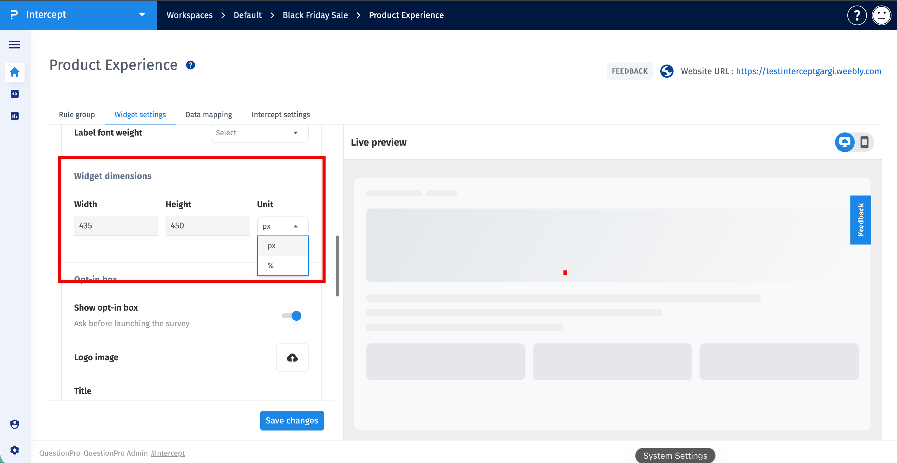
The Widget Dimensions section controls the size of the survey widget displayed after visitors click the feedback launcher.
-
Width
Specify the width of the feedback widget.
-
Height
Specify the height of the feedback widget.
-
Unit
Select the unit of measurement for the widget dimensions. You can choose between the following options:
- Pixels (px) – Uses fixed dimensions for the widget. The widget maintains the specified width and height regardless of the screen size.
- Percentage (%) – Uses responsive dimensions based on the available browser or container space. The widget automatically scales to provide a better viewing experience across different screen sizes and devices.
The Opt-in Box displays an invitation before the survey opens, allowing visitors to decide whether they want to participate.
-
Show Opt-in Box
Enable this option to display the invitation before launching the survey. When disabled, clicking the feedback launcher opens the survey immediately.
-
Logo Image
Upload a logo to display within the opt-in box.
-
Title
Enter the title displayed at the top of the opt-in box. Rich text formatting options are available.
-
Subtitle
Enter supporting text displayed below the title. Rich text formatting options are available.
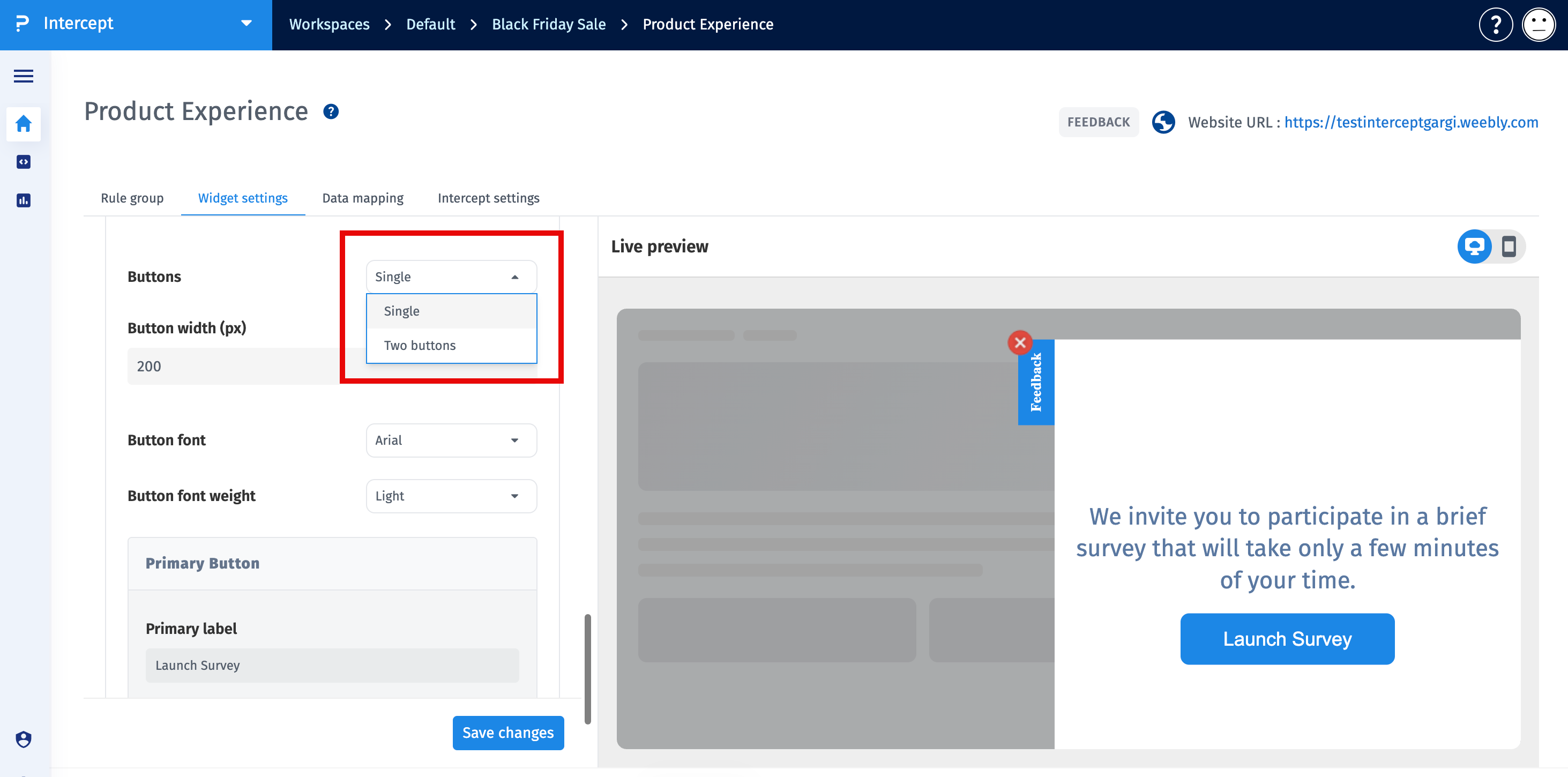
Configure the appearance and behavior of the buttons displayed within the opt-in box.
-
Buttons
Select whether the opt-in box displays one button or two buttons.
-
Layout
Choose whether the buttons are displayed horizontally or vertically.
-
Button Width (px)
Specifies the width of each button.
-
Button Font
Select the font family used for the button labels.
-
Button Font Weight
Select the font weight used for the button labels.
- Primary Label - Specifies the text displayed on the primary button.
- Button Color - Select the background color for the primary button.
- Text Color - Select the text color for the primary button.
This section is available only when Two Buttons is selected.
- Secondary Label - Specifies the text displayed on the secondary button.
- Button Color - Select the background color for the secondary button.
- Text Color - Select the text color for the secondary button.
- Use a clear and descriptive feedback tab label.
- Position the feedback launcher where it is easy to find without obstructing website content.
- Use colors that align with your website branding while maintaining readability.
- Keep the opt-in invitation concise to encourage participation.
- Use the live preview to verify your changes before saving.
