

- Custom Variable Widget
- Priority Matrix
- Heatmap Widget
- Grid Widget
- Weighted mean widget
- Comment List widget
- Widget Filters
- Ranking List Widget
- Distribution Chart
- NPS Widget
- Trend Widget
- Word Cloud Widget
- Cross tab widget
- KPI Comparison Widget
- Bubble chart
- Custom Metric Trend Chart
- Trend Comparison Widget

Floating Plus Icon Intercept
The Floating Plus Icon is a Feedback Intercept that provides visitors with an easy and unobtrusive way to share feedback from their website.
Instead of displaying a text-based feedback tab, the Floating Plus Icon displays an + icon on the edge of the webpage. Visitors can click the icon to open the configured feedback experience.
The Floating Plus Icon is part of the Feedback intercept type. It uses the same targeting, survey, widget, data mapping, and intercept configuration available for Feedback Intercepts.
The primary difference is the way the feedback launcher is displayed. The Floating Plus Icon uses a + icon instead of a text-based feedback button. Settings specifically related to the text displayed on the feedback button are therefore not applicable to this intercept.
The Floating Plus Icon is a website feedback launcher that remains available on the edge of the webpage while the visitor browses the site.
When a visitor clicks the + icon, the configured feedback experience is displayed.
The Floating Plus Icon is useful when you want to provide continuous access to feedback without taking up the space required by a traditional text-based feedback tab.
The feature can be configured using the same Feedback Intercept settings, including:
- Rule Group - Define when and to whom the intercept should be displayed.
- Widget Settings - Customize the appearance, position, dimensions, opt-in box, and buttons.
- Data Mapping - Configure the data that is passed to or associated with the feedback experience.
- Intercept Settings - Configure the behavior of the intercept.
To create a Floating Plus Icon Intercept:
- Select the Project where the intercept will reside.
- Click Create Intercept.
- Select the Feedback intercept type.
- Select the survey that you want to associate with the intercept.
- Configure the targeting rules.
- In the Design tab, select Plus Icon as the display option.
- Configure data mapping, if required.
- Review the configuration using the Live Preview.
- Save the intercept.
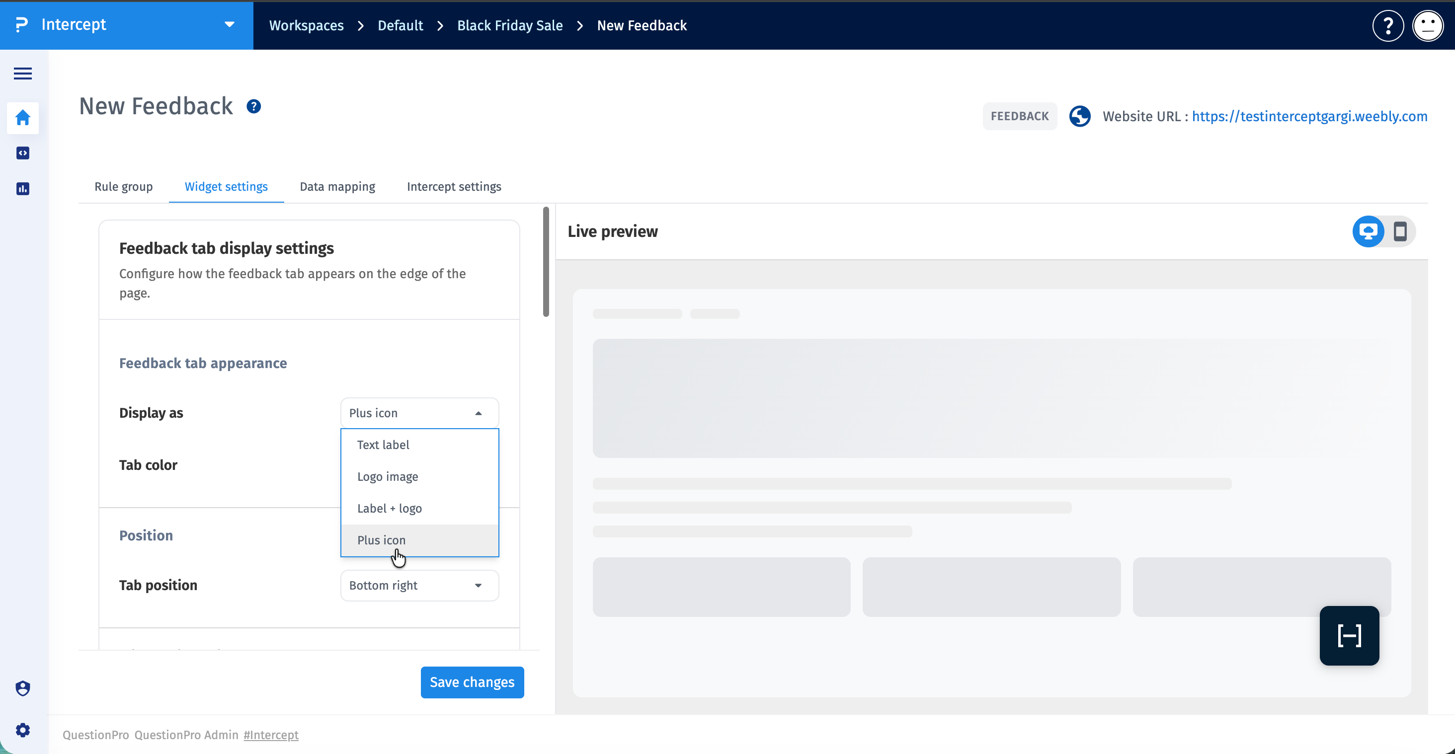
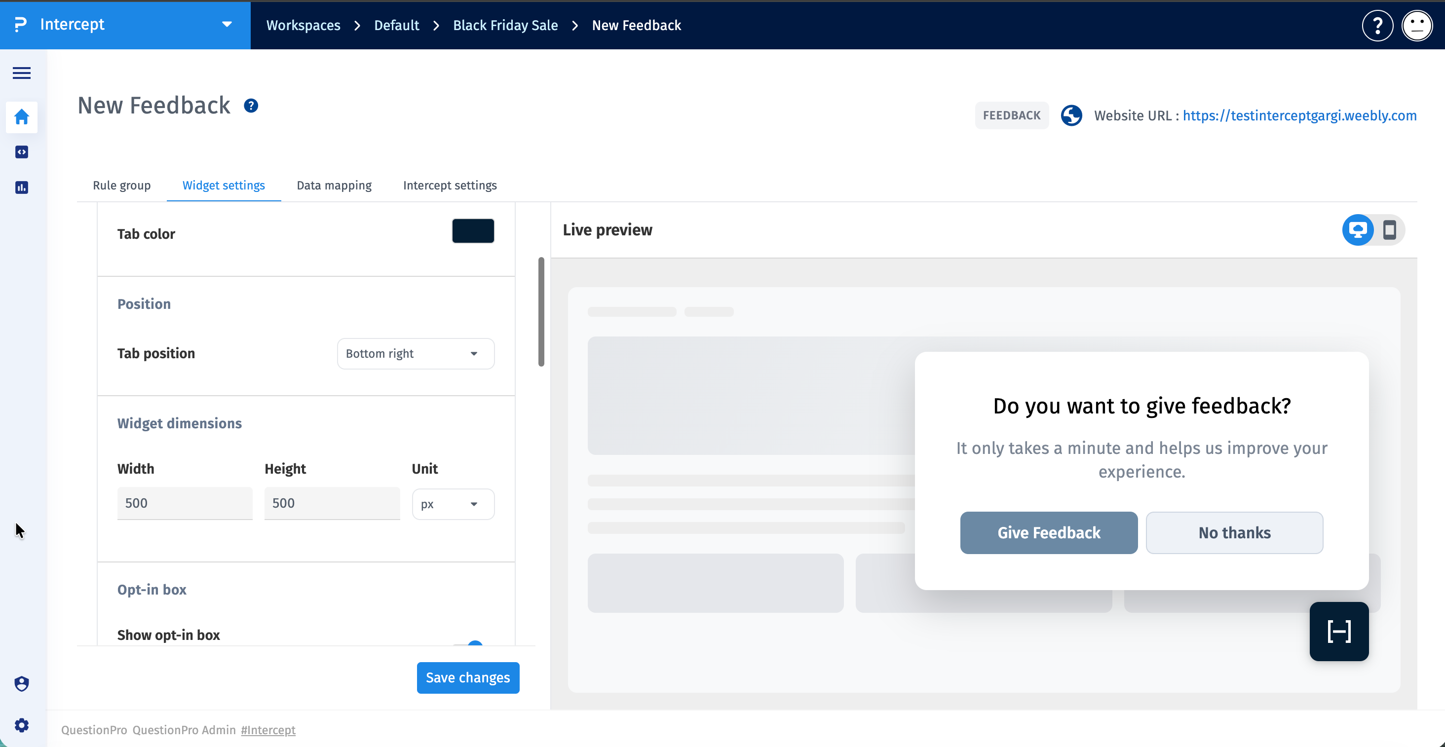
After the Floating Plus Icon Intercept is configured and activated, the + icon is displayed on webpages where the intercept conditions are met.
- The visitor opens a webpage where the intercept is installed.
- The configured Rule Group determines whether the visitor qualifies to see the intercept.
- The Floating Plus Icon appears at the configured position on the webpage.
- The visitor clicks the + icon.
- The configured feedback experience is displayed.
- If an opt-in box is enabled, the visitor sees the opt-in experience before entering the survey.
- The visitor can provide feedback through the configured survey.
The Floating Plus Icon appearance can be customized through the Feedback Widget Settings.
Use the available appearance settings to configure the launcher according to your website design.
Tab Color controls the color of the Floating Plus Icon launcher.
The Widget Dimensions settings control the size of the feedback experience displayed after the visitor interacts with the Floating Plus Icon.
- Width - Specify the width of the feedback widget.
- Height - Specify the height of the feedback widget.
- Unit
- Pixels (px) - Uses fixed dimensions.
- Percentage (%) - Uses responsive dimensions based on the available browser space.
The Opt-in Box can be displayed before the feedback survey opens.
- Show Opt-in Box - Display an invitation before opening the survey.
- Logo Image - Upload a logo to display in the opt-in experience.
- Title - Specify the title displayed in the opt-in box.
- Subtitle - Specify supporting text displayed below the title.
If the opt-in box is disabled, the feedback experience can open directly when the visitor clicks the Floating Plus Icon.
The button settings control the actions available to visitors in the opt-in experience.
- Buttons - Choose whether to display one or two buttons.
- Layout - Arrange the buttons horizontally or vertically.
- Button Width - Specify the width of the buttons.
- Button Font - Select the font used for button labels.
- Button Font Weight - Select the font weight used for button labels.
When two buttons are enabled, the primary and secondary button labels, colors, and text colors can be configured.
